我有一个包含分类数据的数据框:
     colour  direction
1    red     up
2    blue    up
3    green   down
4    red     left
5    red     right
6    yellow  down
7    blue    down
我想根据分类生成一些图表,如饼图和直方图。是否可以在不创建虚拟数值变量的情况下实现?就像这样:
df.plot(kind='hist')
你可以直接在该系列上使用value_counts:
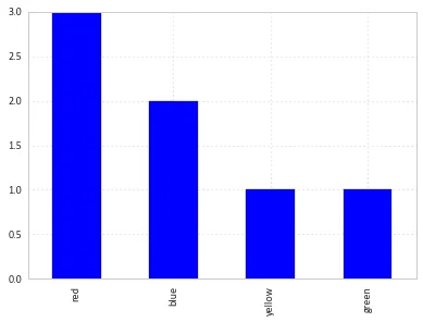
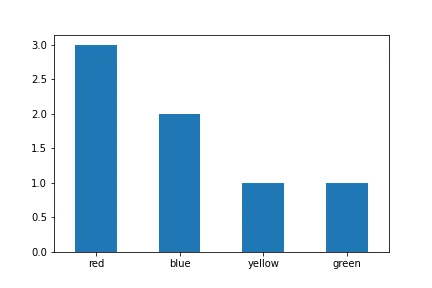
df['colour'].value_counts().plot(kind='bar')
像这样:
df.groupby('colour').size().plot(kind='bar')
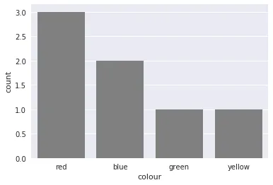
seaborn中的countplot。该包基于pandas构建,创建了一个高级绘图接口。它为你提供良好的样式和正确的坐标轴标签。import pandas as pd
import seaborn as sns
sns.set()
df = pd.DataFrame({'colour': ['red', 'blue', 'green', 'red', 'red', 'yellow', 'blue'],
'direction': ['up', 'up', 'down', 'left', 'right', 'down', 'down']})
sns.countplot(df['colour'], color='gray')
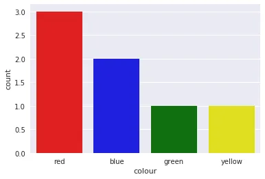
它还支持通过一些小技巧以正确的颜色着色条形图
sns.countplot(df['colour'],
              palette={color: color for color in df['colour'].unique()})
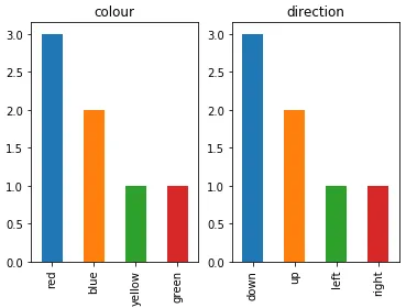
如果要在同一张图中绘制多个分类特征的条形图,我建议:
import pandas as pd
import matplotlib.pyplot as plt

df = pd.DataFrame(
    {
        "colour": ["red", "blue", "green", "red", "red", "yellow", "blue"],
        "direction": ["up", "up", "down", "left", "right", "down", "down"],
    }
)

categorical_features = ["colour", "direction"]
fig, ax = plt.subplots(1, len(categorical_features))
for i, categorical_feature in enumerate(df[categorical_features]):
    df[categorical_feature].value_counts().plot("bar", ax=ax[i]).set_title(categorical_feature)
fig.show()
False的value_counts函数,这样可以保留类别的顺序。df['colour'].value_counts(sort=False).plot.bar(rot=0)
Pandas.Series.plot.piehttps://pandas.pydata.org/docs/reference/api/pandas.Series.plot.pie.html
在不离开内置功能的情况下,我们可以比这更好。
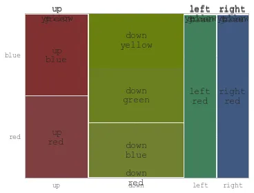
人们常常对饼图提出质疑,但它们与马赛克图/树状图具有相同的优点:帮助保持整体比例的可读性。
kwargs = dict(
    startangle = 90,
    colormap   = 'Pastel2',
    fontsize   = 13,
    explode    = (0.1,0.1,0.1),
    figsize    = (60,5),
    autopct    = '%1.1f%%',
    title      = 'Chemotherapy Stratification'
)

df['treatment_chemo'].value_counts().plot.pie(**kwargs)

import plotly.express as px
px.bar(df["colour"].value_counts())
Roman的回答非常有帮助且正确,但在最新版本中,您还需要指定类型(kind)作为参数的顺序可能会改变。
import pandas as pd
import matplotlib.pyplot as plt

df = pd.DataFrame(
    {
    "colour": ["red", "blue", "green", "red", "red", "yellow", "blue"],
    "direction": ["up", "up", "down", "left", "right", "down", "down"],
    }
)

categorical_features = ["colour", "direction"]
fig, ax = plt.subplots(1, len(categorical_features))
for i, categorical_feature in enumerate(df[categorical_features]):
    df[categorical_feature].value_counts().plot(kind="bar", ax=ax[i]).set_title(categorical_feature)
fig.show()
df["colour"].value_counts().plot(kind='bar')作为常见的替代方案。 - openwonkdf['colour'].value_counts()[['green', 'yellow', 'blue', 'red']]。 - Alexanderdf["colour"].value_counts().plot().bar()更加Pandarific - 但这让我免去了一些痛苦!谢谢! - mishaF