WPF TabControl, 如何使用C#代码更改TabItem的背景颜色?

7
你好,我认为这是初学者的问题。我已经搜索了所有相关的问题,但是所有答案都是.xaml文件的。然而,我需要的是后台代码。 我有一个TabControl。我需要设置它的项目背景颜色。 当选中、未选中和悬停时,我需要为项目设置不同的颜色。 非常感谢你的帮助。 我想在这里发布我的代码。但是目前,我只有一个TabControl实例和一个名为ActiveTabIndex的属性。
---------------------------------------编辑1-----------------------------------------------
我添加了一个SelectionChanged事件。
(this.myTabControl as System.Windows.Controls.TabControl).SelectionChanged += TabSet_SelectionChanged;
void TabSet_SelectionChanged(object sender, System.Windows.Controls.SelectionChangedEventArgs e)
        {
            foreach (System.Windows.Controls.TabItem item in (this.myTabControl as System.Windows.Controls.TabControl).Items)
            {
                if (item == (this.myTabControl as System.Windows.Controls.TabControl).SelectedItem)
                {
                    item.Background = System.Windows.Media.Brushes.Red;
                }
                else
                    item.Background = System.Windows.Media.Brushes.Green;
            }
        }

然而,我只能将它设置为绿色。所选项目的背景颜色仍保持默认颜色而不是红色。对此有什么提示吗? 另外,我想知道如何为悬停添加事件。还没有找到确切的事件。再次感谢。

-----------------------编辑2------------------------------

经过长时间的讨论,我决定(实际上不是我的决定)使用XAML。是的,我是WPF的新手。因此,我仍然有关于此的问题(非常抱歉,希望您能理解)。以下是我的问题: 当鼠标悬停在TabItem上时,我想将背景颜色更改为橙色。现在当鼠标悬停在ContentPanel和TabItem上时,颜色为橙色。我需要它仅在鼠标悬停在TabItem上时为橙色。(我不确定我表达清楚了。) 另一个问题是,我想让用户设置颜色而不是直接设置为红色。我想这需要一些绑定。对于这个问题,我之后会去搜索。只是想弄清楚。 非常感谢大家。真的很有帮助。

<TabItem x:Class="MyControls.Tab"
             xmlns="http://schemas.microsoft.com/winfx/2006/xaml/presentation"
             xmlns:x="http://schemas.microsoft.com/winfx/2006/xaml"
             xmlns:mc="http://schemas.openxmlformats.org/markup-compatibility/2006" 
             xmlns:d="http://schemas.microsoft.com/expression/blend/2008" 
             mc:Ignorable="d" 
             d:DesignHeight="300" d:DesignWidth="300">
    <TabItem.Style>
        <Style TargetType="{x:Type TabItem}">
            <Setter Property="Template">
                <Setter.Value>
                    <ControlTemplate TargetType="{x:Type TabItem}">
                        <Grid>
                            <Border  Name="Border" Margin="0,0,-4,0" BorderThickness="1,1,1,1" CornerRadius="2,12,0,0" >
                                <ContentPresenter x:Name="ContentSite" VerticalAlignment="Center" HorizontalAlignment="Center" ContentSource="Header" Margin="12,2,12,2" RecognizesAccessKey="True"/>
                            </Border>
                        </Grid>
                        <ControlTemplate.Triggers>

                            <Trigger Property="IsSelected" Value="True">
                                <Setter Property="Panel.ZIndex" Value="100" />
                                <Setter TargetName="Border" Property="Background" Value="Red" />
                                <Setter TargetName="Border" Property="BorderThickness" Value="1,1,1,0" />
                            </Trigger>

                            <Trigger Property="IsSelected" Value="False">
                                <Setter TargetName="Border" Property="Background" Value="Green" />                                
                            </Trigger>
                            <Trigger Property="IsMouseOver" Value="True">
                                <Setter TargetName="Border" Property="Background" Value="Orange" />
                            </Trigger>

                        </ControlTemplate.Triggers>
                    </ControlTemplate>
                </Setter.Value>
            </Setter>
        </Style>
    </TabItem.Style>
</TabItem>

------------- 编辑3 ----------------

我的表述可能不够清楚。 现在的情况是这样的: 
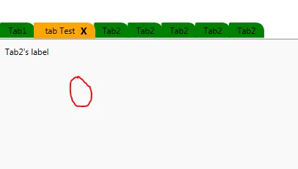
如果鼠标移到其他选项卡上,一切都很正常: enter image description here

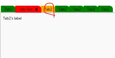
但是当鼠标移到圆形区域时,所选项目的背景颜色应该从橙色变为红色: enter image description here

---------------编辑4 -------------------

感谢大家的回答。 经过与用户和其他人的长时间讨论,我们希望能够动态更改背景颜色。用户想要自行设置颜色。基本上,我需要先进行一些绑定(如果这是正确的术语)。我尝试了以下操作。然而,所选选项卡没有红色背景。我使用Snoop进行了检查,结果发现背景颜色在本地被设置为红色。我有点困惑了。我向周围的人提出了问题,并得到了建议,说既然它在ControlTemplate下,所以应该使用TemplateBinding。但是,我尝试创建依赖属性等等。但是我不明白为什么要使用TemplateBinding,因为我读了一些文章说它是用于编译时绑定的。我完全困惑了。我是WPF的新手,如果问题太低级,请见谅。 再次感谢!

<TabItem x:Class="MyControl.Tab"
             xmlns="http://schemas.microsoft.com/winfx/2006/xaml/presentation"
             xmlns:x="http://schemas.microsoft.com/winfx/2006/xaml"
             xmlns:mc="http://schemas.openxmlformats.org/markup-compatibility/2006" 
             xmlns:d="http://schemas.microsoft.com/expression/blend/2008" 
             mc:Ignorable="d" 
             d:DesignHeight="300" d:DesignWidth="300">
    <TabItem.Style>
        <Style TargetType="{x:Type TabItem}">
            <Setter Property="Template">
                <Setter.Value>
                    <ControlTemplate TargetType="{x:Type TabItem}">
                        <Grid>
                            <Border  Name="Border" Margin="0,0,-4,0" BorderThickness="1,1,1,1" CornerRadius="2,12,0,0" >
                                <ContentPresenter x:Name="ContentSite" VerticalAlignment="Center" HorizontalAlignment="Center" ContentSource="Header" Margin="12,2,12,2" RecognizesAccessKey="True"/>
                            </Border>
                        </Grid>
                        <ControlTemplate.Triggers>
                            <Trigger Property="IsSelected" Value="True">
                                <Setter Property="Panel.ZIndex" Value="100" />
                                <Setter TargetName="Border" Property="Background" Value="{Binding SelectedBgClr}" />
                                <Setter Property="Foreground" Value="Yellow" />
                                <Setter TargetName="Border" Property="BorderThickness" Value="1,1,1,0" />
                            </Trigger>                            
                            <Trigger Property="IsSelected" Value="False">
                                <Setter TargetName="Border" Property="Background" Value="Green" /> 
                                <Setter Property="Foreground" Value="AliceBlue"/>
                            </Trigger>
                            <Trigger Property="IsMouseOver" Value="True">
                                <Setter TargetName="Border" Property="Background" Value="Orange" />
                                <Setter Property="Foreground" Value="Black"/>
                            </Trigger>
                        </ControlTemplate.Triggers>
                    </ControlTemplate>
                </Setter.Value>
            </Setter>
        </Style>
    </TabItem.Style>
</TabItem>

后面的代码是:
 public Tab()
        {
            SelectedBgClr = new SolidColorBrush(Colors.Red);
            //UnSelectedBgClr = new SolidColorBrush(Colors.Green);
            //HoverBgClr = new SolidColorBrush(Colors.Orange);
            InitializeComponent();

        }
public static readonly DependencyProperty SelectedBgClrProperty = DependencyProperty.Register("SelectedBgClr", typeof(Brush), typeof(Tab), new UIPropertyMetadata(null));
public Brush SelectedBgClr
{
    get
    {
        return (Brush)GetValue(SelectedBgClrProperty);
    }
    set
    {
        SetValue(SelectedBgClrProperty, value);
    }
}

2
很明显,XAML 的存在就是为了回答你的问题,因为这就是 XAML 的用途。 - Federico Berasategui
1
HighCore是正确的 - 选中/取消选中/悬停是由控件模板中的可视状态定义设置的。请参见此处:http://msdn.microsoft.com/en-us/library/ms754137(v=vs.110).aspx - McGarnagle
1
@Payson,不完全是这样。XAML并没有被编译成代码,而是被编译成BAML并作为流读取。因此,应该将XAML用于UI,将代码用于业务逻辑。不要在代码中编写UI。WPF不同于WinForms,请注意区分。 - Federico Berasategui
1
如果其他人一直以错误的方式推进项目,那么这个项目将会彻底失败,当它在地上燃烧时,我会盯着它看并大笑。然后我会说:“我告诉过你们WPF不像垃圾winforms”。 - Federico Berasategui
@HighCore,我这样做是因为我正在开发一些 UI 框架而不是直接开发 UI。我已经更新了我的问题关于绑定值的部分。方便的时候能否帮我检查一下?非常感谢。 - Payson
显示剩余12条评论
3个回答

5
你发现很难得到问题的答案,是因为你完全走错了路;我能想到很少的情况下,像你建议的在代码中更改控件是合理的。WPF特别设计了将视觉状态与代码分离,如果忽略这一点,后果自负!
实际上,以下内容可以解决你的问题...有点...
foreach (TabItem item in tabControl.Items)
    item.Background = new SolidColorBrush(Colors.Blue);

如果您这样做,您会发现它改变了未选中选项卡的背景颜色,但没有改变当前选中选项卡的颜色。您还会注意到,用鼠标突出显示选项卡会显示另一种颜色。实际上,TabItem有7种不同的视觉状态,为每种情况添加代码开始变得混乱,肯定比使用XAML更加复杂。
“正确”控制背景颜色的方式是通过XAML和数据绑定。首先,转到Microsoft MSDN页面 WPF TabControl Styles and Templates,您将找到TabItem的完整模板。将其粘贴到Window.Resources部分中,现在您可以开始尝试更改外观(不要忘记添加名称空间和资源)。如果您尝试使用各种资源玩耍,您会注意到TabItems使用线性渐变,ControlLightColor用于所有选项卡的顶部,ControlMediumColor用于未选定选项卡的底部,而ControlDarkColor用于当前选定选项卡的底部。要在运行时控制此操作,您需要找到样式中散布的这些资源的所有实例,并将它们绑定到代码中的属性,然后编写一个ValueConverter将您的属性转换为刷子(我猜测是布尔值)。另一种(更好的)方法,不需要编写任何额外的代码,是使用DataTrigger响应您的属性更改值并更改TabItem的视觉外观,但这已经超出了“初学者”阶段,您需要提供有关您特定情况的更多信息。
更新:这对我来说似乎有效:
void TabSet_SelectionChanged(object sender, System.Windows.Controls.SelectionChangedEventArgs e)
    {
        foreach (TabItem item in tabControl.Items)
            item.Background = new SolidColorBrush(item.IsSelected ? Colors.Green : Colors.Red);
    }

我仍然认为这是非常错误的。如果您坚持要在代码中实现这一点,那么您不应该使用WPF。这完全是错误的技术选择,我无法强调这一点!更新#2:您已经接近成功了,您只需要在承载选项卡控件的窗口中实现此功能即可。
<Window x:Class="MyWpfApplication.Window1"
        xmlns="http://schemas.microsoft.com/winfx/2006/xaml/presentation"
        xmlns:x="http://schemas.microsoft.com/winfx/2006/xaml"
        Title="Window1" Height="300" Width="300" WindowState="Maximized">

    <Window.Resources>

        <Style TargetType="{x:Type TabItem}">
            <Setter Property="Template">
                <Setter.Value>
                    <ControlTemplate TargetType="{x:Type TabItem}">
                        <Grid>
                            <Border  Name="Border" Margin="0,0,-4,0" BorderThickness="1,1,1,1" CornerRadius="2,12,0,0" >
                                <ContentPresenter x:Name="ContentSite" VerticalAlignment="Center" HorizontalAlignment="Center" ContentSource="Header" Margin="12,2,12,2" RecognizesAccessKey="True"/>
                            </Border>
                        </Grid>
                        <ControlTemplate.Triggers>

                            <Trigger Property="IsSelected" Value="True">
                                <Setter Property="Panel.ZIndex" Value="100" />
                                <Setter TargetName="Border" Property="Background" Value="Red" />
                                <Setter TargetName="Border" Property="BorderThickness" Value="1,1,1,0" />
                            </Trigger>

                            <Trigger Property="IsSelected" Value="False">
                                <Setter TargetName="Border" Property="Background" Value="Green" />
                            </Trigger>
                            <Trigger Property="IsMouseOver" Value="True">
                                <Setter TargetName="Border" Property="Background" Value="Orange" />
                            </Trigger>

                        </ControlTemplate.Triggers>
                    </ControlTemplate>
                </Setter.Value>
            </Setter>
        </Style>

    </Window.Resources>

    <TabControl>
        <TabItem Header="Foo" />
        <TabItem Header="Bar" />
        <TabItem Header="Baz" />
    </TabControl>

</Window>

非常感谢 @Mark Feldman。我正在处理这个问题。我现在所做的是: - Payson
我添加了一个SelectionChanged事件,并在那里设置了背景颜色。由于此处空间不足,请查看我的编辑。 - Payson
1
再次更新...不确定为什么你要尝试子类化TabItem,因为在WPF中这真的是没有必要的。 - Mark Feldman
1
@MarkFeldman,您提供的MSDN资源链接已经失效。 - Steffen Winkler
1
@SteffenWinkler 感谢您提醒,我刚和同事抱怨过 MSDN 链接总是失效。我已经相应地更新了我的回答中的链接。 - Mark Feldman
显示剩余4条评论

2

WPF允许您基于现有控件创建新的自定义控件类型,然后您可以使用Microsoft网站上的模板/样式声明来填充它并更改其中的部分以适合您的需求。创建名为MyTabControl的新用户控件,并将其后台代码替换为以下内容:

public partial class MyTabControl : TabControl
{
    public static readonly DependencyProperty SelectedBgClrProperty = DependencyProperty.Register("SelectedBgClr",
        typeof(Brush), typeof(MyTabControl), new UIPropertyMetadata(null));

    [Category("Appearance")]
    public Brush SelectedBgClr
    {
        get
        {
            return (Brush)GetValue(SelectedBgClrProperty);
        }
        set
        {
            SetValue(SelectedBgClrProperty, value);
        }
    }

    public MyTabControl()
    {
        InitializeComponent();
    }
}

现在用以下内容替换xaml(您需要将命名空间更改为您的项目所需):
<TabControl x:Class="TabDemo.MyTabControl"
         xmlns="http://schemas.microsoft.com/winfx/2006/xaml/presentation"
         xmlns:x="http://schemas.microsoft.com/winfx/2006/xaml"
         xmlns:mc="http://schemas.openxmlformats.org/markup-compatibility/2006" 
         xmlns:d="http://schemas.microsoft.com/expression/blend/2008" 
         mc:Ignorable="d" 
         Name="tabControl"
         d:DesignHeight="300" d:DesignWidth="300">

<TabControl.Resources>

    <Style TargetType="{x:Type TabItem}">
        <Setter Property="Template">
            <Setter.Value>
                <ControlTemplate TargetType="{x:Type TabItem}">
                    <Grid>
                        <Border  Name="Border" Margin="0,0,-4,0" BorderThickness="1,1,1,1" CornerRadius="2,12,0,0" >
                            <ContentPresenter x:Name="ContentSite" VerticalAlignment="Center" HorizontalAlignment="Center" ContentSource="Header" Margin="12,2,12,2" RecognizesAccessKey="True"/>
                        </Border>
                    </Grid>
                    <ControlTemplate.Triggers>
                        <Trigger Property="IsSelected" Value="True">
                            <Setter Property="Panel.ZIndex" Value="100" />
                            <Setter TargetName="Border" Property="Background" Value="{Binding ElementName=tabControl, Path=SelectedBgClr}" />
                            <Setter Property="Foreground" Value="Yellow" />
                            <Setter TargetName="Border" Property="BorderThickness" Value="1,1,1,0" />
                        </Trigger>
                        <Trigger Property="IsSelected" Value="False">
                            <Setter TargetName="Border" Property="Background" Value="Green" />
                            <Setter Property="Foreground" Value="AliceBlue"/>
                        </Trigger>
                        <Trigger Property="IsMouseOver" Value="True">
                            <Setter TargetName="Border" Property="Background" Value="Orange" />
                            <Setter Property="Foreground" Value="Black"/>
                        </Trigger>
                    </ControlTemplate.Triggers>
                </ControlTemplate>
            </Setter.Value>
        </Setter>
    </Style>
</TabControl.Resources>

<TabControl.Style>
    <Style  TargetType="{x:Type TabControl}">
        <Setter Property="OverridesDefaultStyle"
          Value="True" />
        <Setter Property="SnapsToDevicePixels"
          Value="True" />
        <Setter Property="Template">
            <Setter.Value>
                <ControlTemplate TargetType="{x:Type TabControl}">
                    <Grid KeyboardNavigation.TabNavigation="Local">
                        <Grid.RowDefinitions>
                            <RowDefinition Height="Auto" />
                            <RowDefinition Height="*" />
                        </Grid.RowDefinitions>
                        <VisualStateManager.VisualStateGroups>
                            <VisualStateGroup x:Name="CommonStates">
                                <VisualState x:Name="Disabled">
                                    <Storyboard>
                                        <ColorAnimationUsingKeyFrames Storyboard.TargetName="Border"
                                                Storyboard.TargetProperty="(Border.BorderBrush).
                    (SolidColorBrush.Color)">
                                            <EasingColorKeyFrame KeyTime="0"
                                         Value="#FFAAAAAA" />
                                        </ColorAnimationUsingKeyFrames>
                                    </Storyboard>
                                </VisualState>
                            </VisualStateGroup>
                        </VisualStateManager.VisualStateGroups>
                        <TabPanel x:Name="HeaderPanel"
                    Grid.Row="0"
                    Panel.ZIndex="1"
                    Margin="0,0,4,-1"
                    IsItemsHost="True"
                    KeyboardNavigation.TabIndex="1" />
                        <Border x:Name="Border"
                  Grid.Row="1"
                  BorderThickness="1"
                  CornerRadius="2"
                  KeyboardNavigation.TabNavigation="Local"
                  KeyboardNavigation.DirectionalNavigation="Contained"
                  KeyboardNavigation.TabIndex="2" Background="{Binding ElementName=tabControl, Path=SelectedBgClr}">
                            <ContentPresenter x:Name="PART_SelectedContentHost"
                              Margin="4"
                              ContentSource="SelectedContent" />
                        </Border>
                    </Grid>
                </ControlTemplate>
            </Setter.Value>
        </Setter>
    </Style>
</TabControl.Style>

现在在您的MainWindow或其他地方,只需像使用常规TabControl一样使用它,SelectedBgClr将设置选定的选项卡标题和主面板背景(如果您查看上面的XAML,您会看到两者的绑定):
<local:MyTabControl SelectedBgClr="Red">
        <TabItem Header="Foo"  />
        <TabItem Header="Bar" />
        <TabItem Header="Baz" />
    </local:MyTabControl>

请注意,后台代码很少,仍然是XAML完成了大部分工作,而MyTabControl只是用作依赖属性的包装器。在实际应用中,您将使用称为附加属性的东西,这样您就不需要派生整个TabControl类。

谢谢!马克!好的,我已经按照你的建议进行了更改。然而,我的情况有点不同。我不会在任何XAML文件中设置SelectedBgClr="Red"。相反,用户将使用C#代码(或其他方式)来设置它们。我所需要做的就是打开一个DependencyProperty,让用户负责选项卡背景颜色。 - Payson
没问题,你可以通过类似于“myTab.SetValue(MyTabControl.SelectedBgClrProperty, Brushes.Red)”这样的方式在代码中设置依赖属性。你也可以在<UserControl.Resources>块中声明一个画刷,并在运行时更改其属性,在这种情况下,你将其称为DynamicResource而不是StaticResource。 - Mark Feldman

0
将以下代码放入您的 TabControlChanged 事件中:
foreach (TabItem AllTabItems in MyTabControl.Items) // Change MyTabControl with your TabControl name
{
    if (!AllTabItems.IsSelected)
    {
        // do something for all unselected tabitems
    }
    else if (AllTabItems.IsSelected)
    {
       // do something for the selected tabitem
    }
    else if (AllTabItems.IsMouseOver)
    {
       // do something for mouseover tabitem
    }
}

网页内容由stack overflow 提供, 点击上面的
可以查看英文原文,
原文链接