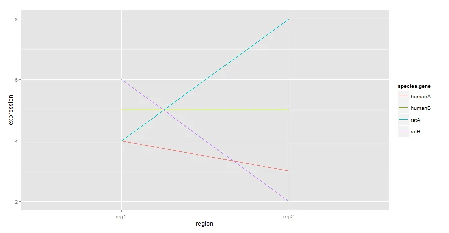
我有一个类似于以下结构的数据集:
region    expression    species/gene
reg1      4             humanA
reg1      5             humanB
reg1      4             ratA
reg1      6             ratB
reg2      3             humanA
reg2      5             humanB
reg2      8             ratA
reg2      2             ratB
我想在x轴上绘制区域1-n,并在y轴上绘制表达值,按物种/基因的值进行彩色编码。我还想通过每个物种/基因组中的趋势线,并在边缘显示r值。理想情况下,我会使用以下格式的东西。
ggplot(data, aes(x=xvar, y=yvar)) +
geom_point(shape=1) +
geom_smooth(method=lm) +
geom_point(shape=19, alpha=1/4)
但是我太菜了,不知道如何将这个与我的数据编织在一起。先感谢您!