散点图中的轴范围

8

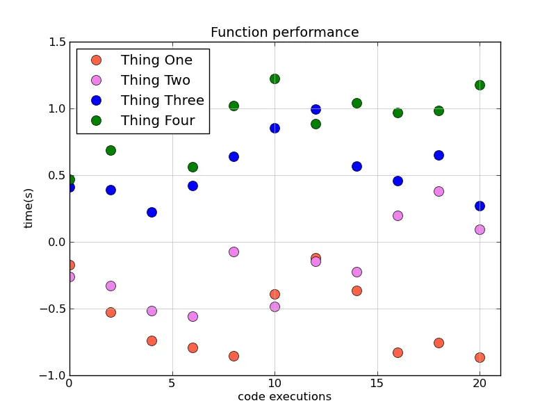
我一直在使用下面的代码绘制运行4个函数所花费的时间。X轴表示执行次数,Y轴表示运行函数所花费的时间。

我想知道你是否能帮助我完成以下任务:

1)设置X轴的限制,以便仅显示正值(X表示每个函数被执行的次数,因此始终为正值)

2)为4个函数创建图例

谢谢,

马克

import matplotlib
from matplotlib.backends.backend_agg import FigureCanvasAgg as FigureCanvas
from matplotlib.figure import Figure
import matplotlib.mlab as mlab


r = mlab.csv2rec('performance.csv')

fig = Figure(figsize=(9,6))

canvas = FigureCanvas(fig)

ax = fig.add_subplot(111)

ax.set_title("Function performance",fontsize=14)

ax.set_xlabel("code executions",fontsize=12)

ax.set_ylabel("time(s)",fontsize=12)

ax.grid(True,linestyle='-',color='0.75')

ax.scatter(r.run,r.function1,s=10,color='tomato');
ax.scatter(r.run,r.function2,s=10,color='violet');
ax.scatter(r.run,r.function3,s=10,color='blue');
ax.scatter(r.run,r.function4,s=10,color='green');

canvas.print_figure('performance.png',dpi=700)

2
当您尝试自己完成时,遇到了什么问题?您不知道如何设置轴限制或创建图例吗?(这两个问题都可以通过搜索文档轻松回答)您是否尝试过并收到错误消息? - David Z
1
嗨,大卫!感谢你的信息。我一直在试图使用ax.xlim([0,150])来设置X轴限制,但结果出现了以下错误信息:AttributeError: 'AxesSubplot'对象没有'xlim'属性。我不确定是否使用scatter()会让我有更多关于坐标轴限制的灵活性。 - Mark
关于图例,我使用了以下代码:ax.scatter(r.run,r.time,s=10,color='tomato', marker='o',label='function1') 但是在 PNG 文件中没有显示任何内容。 - Mark
4
@Mark - 你需要使用 ax.set_xlim(..) 而不是 ax.xlim。此外,在这种情况下,你不需要使用scatter函数。使用 plot 更为合适。Scatter函数用于通过第三个和/或第四个变量来改变标记的颜色和/或大小。在你的情况下,使用 ax.plot(r.run, r.function1, 'o', color='whatever') 更为合适。 - Joe Kington
1
你应该通过将他的答案标记为正确来感谢他。 ;) - Carl F.
1个回答

25
你需要调用legend函数才能显示图例。参数label仅在相关的艺术对象上设置_label属性。该参数是为了方便使用,使得图例中的标签可以清晰地与绘图命令相关联。如果没有显式调用ax.legend(...),它不会将图例添加到绘图中。此外,你需要使用ax.set_xlim而不是ax.xlim来调整x轴限制。还可以查看ax.axis函数。
看起来你想要这样的效果:
import matplotlib as mpl
mpl.use('Agg')
import matplotlib.pyplot as plt
import numpy as np

# Generate some data
x = np.arange(0, 22, 2)
f1, f2, f3, f4 = np.cumsum(np.random.random((4, x.size)) - 0.5, axis=1)

# It's much more convenient to just use pyplot's factory functions...
fig, ax = plt.subplots()

ax.set_title("Function performance",fontsize=14)
ax.set_xlabel("code executions",fontsize=12)
ax.set_ylabel("time(s)",fontsize=12)
ax.grid(True,linestyle='-',color='0.75')

colors = ['tomato', 'violet', 'blue', 'green']
labels = ['Thing One', 'Thing Two', 'Thing Three', 'Thing Four']
for func, color, label in zip([f1, f2, f3, f4], colors, labels):
    ax.plot(x, func, 'o', color=color, markersize=10, label=label)

ax.legend(numpoints=1, loc='upper left')
ax.set_xlim([0, x.max() + 1])

fig.savefig('performance.png', dpi=100)

在此输入图片描述


网页内容由stack overflow 提供, 点击上面的
可以查看英文原文,
原文链接