我尝试创建两个具有相同坐标轴的散点图。如下所示,我明确设置了我的坐标轴限制。然而,由于数据的分布在两个图之间不同,因此x轴的缩放在这些限制范围内发生了变化。请比较下面的图1和图2,它们使用相同的代码进行绘制(除了不同的x值):
图1
#set up figure
fig, ax1 = plt.subplots(1,1)

#plot first series (left y axis)
df.plot(ax=ax1, kind='line', x=bin1, y='hfall', logx=True,
        color='DarkBlue', style='.', markersize=5, legend=False)

#set up second axis as duplicate of the first
ax2 = ax1.twinx()

#plot second series (right y axis)
df.plot(ax=ax2, kind='line', x=bin1, y='vf', logx=True,
        color='Red', style='.', markersize=5, legend=False)

#set axes limits
ax1.set_xlim([0.,0.4])
ax1.set_ylim([1,1.15])
ax2.set_xlim([0.,0.4])
ax2.set_ylim([2e-06,6e-06])

#set labels and title
ax1.set_ylabel('Total horizontal flux ($kg/m^2/s$)', color='DarkBlue')
ax1.set_xlabel('horizontal flux in bin1 ($kg/m^2/s$)')
ax1.set_title('bin1', loc='center', fontsize=14)
ax2.ticklabel_format(axis='y', style='sci', scilimits=(0,0))
ax2.set_ylabel('Total vertical flux (all bins) ($kg/m^2/s$)', color='Red')

plt.show()
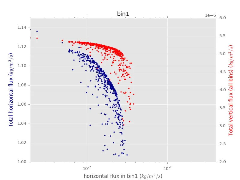
Figure 2
#set up figure
fig, ax1 = plt.subplots(1,1)

#plot first series (left y axis)
df.plot(ax=ax1, kind='line', x=bin2, y='hfall', logx=True,
        color='DarkBlue', style='.', markersize=5, legend=False)

#set up second axis as duplicate of the first
ax2 = ax1.twinx()

#plot second series (right y axis)
df.plot(ax=ax2, kind='line', x=bin2, y='vf', logx=True,
        color='Red', style='.', markersize=5, legend=False)

#set axes limits
ax1.set_xlim([0.,0.4])
ax1.set_ylim([1,1.15])
ax2.set_xlim([0.,0.4])
ax2.set_ylim([2e-06,6e-06])

#set labels and title
ax1.set_ylabel('Total horizontal flux ($kg/m^2/s$)', color='DarkBlue')
ax1.set_xlabel('horizontal flux in bin2 ($kg/m^2/s$)')
ax1.set_title('bin2', loc='center', fontsize=14)
ax2.ticklabel_format(axis='y', style='sci', scilimits=(0,0))
ax2.set_ylabel('Total vertical flux (all bins) ($kg/m^2/s$)', color='Red')

plt.show()
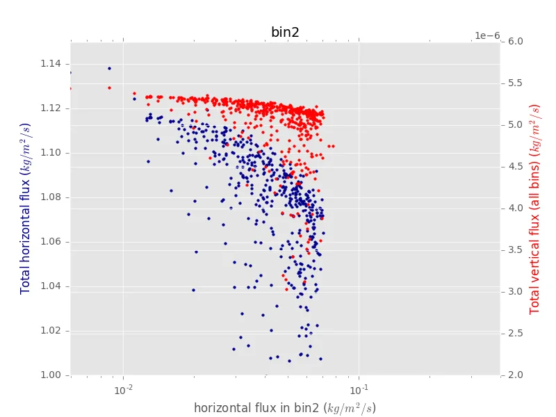
我知道这可能是为了向我展示数据的变异性而发生的,但我想直接比较这两个图 - 在对数刻度上所占空间的移动是有用的。那么,有没有人知道我如何停止自动缩放x轴的发生?(即,我希望两个图的x轴完全相同)