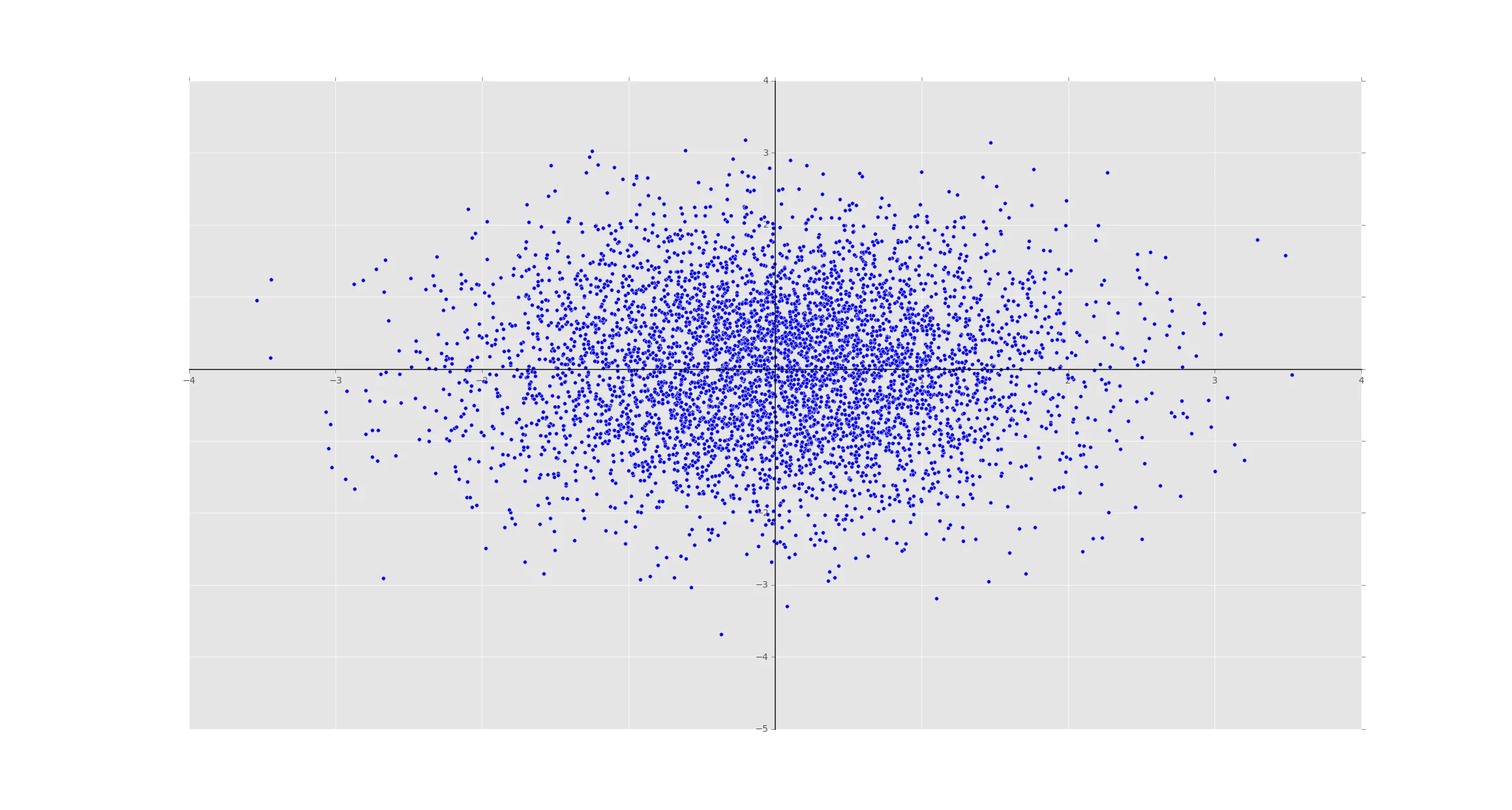
我希望在散点图中将坐标轴轴线通过原点(0,0),因此我在下面的示例中设置了脊柱位置。问题是,我的实际数据点覆盖了坐标轴刻度标签,因此无法看到它们。
如何让matplotlib“覆盖”数据点并显示坐标轴刻度标签?
import numpy as np
from matplotlib import pyplot as plt
plt.style.use('ggplot')


x = np.random.randn(5000)
y = np.random.randn(5000)

f, ax = plt.subplots()
plt.scatter(x,y)
ax.spines['left'].set_position('zero')
ax.spines['left'].set_color('black')
ax.spines['right'].set_color('none')
ax.spines['bottom'].set_position('zero')
ax.spines['bottom'].set_color('black')
ax.spines['top'].set_color('none')

plt.show()
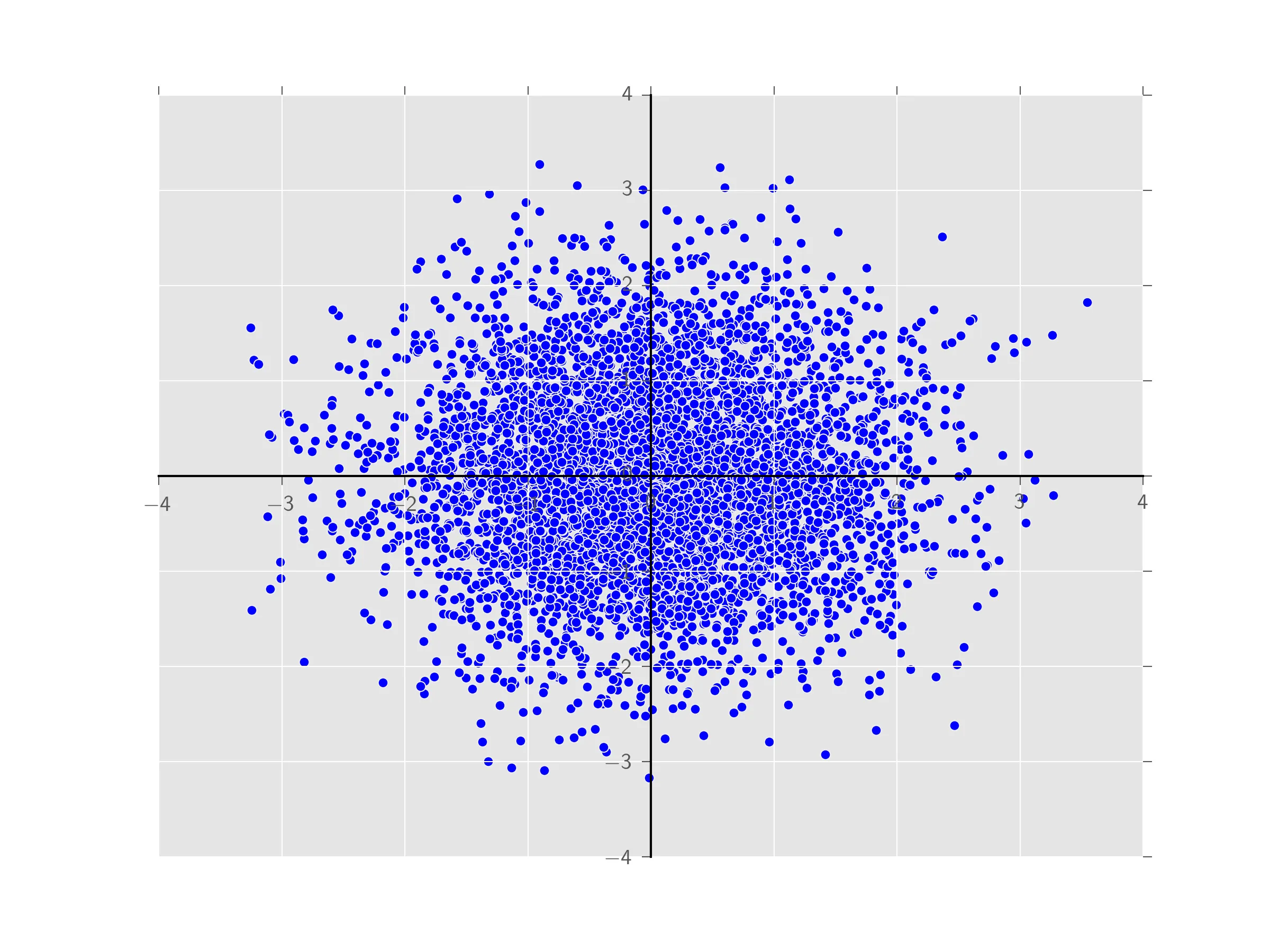
ax.tick_params(labelcolor='r', zorder=100)不起作用,这有意义吗? - Rutger Kassies