我在绘制图表时很难在图表下方绘制网格线,而不会影响主要的x轴和y轴zorder:
import matplotlib.pyplot as plt
import numpy as np


N = 5
menMeans = (20, 35, 30, 35, 27)
menStd =   (2, 3, 4, 1, 2)

ind = np.arange(N)  # the x locations for the groups
width = 0.35       # the width of the bars

fig, ax = plt.subplots()
rects1 = ax.bar(ind, menMeans, width, color='r', yerr=menStd, alpha=0.9, linewidth = 0,zorder=3)

womenMeans = (25, 32, 34, 20, 25)
womenStd =   (3, 5, 2, 3, 3)
rects2 = ax.bar(ind+width, womenMeans, width, color='y', yerr=womenStd, alpha=0.9, linewidth = 0,zorder=3)

# add some
ax.set_ylabel('Scores')
ax.set_title('Scores by group and gender')
ax.set_xticks(ind+width)
ax.set_xticklabels( ('G1', 'G2', 'G3', 'G4', 'G5') )

ax.legend( (rects1[0], rects2[0]), ('Men', 'Women') )

fig.gca().yaxis.grid(True, which='major', linestyle='-', color='#D9D9D9',zorder=2, alpha = .9)
[line.set_zorder(4) for line in ax.lines]

def autolabel(rects):
    # attach some text labels
    for rect in rects:
        height = rect.get_height()
        ax.text(rect.get_x()+rect.get_width()/2., 1.05*height, '%d'%int(height),
                ha='center', va='bottom')

autolabel(rects1)
autolabel(rects2)

plt.show()
这个示例来自matplotlib,我稍作修改以展示如何让问题显现。我无法发布图像,但是如果您运行该代码,您将看到条形图不仅绘制在水平网格线上方,而且还绘制在x和y轴上方。我不想让x和y轴被图形遮挡,特别是当刻度也被阻挡时。
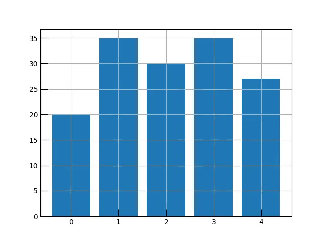


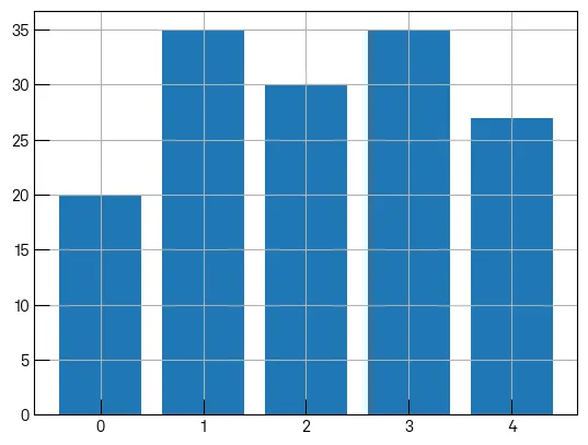
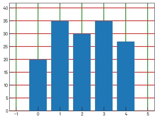
fig.gca()而不是ax? - Francesco Montesanoax.lines中的线条是由什么创建的吗? - Francesco Montesano