我有这段代码。
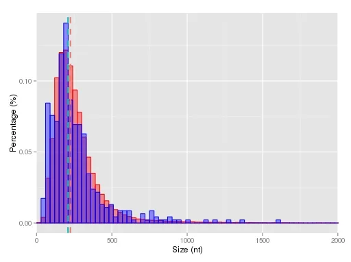
ggplot()
+ geom_histogram(aes(x=V1, y=(..count..)/sum(..count..)), fill="red", alpha=.4, colour="red", data=coding, stat = "bin", binwidth = 30)
+ geom_histogram(aes(x=V1,y=(..count..)/sum(..count..)), fill="blue", alpha=.4, colour="blue", data=lncrna, stat = "bin", binwidth = 30)
+ coord_cartesian(xlim = c(0, 2000))
+ xlab("Size (nt)")
+ ylab("Percentage (%)")
+ geom_vline(data=cdf, aes(xintercept=rating.mean, colour=Labels), linetype="dashed", size=1)
能够生成漂亮的直方图,但不带图例:
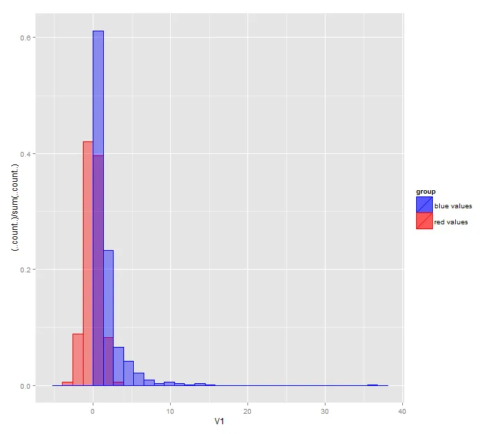
在我访问的每个帖子中都遇到了同样的问题,他们说要将color放在aes里面。然而,这并没有给出任何图例。
我尝试了:
ggplot() + geom_histogram(aes(x=V1, y=(..count..)/sum(..count..),color="red", fill="red"), fill="red", alpha=.4, colour="red", data=coding, stat = "bin", binwidth = 30)
+ geom_histogram(aes(x=V1,y=(..count..)/sum(..count..), color="blue", fill="blue"), fill="blue", alpha=.4, colour="blue", data=lncrna, stat = "bin", binwidth = 30)
+ coord_cartesian(xlim = c(0, 2000))
+ xlab("Size (nt)")
+ ylab("Percentage (%)")
+ geom_vline(data=cdf, aes(xintercept=rating.mean, colour=Labels), linetype="dashed", size=1)
没有成功。
我如何在我的图表中放置图例?
aes()函数。 - Steve Scoding和lncrna合并成一个对象,并加入另一列来指示数据来源(假设该变量名为origin)。您可以在aes()中进行映射,例如ggplot(merged.data, aes(..., fill = origin)) + geom_histogram()。您可以通过 scales 来控制具体的颜色。请参考 http://docs.ggplot2.org/current/。 - Roman Luštrik