我正在按照此链接中的代码进行操作,只是稍微用了不同的数值(所以我的代码与链接中描述的完全相同)。
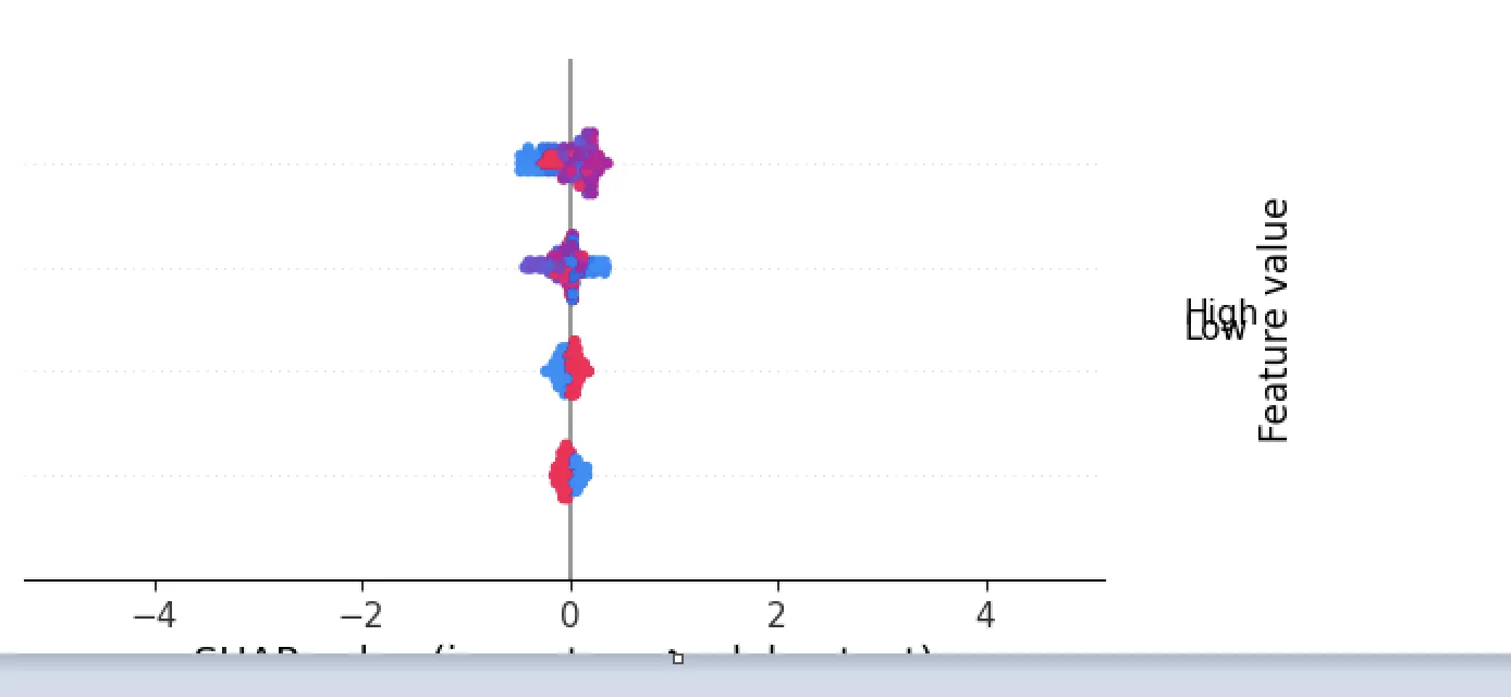
我的输出结果如下所示:
我的输出结果如下所示:
参考问题中给出的代码链接,在计算完 shap_values 后,你可以尝试以下解决方案:
import matplotlib.pyplot as plt
.
.
# Calculate shap_values
fig = shap.summary_plot(shap_values[1], X_test, show=False)
_, h = plt.gcf().get_size_inches()
plt.gcf().set_size_inches(h*5, h)
plt.show()
或者
import matplotlib.pyplot as plt
.
.
# Calculate shap_values
shap.summary_plot(shap_values[1], X_test, show=False)
ax = plt.gca()

# You can change the min and max value of xaxis by changing the arguments of:
ax.set_xlim(-0.5, 0.5)
plt.show()