我刚刚创建了下面这个热图。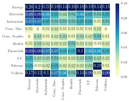
在图例中,最大值(vmax)被设置为0.10。我这样做是因为我想避免给更“极端”的值着色。但在图例中,是否可以修改并写入“>= 0.10”,即添加“大于或等于”?
这是一种相当hack的解决方案,我认为肯定有更聪明的方法可以做到这一点,希望@mwaskom可以发表意见。但是,在调用heatmap函数时,我能够通过将color-bar对象显式传递为参数来访问它,如下所示:
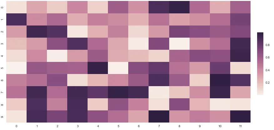
import seaborn as sns; sns.set()
import numpy as np; np.random.seed(0)
from matplotlib import pyplot as plt

fig, ax = plt.subplots()
fig.set_size_inches(14, 7)
uniform_data = np.random.rand(10, 12)
cbar_ax = fig.add_axes([.92, .3, .02, .4])
sns.heatmap(uniform_data, ax=ax, cbar_ax=cbar_ax)
生成这个:
我能够在ax.get_yticks()中找到刻度本身:
In [41]: cbar_ax.get_yticks()
Out [41]: array([ 0.19823662,  0.39918933,  0.60014204,  0.80109475])
标签本身是字符串:
In [44]: [x.get_text() for x in cbar_ax.get_yticklabels()]
Out [44]: [u'0.2', u'0.4', u'0.6', u'0.8']
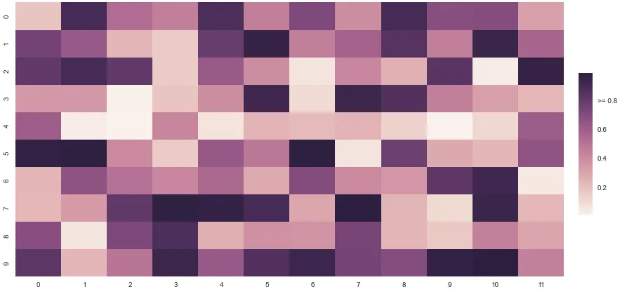
因此,我们可以简单地更改yticklabels中最后一个元素的文本对象,希望能得到更正的轴,在这里是我的最终代码:
fig, ax = plt.subplots()
fig.set_size_inches(14, 7)
uniform_data = np.random.rand(10, 12)
#add an axis to our plot for our cbar, tweak the numbers there to play with the sizing.
cbar_ax = fig.add_axes([.92, .3, .02, .4])
#assign the cbar to be in that axis using the cbar_ax kw
sns.heatmap(uniform_data, ax=ax, cbar_ax=cbar_ax)

#hacky solution to change the highest (last) yticklabel
changed_val = ">= " + cbar_ax.get_yticklabels()[-1].get_text()

#make a new list of labels with the changed value.
labels = [x.get_text() for x in cbar_ax.get_yticklabels()[:-1]] + [changed_val]

#set the yticklabels to the new labels we just created.
cbar_ax.set_yticklabels(labels)
这将产生:
关于此主题的一些其他资源可以在这里找到,我从mwaskom的回复中获取了一些信息。