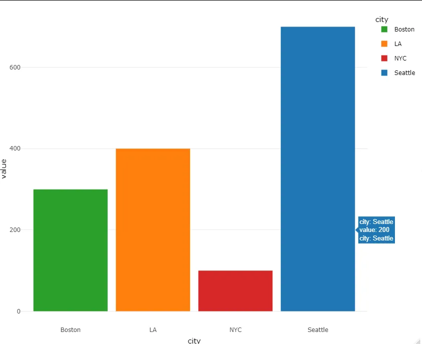
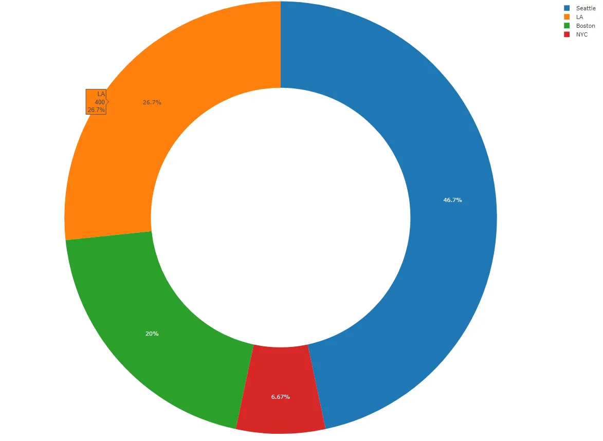
我正在使用R中的plotly。我试图绘制具有相同颜色的图表。下面您可以看到数据和图表。
library(plotly)
library(reshape2)
library(dplyr)

df<-data.frame(city=c("NYC","Seattle","Boston","LA","Seattle"),
               value=c(100,200,300,400,500))
df <-melt(df)
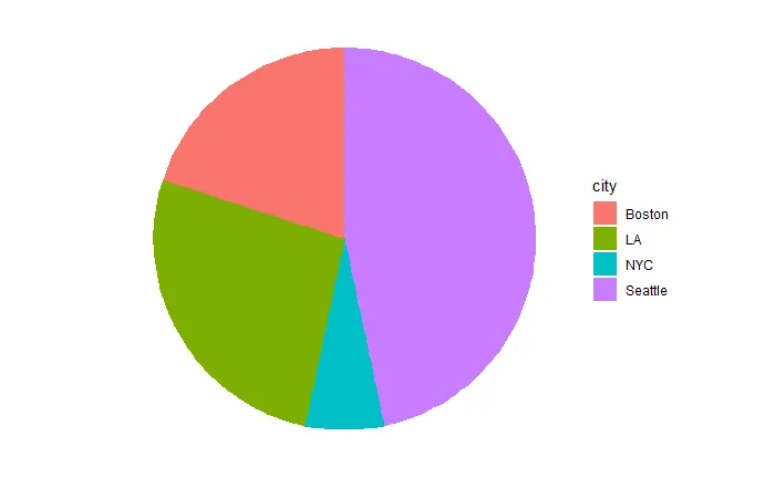
现在我正在绘制饼图,颜色如下所示:
fig<-df %>%
  plot_ly(labels = ~city, values = ~value)
fig <- fig %>% add_pie(hole = 0.6)
fig
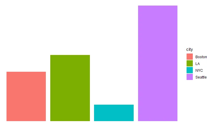
df <-melt(df)
fig <- plot_ly(df, x = ~city, y = ~value, type = 'bar')
fig
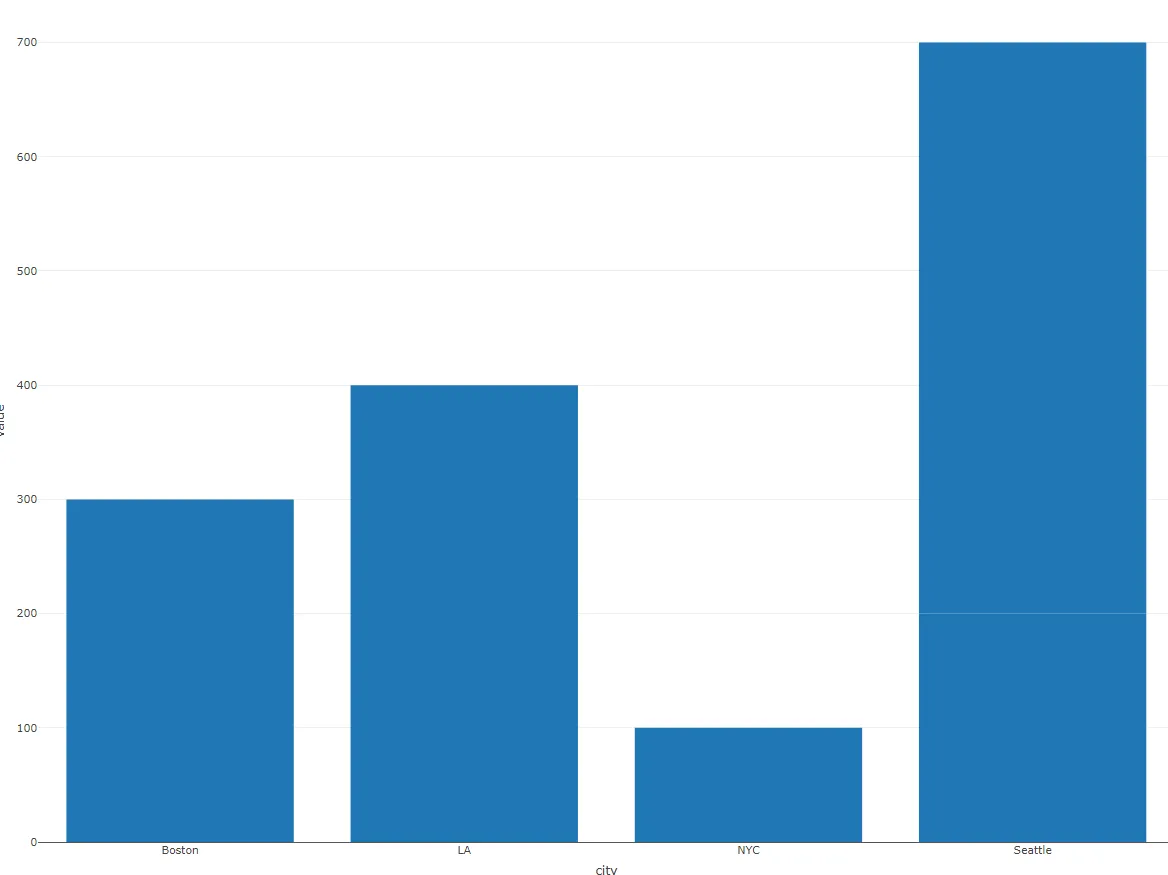
有人能帮我解决如何用与饼图相同的颜色绘制条形图吗?