我有一个数据框,想要在X轴上绘制年份和月份,在Y轴上绘制计数。
df1<-data.frame(
  Year=sample(2016:2018,100,replace = T),
  Month=sample(month.abb,100,replace = T),
  category1=sample(letters[1:6],100,replace = T),
  catergory2=sample(LETTERS[8:16],100,replace = T),
  lic=sample(c("P","F","T"),100,replace = T),
  count=sample(1:1000,100,replace = T)
)
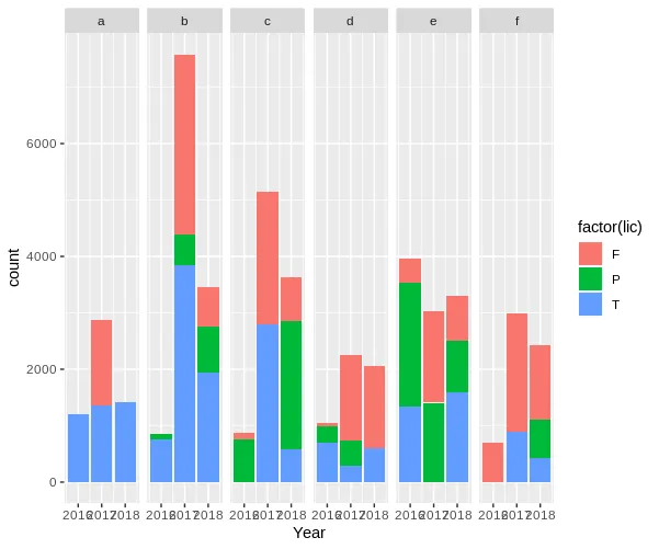
情节:
ggplot(df1,aes(Year,count,fill=factor(lic)))+geom_bar(stat = "identity",position = "stack")+facet_grid(~category1)
输出:
但是我需要按照年份和月份的顺序在单个图表中呈现。
face_grid、facet_wrap获得了解决方案。 - sai saran