我有一个数据框 df,它看起来像这样
    > dput(head(df))
    structure(list(Percent = c(1, 2, 3, 4, 5), Test = c(4, 2, 3,
    5, 2), Train = c(10, 12, 10, 13, 15)), .Names = c("Percent",
    "Test", "Train"), row.names = c(NA, 5L), class = "data.frame")
看起来是这样的
Percent    Test    Train
1          4       10
2          2       12
3          3       10
4          5       13
5          2       15
我该如何使用 ggplot 将 Test 和 Train 绘制成两条线?
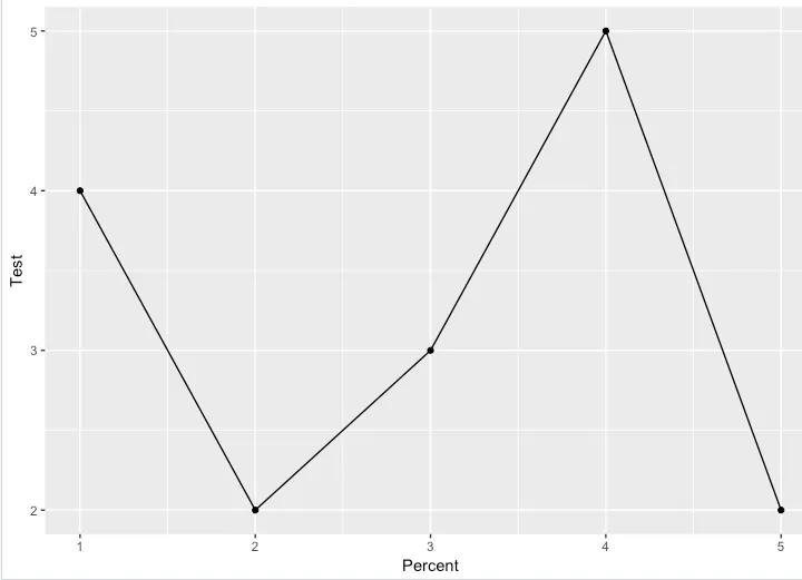
目前我的绘图结果如下:
ggplot(dfk, aes(x = Percent, y = Test)) + geom_point() +
  geom_line()
我还想在图表上添加
Train点和连接线,并以不同的颜色和标签显示在图例中。我不确定如何做到这一点。