如何在折线图中放置内联标签

146
在Matplotlib中,制作图例并不太困难(如下所示:example_legend()),但我认为将标签直接放在绘制的曲线上更符合良好的风格(如下所示:example_inline())。这可能非常繁琐,因为我必须手动指定坐标,并且如果重新格式化图表,则可能需要重新调整标签的位置。在Matplotlib中是否有一种自动生成曲线标签的方法?如果能根据曲线的角度自动调整文本的角度,那就更好了。
import numpy as np
import matplotlib.pyplot as plt

def example_legend():
    plt.clf()
    x = np.linspace(0, 1, 101)
    y1 = np.sin(x * np.pi / 2)
    y2 = np.cos(x * np.pi / 2)
    plt.plot(x, y1, label='sin')
    plt.plot(x, y2, label='cos')
    plt.legend()

Figure with legend

def example_inline():
    plt.clf()
    x = np.linspace(0, 1, 101)
    y1 = np.sin(x * np.pi / 2)
    y2 = np.cos(x * np.pi / 2)
    plt.plot(x, y1, label='sin')
    plt.plot(x, y2, label='cos')
    plt.text(0.08, 0.2, 'sin')
    plt.text(0.9, 0.2, 'cos')

Figure with inline labels

6个回答

128

更新: 用户cphyc友情提供了此答案中代码的Github仓库(请查看这里),并将代码捆绑成一个包,可以使用pip install matplotlib-label-lines进行安装。
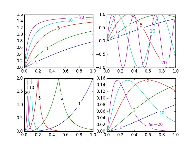

漂亮图片:

semi-automatic plot-labeling

matplotlib中,轮廓图标签(可以自动或手动通过鼠标单击放置标签)非常容易。但是,似乎还没有类似的功能来以这种方式标记数据系列!我可能错过了某些语义上不包括此功能的原因。
无论如何,我编写了以下模块,允许半自动绘图标注。它只需要numpy和标准math库中的一些函数。

描述

labelLines函数的默认行为是沿着x轴均匀分布标签(当然自动放置在正确的y值)。如果您想要,您只需传递每个标签的x坐标数组即可。如果您喜欢,您甚至可以调整一个标签的位置(如右下角的图所示),并将其余标签均匀分布。
此外,label_lines函数没有考虑在plot命令中未分配标签的行(或更准确地说,如果标签包含'_line')。
传递给labelLineslabelLine的关键字参数会传递到text函数调用中(如果调用代码选择不指定,则会设置某些关键字参数)。
问题
  • 注释边界框有时会与其他曲线产生不希望的干扰。 如左上图中的110注释所示。我甚至不确定这能否避免。
  • 有时候指定y位置会很好。
  • 将注释放置在正确位置仍然是一个迭代的过程
  • 只有当x轴值为float时才有效
陷阱
默认情况下,labelLines函数假定所有数据系列跨越轴限定的范围。请看漂亮图片左上角的蓝色曲线。如果只有x范围为0.5-1的数据可用,那么我们不可能在所需位置放置标签(这个位置略小于0.2)。参见this question,了解一个特别恶劣的例子。目前,代码无法智能识别此场景并重新排列标签,但是有一个合理的解决方法。labelLines函数接受xvals参数;用户指定的x值列表,而不是默认的宽度上的线性分布。因此,用户可以决定使用哪些x值来放置每个数据系列的标签。
此外,我相信这是第一个完成将标签与其所在曲线对齐的奖励目标的答案。 :)

label_lines.py:

from math import atan2,degrees
import numpy as np

#Label line with line2D label data
def labelLine(line,x,label=None,align=True,**kwargs):

    ax = line.axes
    xdata = line.get_xdata()
    ydata = line.get_ydata()

    if (x < xdata[0]) or (x > xdata[-1]):
        print('x label location is outside data range!')
        return

    #Find corresponding y co-ordinate and angle of the line
    ip = 1
    for i in range(len(xdata)):
        if x < xdata[i]:
            ip = i
            break

    y = ydata[ip-1] + (ydata[ip]-ydata[ip-1])*(x-xdata[ip-1])/(xdata[ip]-xdata[ip-1])

    if not label:
        label = line.get_label()

    if align:
        #Compute the slope
        dx = xdata[ip] - xdata[ip-1]
        dy = ydata[ip] - ydata[ip-1]
        ang = degrees(atan2(dy,dx))

        #Transform to screen co-ordinates
        pt = np.array([x,y]).reshape((1,2))
        trans_angle = ax.transData.transform_angles(np.array((ang,)),pt)[0]

    else:
        trans_angle = 0

    #Set a bunch of keyword arguments
    if 'color' not in kwargs:
        kwargs['color'] = line.get_color()

    if ('horizontalalignment' not in kwargs) and ('ha' not in kwargs):
        kwargs['ha'] = 'center'

    if ('verticalalignment' not in kwargs) and ('va' not in kwargs):
        kwargs['va'] = 'center'

    if 'backgroundcolor' not in kwargs:
        kwargs['backgroundcolor'] = ax.get_facecolor()

    if 'clip_on' not in kwargs:
        kwargs['clip_on'] = True

    if 'zorder' not in kwargs:
        kwargs['zorder'] = 2.5

    ax.text(x,y,label,rotation=trans_angle,**kwargs)

def labelLines(lines,align=True,xvals=None,**kwargs):

    ax = lines[0].axes
    labLines = []
    labels = []

    #Take only the lines which have labels other than the default ones
    for line in lines:
        label = line.get_label()
        if "_line" not in label:
            labLines.append(line)
            labels.append(label)

    if xvals is None:
        xmin,xmax = ax.get_xlim()
        xvals = np.linspace(xmin,xmax,len(labLines)+2)[1:-1]

    for line,x,label in zip(labLines,xvals,labels):
        labelLine(line,x,label,align,**kwargs)

生成上面漂亮图片的测试代码:

from matplotlib import pyplot as plt
from scipy.stats import loglaplace,chi2

from labellines import *

X = np.linspace(0,1,500)
A = [1,2,5,10,20]
funcs = [np.arctan,np.sin,loglaplace(4).pdf,chi2(5).pdf]

plt.subplot(221)
for a in A:
    plt.plot(X,np.arctan(a*X),label=str(a))

labelLines(plt.gca().get_lines(),zorder=2.5)

plt.subplot(222)
for a in A:
    plt.plot(X,np.sin(a*X),label=str(a))

labelLines(plt.gca().get_lines(),align=False,fontsize=14)

plt.subplot(223)
for a in A:
    plt.plot(X,loglaplace(4).pdf(a*X),label=str(a))

xvals = [0.8,0.55,0.22,0.104,0.045]
labelLines(plt.gca().get_lines(),align=False,xvals=xvals,color='k')

plt.subplot(224)
for a in A:
    plt.plot(X,chi2(5).pdf(a*X),label=str(a))

lines = plt.gca().get_lines()
l1=lines[-1]
labelLine(l1,0.6,label=r'$Re=${}'.format(l1.get_label()),ha='left',va='bottom',align = False)
labelLines(lines[:-1],align=False)

plt.show()

1
@blujay,我很高兴你能够适应它以满足你的需求。我会将该约束添加为一个问题。 - NauticalMile
1
@Liza, 请阅读我新增的提示(Gotcha),它能为你解决这个问题。对于你的情况(我假设你和 这个问题 中的提问者一样),除非你想手动创建一个 xvals 的列表,否则你可能需要稍微修改一下 labelLines 代码:在 if xvals is None: 范围内的代码中根据其他条件来创建一个列表。你可以从 xvals = [(np.min(l.get_xdata())+np.max(l.get_xdata()))/2 for l in lines] 开始。 - NauticalMile
1
@Liza 你的图表很有趣。问题在于你的数据在图中分布不均,并且有很多曲线几乎重叠在一起。使用我的解决方案,在许多情况下很难区分标签。我认为最好的解决方案是在图表的不同空白部分有堆叠标签的块。参见这个图表,其中有两个堆叠标签的块(一个块有1个标签,另一个块有4个标签)。实现这个需要相当大的工作量,我可能会在未来某个时候完成它。 - NauticalMile
1
注意:自Matplotlib 2.0以来,.get_axes().get_axis_bgcolor()已被弃用。请分别替换为.axes.get_facecolor() - Jiageng
1
“labellines” 的另一个很棒的特点是,与 “plt.text” 或 “ax.text” 相关的属性也适用于它。这意味着您可以在 “labelLines()” 函数中设置 “fontsize” 和 “bbox” 参数。 - tionichm
显示剩余7条评论

75

@Jan Kuiken的回答肯定经过深思熟虑和全面考虑,但是有一些注意事项:

  • 它并不适用于所有情况
  • 它需要相当数量的额外代码
  • 它可能因图形而异

一个更简单的方法是注释每个图的最后一个点。该点也可以用圆圈强调。这可以通过添加一行额外的代码来实现:

import matplotlib.pyplot as plt

for i, (x, y) in enumerate(samples):
    plt.plot(x, y)
    plt.text(x[-1], y[-1], f'sample {i}')

另一种选择是使用方法matplotlib.axes.Axes.annotate


3
+1!这看起来是一个不错且简单的解决方案。抱歉我有些懒,但这会是什么样子呢?文本会在图形内部还是在右侧y轴上方呢? - rocarvaj
1
@rocarvaj 这取决于其他设置。标签可能会突出到绘图框之外。避免这种行为的两种方法是:1)使用与“-1”不同的索引,2)设置适当的轴限制以允许标签的空间。 - 0 _
2
如果图表集中在某个y值上,情况也会变得混乱 - 端点太靠近,文本看起来不美观。 - LazyCat
@LazyCat:没错。为了解决这个问题,可以将注释设为可拖动的。我想这可能有点麻烦,但这样做应该能解决问题。 - PlacidLush
1
给这个人一枚奖章。 - Philippe Remy

36

不错的问题,我之前尝试过一些实验,但由于它仍然没有很好的解决方案,所以并没有经常使用。我将绘图区域分成一个32x32 的网格,并为每条线计算了一个“潜力场”,以确定标签的最佳位置,遵循以下规则:

  • 空白处是标签的好位置
  • 标签应该靠近相应的线
  • 标签应远离其他线

代码大致如下:

import matplotlib.pyplot as plt
import numpy as np
from scipy import ndimage


def my_legend(axis = None):

    if axis == None:
        axis = plt.gca()

    N = 32
    Nlines = len(axis.lines)
    print Nlines

    xmin, xmax = axis.get_xlim()
    ymin, ymax = axis.get_ylim()

    # the 'point of presence' matrix
    pop = np.zeros((Nlines, N, N), dtype=np.float)    

    for l in range(Nlines):
        # get xy data and scale it to the NxN squares
        xy = axis.lines[l].get_xydata()
        xy = (xy - [xmin,ymin]) / ([xmax-xmin, ymax-ymin]) * N
        xy = xy.astype(np.int32)
        # mask stuff outside plot        
        mask = (xy[:,0] >= 0) & (xy[:,0] < N) & (xy[:,1] >= 0) & (xy[:,1] < N)
        xy = xy[mask]
        # add to pop
        for p in xy:
            pop[l][tuple(p)] = 1.0

    # find whitespace, nice place for labels
    ws = 1.0 - (np.sum(pop, axis=0) > 0) * 1.0 
    # don't use the borders
    ws[:,0]   = 0
    ws[:,N-1] = 0
    ws[0,:]   = 0  
    ws[N-1,:] = 0  

    # blur the pop's
    for l in range(Nlines):
        pop[l] = ndimage.gaussian_filter(pop[l], sigma=N/5)

    for l in range(Nlines):
        # positive weights for current line, negative weight for others....
        w = -0.3 * np.ones(Nlines, dtype=np.float)
        w[l] = 0.5

        # calculate a field         
        p = ws + np.sum(w[:, np.newaxis, np.newaxis] * pop, axis=0)
        plt.figure()
        plt.imshow(p, interpolation='nearest')
        plt.title(axis.lines[l].get_label())

        pos = np.argmax(p)  # note, argmax flattens the array first 
        best_x, best_y =  (pos / N, pos % N) 
        x = xmin + (xmax-xmin) * best_x / N       
        y = ymin + (ymax-ymin) * best_y / N       


        axis.text(x, y, axis.lines[l].get_label(), 
                  horizontalalignment='center',
                  verticalalignment='center')


plt.close('all')

x = np.linspace(0, 1, 101)
y1 = np.sin(x * np.pi / 2)
y2 = np.cos(x * np.pi / 2)
y3 = x * x
plt.plot(x, y1, 'b', label='blue')
plt.plot(x, y2, 'r', label='red')
plt.plot(x, y3, 'g', label='green')
my_legend()
plt.show()

以下是翻译的结果:

最终的图形如下: enter image description here


非常好。然而,我有一个例子并不完全有效:plt.plot(x2, 3*x2**2, label="3x*x"); plt.plot(x2, 2*x2**2, label="2x*x"); plt.plot(x2, 0.5*x2**2, label="0.5x*x"); plt.plot(x2, -1*x2**2, label="-x*x"); plt.plot(x2, -2.5*x2**2, label="-2.5*x*x"); my_legend();这会将其中一个标签放在左上角。有什么解决方法吗?似乎问题可能是线条太靠近了。 - egpbos
抱歉,忘记了 x2 = np.linspace(0,0.5,100) - egpbos
有没有不用scipy的方法?在我的当前系统上安装很麻烦。 - AnnanFay
1
这在我的Python 3.6.4、Matplotlib 2.1.2和Scipy 1.0.0下无法工作。更新了print命令后,它可以运行并创建4个图形,其中3个似乎是像素化的无意义图形(可能与32x32有关),第四个标签位置奇怪。 - Y Davis

15

matplotx (我编写的) 有line_labels()函数,可以将标签绘制在线条右侧。当许多线条聚集在一处时,该函数智能地避免重叠。(请参见stargraph的示例.) 它通过解决关于标签目标位置的一个特定非负最小二乘问题来实现。总之,在许多没有重叠的情况下,例如下面的示例,这甚至是不必要的。

import matplotlib.pyplot as plt
import matplotx
import numpy as np

# create data
rng = np.random.default_rng(0)
offsets = [1.0, 1.50, 1.60]
labels = ["no balancing", "CRV-27", "CRV-27*"]
x0 = np.linspace(0.0, 3.0, 100)
y = [offset * x0 / (x0 + 1) + 0.1 * rng.random(len(x0)) for offset in offsets]

# plot
with plt.style.context(matplotx.styles.dufte):
    for yy, label in zip(y, labels):
        plt.plot(x0, yy, label=label)
    plt.xlabel("distance [m]")
    matplotx.ylabel_top("voltage [V]")  # move ylabel to the top, rotate
    matplotx.line_labels()  # line labels to the right
    plt.show()
    # plt.savefig("out.png", bbox_inches="tight")

输入图片说明


2
我采用了@NauticalMile的另一种方法,由@cphyc打包,并使用Shapely进行自动标签定位以避免重叠。如果你有很多图表和很多线条,这将非常有帮助,因为它避免了手动标签定位。
使用原始示例,它会给出: Examples 你可以尝试使用pip install matplotlib-inline-labels进行安装。请参阅repo

1

像 Ioannis Filippidis 所做的那样,采用更简单的方法:

import matplotlib.pyplot as plt
import numpy as np

# evenly sampled time at 200ms intervals
tMin=-1 ;tMax=10
t = np.arange(tMin, tMax, 0.1)

# red dashes, blue points default
plt.plot(t, 22*t, 'r--', t, t**2, 'b')

factor=3/4 ;offset=20  # text position in view  
textPosition=[(tMax+tMin)*factor,22*(tMax+tMin)*factor]
plt.text(textPosition[0],textPosition[1]+offset,'22  t',color='red',fontsize=20)
textPosition=[(tMax+tMin)*factor,((tMax+tMin)*factor)**2+20]
plt.text(textPosition[0],textPosition[1]+offset, 't^2', bbox=dict(facecolor='blue', alpha=0.5),fontsize=20)
plt.show()

在sageCell上编写Python 3代码


网页内容由stack overflow 提供, 点击上面的
可以查看英文原文,
原文链接