答案:
如果不更改数据源,则需要完全替换legend,legendgroup和hovertemplate中的名称,具体操作如下:
newnames = {'col1':'hello', 'col2': 'hi'}
fig.for_each_trace(lambda t: t.update(name = newnames[t.name],
                                      legendgroup = newnames[t.name],
                                      hovertemplate = t.hovertemplate.replace(t.name, newnames[t.name])
                                     )
                  )
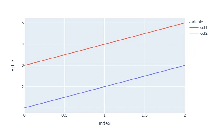
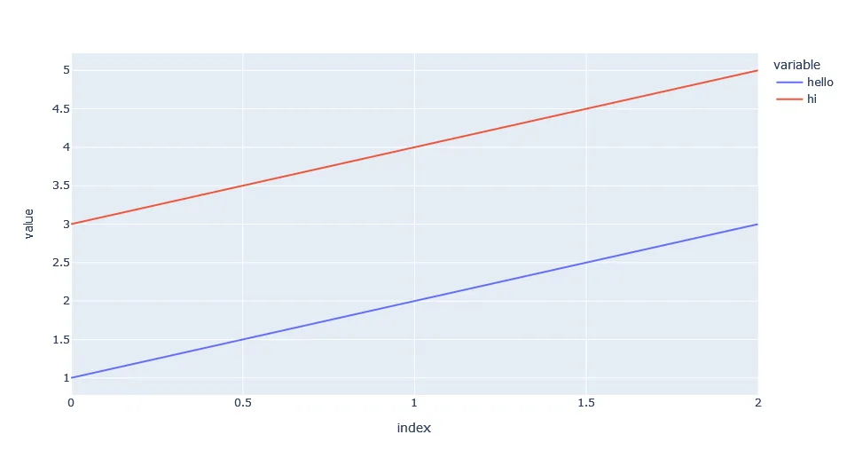
情节:
详细信息:
使用
fig.for_each_trace(lambda t: t.update(name = newnames[t.name]))
使用字典可以在不更改源代码的情况下更改图例中的名称。
newnames = {'col1':'hello', 'col2': 'hi'}
在以下图表结构的部分(对于您的第一个跟踪,col1),将新名称映射到现有的col1和col2:
{'hovertemplate': 'variable=col1<br>index=%{x}<br>value=%{y}<extra></extra>',
'legendgroup': 'col1',
'line': {'color': '#636efa', 'dash': 'solid'},
'mode': 'lines',
'name': 'hello',
'orientation': 'v',
'showlegend': True,
'type': 'scatter',
'x': array([0, 1, 2], dtype=int64),
'xaxis': 'x',
'y': array([1, 2, 3], dtype=int64),
'yaxis': 'y'},
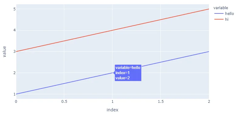
但是,正如您所见,这与'legendgroup': 'col1'以及'hovertemplate': 'variable=col1<br>index=%{x}<br>value=%{y}<extra></extra>'无关。根据您的图形复杂程度,这可能会带来问题。因此,我建议将 legendgroup = newnames[t.name]和hovertemplate = t.hovertemplate.replace(t.name, newnames[t.name])添加到代码中。
完整代码:
import pandas as pd
import plotly.express as px
from itertools import cycle

d = {'col1': [1, 2, 3], 'col2': [3, 4, 5]}
df = pd.DataFrame(data=d)
fig = px.line(df, x=df.index, y=['col1', 'col2'])

newnames = {'col1':'hello', 'col2': 'hi'}
fig.for_each_trace(lambda t: t.update(name = newnames[t.name],
                                      legendgroup = newnames[t.name],
                                      hovertemplate = t.hovertemplate.replace(t.name, newnames[t.name])
                                     )
                  )