我希望能够自定义在 plotly 上悬停在柱状图上时所看到的内容。
请查看本帖子末尾的 reprex。 我查看了 如何设置不同的文本和 hoverinfo 文本。
请查看本帖子末尾的 reprex。 我查看了 如何设置不同的文本和 hoverinfo 文本。
https://community.rstudio.com/t/changing-hovertext-in-plotly/71736
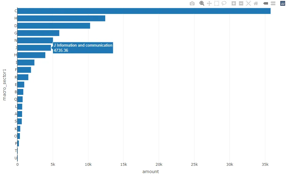
但我一定犯了一些错误。当我悬停在一个条形图上时,我想只看到变量“macro_sector”和“amount”,而不是在条形图上看到任何静态文本。我该怎么做?非常感谢。library(dplyr)
#>
#> Attaching package: 'dplyr'
#> The following objects are masked from 'package:stats':
#>
#> filter, lag
#> The following objects are masked from 'package:base':
#>
#> intersect, setdiff, setequal, union
library(plotly)
#> Loading required package: ggplot2
#>
#> Attaching package: 'plotly'
#> The following object is masked from 'package:ggplot2':
#>
#> last_plot
#> The following object is masked from 'package:stats':
#>
#> filter
#> The following object is masked from 'package:graphics':
#>
#> layout
df <- structure(list(macro_sector = c("U Activities of extraterritorial organisations and bodies",
"T Activities of households as employers; u0ndifferentiated goods- and services-producing activities of households for own use",
"P Education", "O Public administration and defence; compulsory social security",
"K Financial and insurance activities", "S Other service activities",
"A Agriculture, forestry and fishing", "L Real estate activities",
"Q Human health and social work activities", "B Mining and quarrying ",
"E Water supply; sewerage, waste management and remediation activities",
"R Arts, entertainment and recreation", "F Construction", "I Accommodation and food service activities",
"M Professional, scientific and technical activities", "J Information and communication",
"N Administrative and support service activities", "G Wholesale and retail trade; repair of motor vehicles and motorcycles",
"D Electricity, gas, steam and air conditioning supply", "H Transportation and storage",
"C Manufacturing"), amount = c(2.2935, 17.6690005, 204.47243683,
347.24800021, 400.12333973, 613.6673475, 657.3337123, 672.74723757,
736.05549391, 828.06106689, 961.82905534, 1538.40117934, 1918.77325865,
2397.02875187, 3941.39973575, 4735.36088945, 5025.39834121, 5913.94010435,
10267.76691901, 12407.11032805, 35782.07991161), macro_sector1 = structure(1:21, .Label = c("U",
"T", "P", "O", "K", "S", "A", "L", "Q", "B", "E", "R", "F", "I",
"M", "J", "N", "G", "D", "H", "C"), class = "factor")), class = c("tbl_df",
"tbl", "data.frame"), row.names = c(NA, -21L)) %>%
mutate(amount=round(amount, 2))
fig <- plot_ly(df,
x = ~amount, y = ~macro_sector1,
type = 'bar' ,
text= ~paste0(macro_sector, "<br>", amount),
hoverinfo= text ## ,
## hovertext = text
)
2022年2月8日由 reprex package (v2.0.1)创建