ggplot使图例符号变细

6

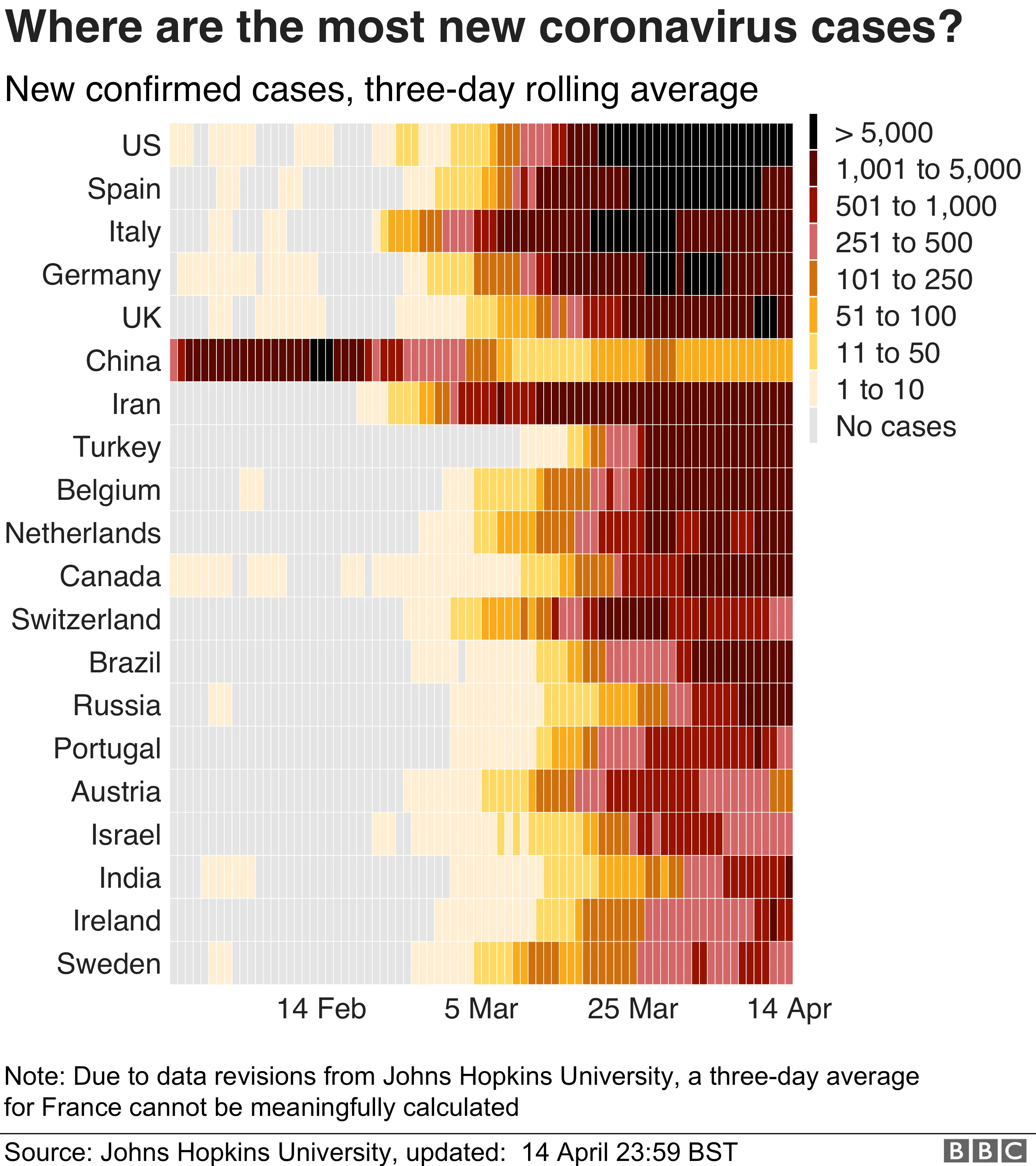
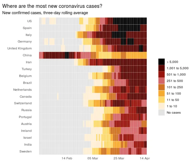
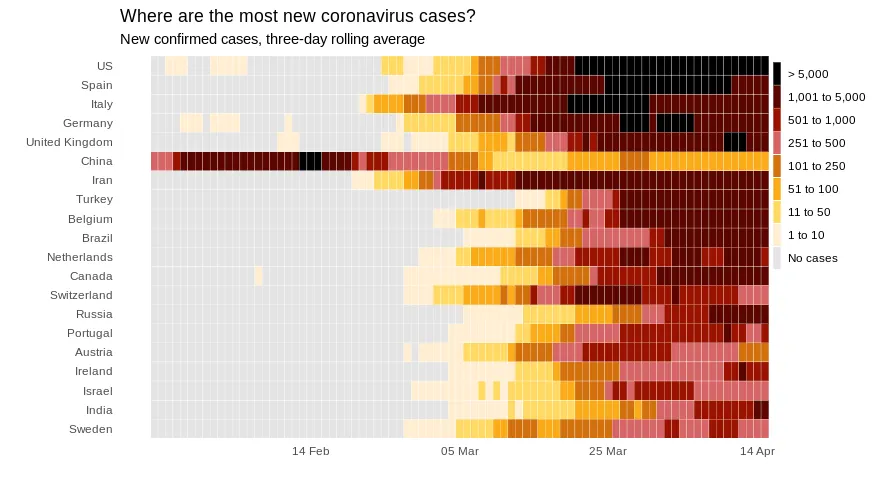
我试图复制BBC的这个图表。我已经接近成功,但是我无法使图例中的符号变细。这可能吗?

enter image description here

library(tidyverse)
library("rio")
url <- "https://gist.githubusercontent.com/ericpgreen/a728be304b811fe7708699682eb4ba42/raw/fd924596e30c131dbaf97c00c9d9863bb40abb9a/bbcCovid.R"
df_plot <- rio::import(url)

ggplot(df_plot, aes(x=date, 
                    y=reorder(Country.Region, 
                              total, 
                              order=TRUE))) +
  geom_tile(aes(fill=casesRollf), 
            color="white", 
            na.rm = TRUE
            #, key_glyph = draw_key_timeseries
  ) +
  theme_bw() + theme_minimal() +
  theme(panel.grid.major = element_blank(), 
        panel.grid.minor = element_blank(),
        legend.title = element_blank(),
        plot.title.position = "plot") +
  scale_x_date(breaks = as.Date(c("2020-02-14",
                                  "2020-03-05",
                                  "2020-03-25",
                                  "2020-04-14")),
               date_labels = "%d %b") +
  scale_fill_manual(values=
                      c("#e4e4e4", "#ffeed2", 
                        "#ffda64", "#faab19", 
                        "#d2700d",  
                        "#d56666", "#9a1200", 
                        "#5b0600", "#000000"),
                    guide = guide_legend(reverse = TRUE),
                    labels=c("No cases", "1 to 10",
                             "11 to 50", "51 to 100",
                             "101 to 250", "251 to 500",
                             "501 to 1,000", "1,001 to 5,000",
                             "> 5,000")) +
  labs(title = "Where are the most new coronavirus cases?",
       subtitle = "New confirmed cases, three-day rolling average",
       x="",
       y="")

enter image description here


1
为了更好的可读性,可以考虑像“离散颜色条”一样的图例 https://dev59.com/qVUL5IYBdhLWcg3wUmtR - tjebo
3
我建议在theme中也添加选项legend.justification = "top" - Marco Sandri
我本来想建议BBC做同样的事情。那个图表上弹出的传说让我感到很烦! - Andy Baxter
1个回答

7

您可以在theme中使用legend.key.width。为了更接近原始图表,您可以使用legend.positionplot.margin,例如:

ggplot(df_plot, aes(x=date, 
                    y=reorder(Country.Region, 
                              total, 
                              order=TRUE))) +
  geom_tile(aes(fill=casesRollf), 
            color="white", 
            na.rm = TRUE
            #, key_glyph = draw_key_timeseries
  ) +
  theme_bw() + theme_minimal() +
  theme(panel.grid.major = element_blank(), 
        panel.grid.minor = element_blank(),
        legend.title = element_blank()) +
  scale_x_date(breaks = as.Date(c("2020-02-14",
                                  "2020-03-05",
                                  "2020-03-25",
                                  "2020-04-14")),
               date_labels = "%d %b") +
  scale_fill_manual(values=
                      c("#e4e4e4", "#ffeed2", 
                        "#ffda64", "#faab19", 
                        "#d2700d",  
                        "#d56666", "#9a1200", 
                        "#5b0600", "#000000"),
                    guide = guide_legend(reverse = TRUE),
                    labels=c("No cases", "1 to 10",
                             "11 to 50", "51 to 100",
                             "101 to 250", "251 to 500",
                             "501 to 1,000", "1,001 to 5,000",
                             "> 5,000")) +
  labs(title = "Where are the most new coronavirus cases?",
       subtitle = "New confirmed cases, three-day rolling average",
       x="",
       y="")+
  theme(plot.margin=unit(c(0.25,2,0.25,0.25),"cm"),
        legend.position=c(1.03,0.72),
        legend.key.width = unit(0.4,"line"))

这里输入图片描述

顺便说一句:做得很好;)


谢谢!还有感谢您的提示!我找了很久。 - Eric Green
1
如果你想更接近原始图形,可以在 plot.marginlegend.position 中添加一些值。 - dc37

网页内容由stack overflow 提供, 点击上面的
可以查看英文原文,
原文链接