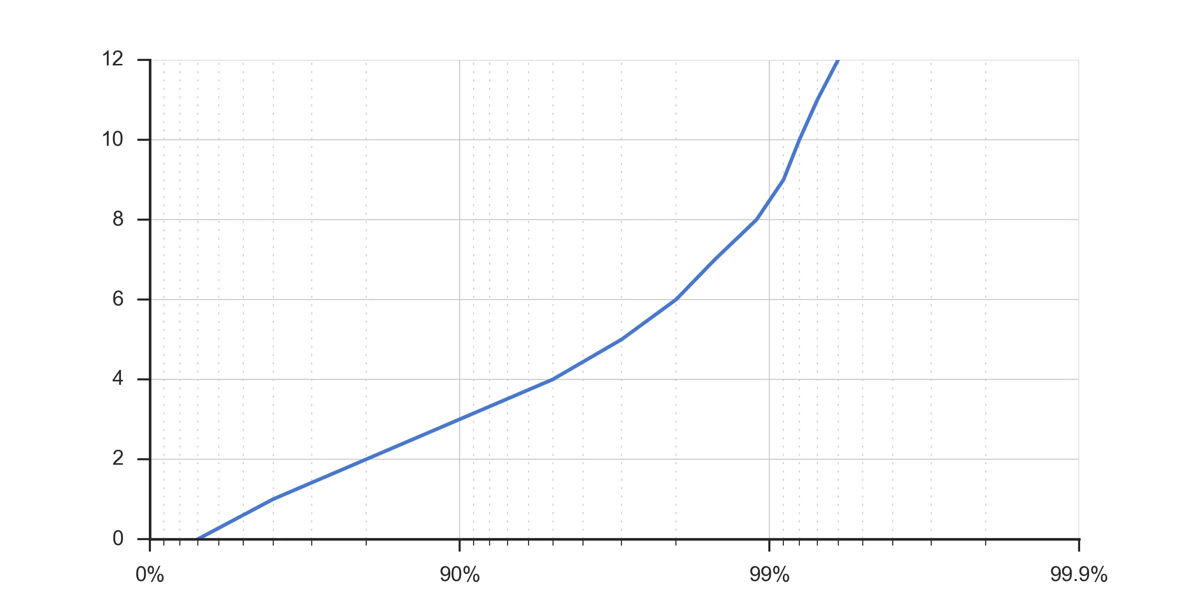
有没有人知道如何更改X轴刻度和标尺以显示像下面这个图中的百分位分布呢?此图来自MATLAB,但我想使用Python(通过Matplotlib或Seaborn)生成。
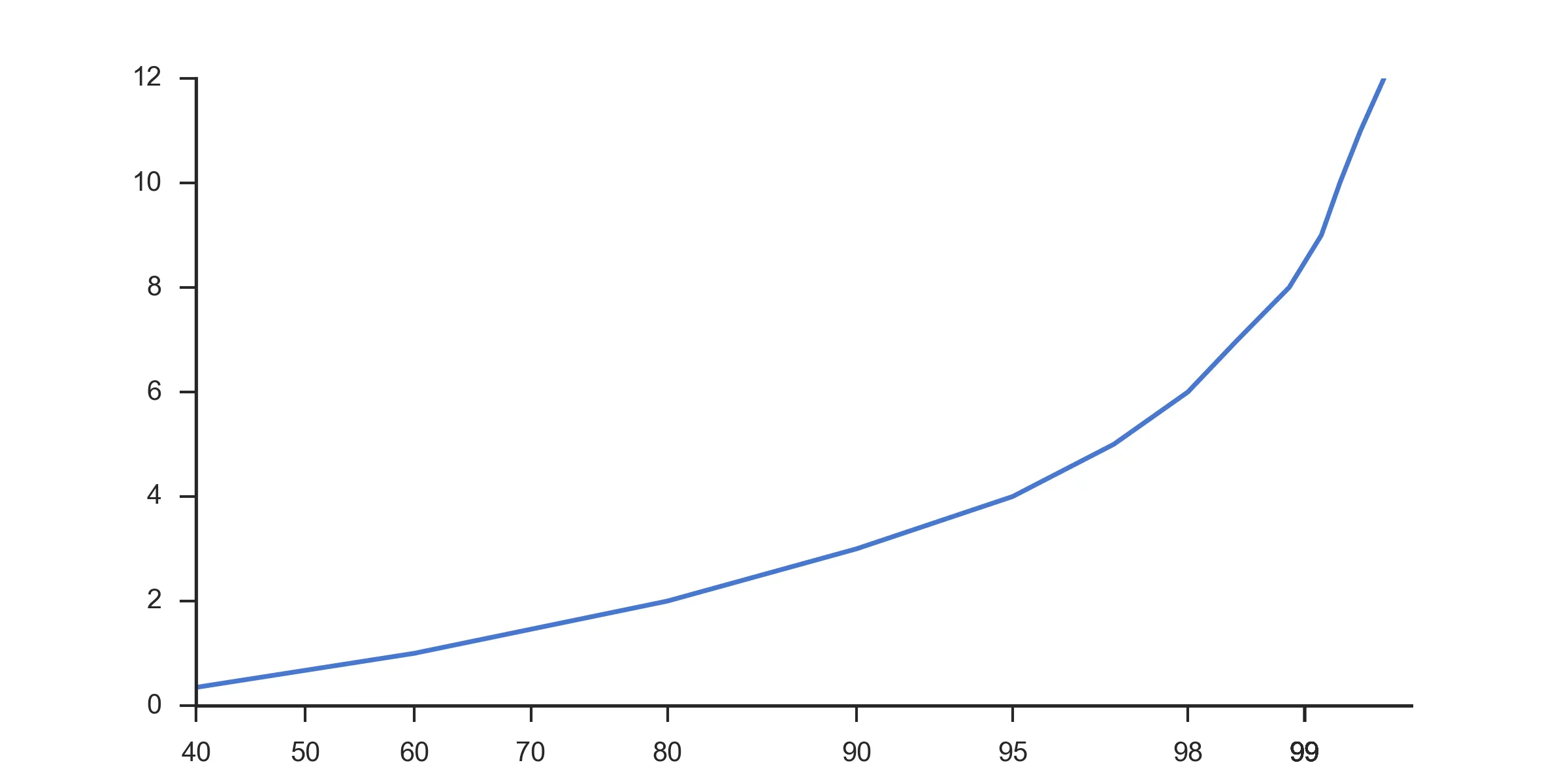
根据@paulh的指针,现在我离成功更近了。这段代码:
import matplotlib
matplotlib.use('Agg')

import numpy as np
import matplotlib.pyplot as plt
import probscale
import seaborn as sns

clear_bkgd = {'axes.facecolor':'none', 'figure.facecolor':'none'}
sns.set(style='ticks', context='notebook', palette="muted", rc=clear_bkgd)

fig, ax = plt.subplots(figsize=(8, 4))

x = [30, 60, 80, 90, 95, 97, 98, 98.5, 98.9, 99.1, 99.2, 99.3, 99.4]
y = np.arange(0, 12.1, 1)

ax.set_xlim(40, 99.5)
ax.set_xscale('prob')

ax.plot(x, y)
sns.despine(fig=fig)
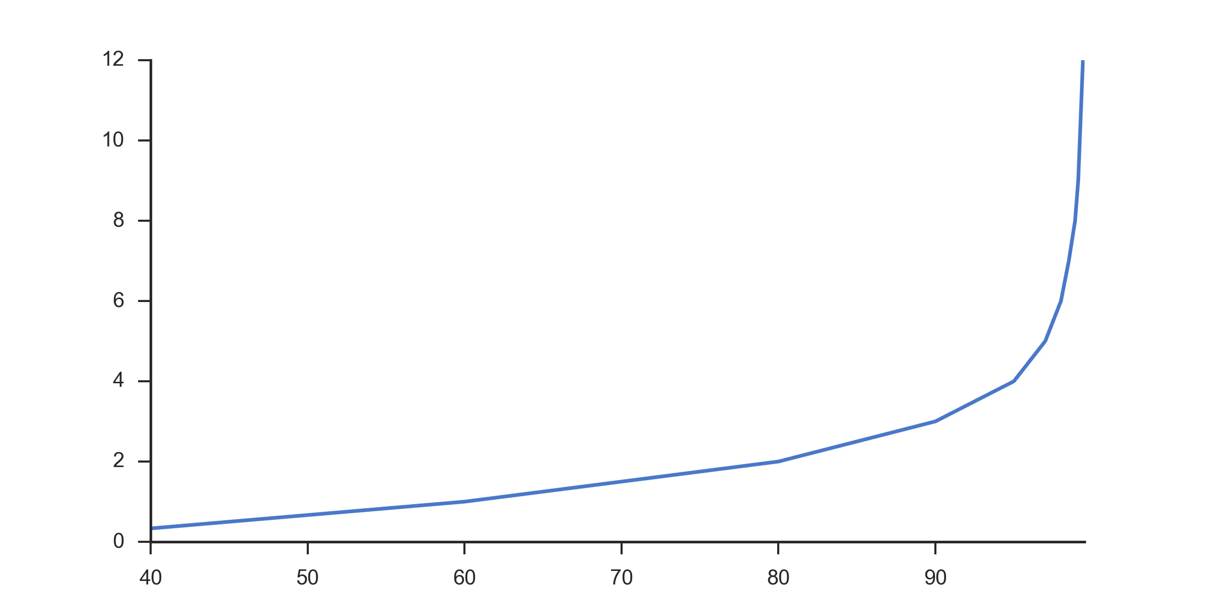
生成以下图表(注意重新分配的X轴):
import matplotlib
matplotlib.use('Agg')

import numpy as np
import matplotlib.pyplot as plt
import seaborn as sns

clear_bkgd = {'axes.facecolor':'none', 'figure.facecolor':'none'}
sns.set(style='ticks', context='notebook', palette="muted", rc=clear_bkgd)

x = [30, 60, 80, 90, 95, 97, 98, 98.5, 98.9, 99.1, 99.2, 99.3, 99.4]
y = np.arange(0, 12.1, 1)

# Number of intervals to display.
# Later calculations add 2 to this number to pad it to align with the reversed axis
num_intervals = 3
x_values = 1.0 - 1.0/10**np.arange(0,num_intervals+2)

# Start with hard-coded lengths for 0,90,99
# Rest of array generated to display correct number of decimal places as precision increases
lengths = [1,2,2] + [int(v)+1 for v in list(np.arange(3,num_intervals+2))]

# Build the label string by trimming on the calculated lengths and appending %
labels = [str(100*v)[0:l] + "%" for v,l in zip(x_values, lengths)]


fig, ax = plt.subplots(figsize=(8, 4))

ax.set_xscale('log')
plt.gca().invert_xaxis()
# Labels have to be reversed because axis is reversed
ax.xaxis.set_ticklabels( labels[::-1] )

ax.plot([100.0 - v for v in x], y)

ax.grid(True, linewidth=0.5, zorder=5)
ax.grid(True, which='minor', linewidth=0.5, linestyle=':')

sns.despine(fig=fig)

plt.savefig("test.png", dpi=300, format='png')
这是生成的图表: