我正在使用Python做一个项目,有两个数据数组。我们称它们为pc和pnc。我需要在同一张图上绘制两者的累积分布。对于pc,它应该是一个小于图,即在(x,y)处,pc中的y点必须小于x的值。对于pnc,它应该是一个大于图,即在(x,y)处,pnc中的y点必须大于x的值。
我尝试使用直方图函数- pyplot.hist。有没有更好、更容易实现我想要的功能的方法呢?另外,它必须以对数刻度在x轴上绘制。
我正在使用Python做一个项目,有两个数据数组。我们称它们为pc和pnc。我需要在同一张图上绘制两者的累积分布。对于pc,它应该是一个小于图,即在(x,y)处,pc中的y点必须小于x的值。对于pnc,它应该是一个大于图,即在(x,y)处,pnc中的y点必须大于x的值。
我尝试使用直方图函数- pyplot.hist。有没有更好、更容易实现我想要的功能的方法呢?另外,它必须以对数刻度在x轴上绘制。
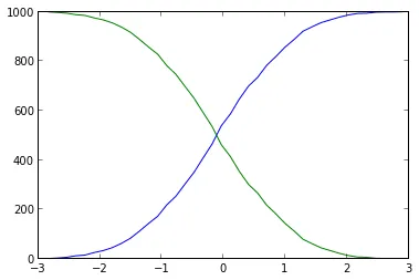
你已经接近了。不应该使用plt.hist作为numpy.histogram,因为它会同时给出值和区间,然后你可以轻松地绘制累积图:
import numpy as np
import matplotlib.pyplot as plt

# some fake data
data = np.random.randn(1000)
# evaluate the histogram
values, base = np.histogram(data, bins=40)
#evaluate the cumulative
cumulative = np.cumsum(values)
# plot the cumulative function
plt.plot(base[:-1], cumulative, c='blue')
#plot the survival function
plt.plot(base[:-1], len(data)-cumulative, c='green')

plt.show()
使用直方图确实不必要且不够精确(分箱使数据模糊):您可以只对所有x值进行排序:每个值的索引是较小值的数量。这种更简短和简单的解决方案如下:
import numpy as np
import matplotlib.pyplot as plt

# Some fake data:
data = np.random.randn(1000)

sorted_data = np.sort(data)  # Or data.sort(), if data can be modified

# Cumulative counts:
plt.step(sorted_data, np.arange(sorted_data.size))  # From 0 to the number of data points-1
plt.step(sorted_data[::-1], np.arange(sorted_data.size))  # From the number of data points-1 to 0

plt.show()
plt.step()而不是plt.plot(),因为数据在离散位置上。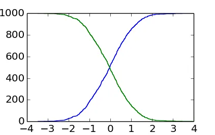
plt.step(np.concatenate([sorted_data, sorted_data[[-1]]]),
         np.arange(sorted_data.size+1))
plt.step(np.concatenate([sorted_data[::-1], sorted_data[[0]]]),
         np.arange(sorted_data.size+1))
在data中有很多点,如果没有缩放效果是看不到的,但当数据只包含少量点时,最后一个点在总数上确实很重要。
plt.step还是这种方法使用了可能是数组的3倍的内存,或者两者都有... - Eric O. Lebigotplt.step(sorted_data, np.arange(1, data.size+1)) 来获取正确的计数吗? - user2489252在与@EOL的充分讨论后,我想发布我的解决方案(左上角)使用随机高斯样本作为摘要:
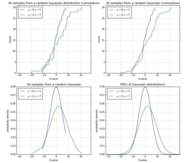
import numpy as np
import matplotlib.pyplot as plt
from math import ceil, floor, sqrt

def pdf(x, mu=0, sigma=1):
    """
    Calculates the normal distribution's probability density
    function (PDF).

    """
    term1 = 1.0 / ( sqrt(2*np.pi) * sigma )
    term2 = np.exp( -0.5 * ( (x-mu)/sigma )**2 )
    return term1 * term2


# Drawing sample date poi
##################################################

# Random Gaussian data (mean=0, stdev=5)
data1 = np.random.normal(loc=0, scale=5.0, size=30)
data2 = np.random.normal(loc=2, scale=7.0, size=30)
data1.sort(), data2.sort()

min_val = floor(min(data1+data2))
max_val = ceil(max(data1+data2))

##################################################


fig = plt.gcf()
fig.set_size_inches(12,11)

# Cumulative distributions, stepwise:
plt.subplot(2,2,1)
plt.step(np.concatenate([data1, data1[[-1]]]), np.arange(data1.size+1), label='$\mu=0, \sigma=5$')
plt.step(np.concatenate([data2, data2[[-1]]]), np.arange(data2.size+1), label='$\mu=2, \sigma=7$')

plt.title('30 samples from a random Gaussian distribution (cumulative)')
plt.ylabel('Count')
plt.xlabel('X-value')
plt.legend(loc='upper left')
plt.xlim([min_val, max_val])
plt.ylim([0, data1.size+1])
plt.grid()

# Cumulative distributions, smooth:
plt.subplot(2,2,2)

plt.plot(np.concatenate([data1, data1[[-1]]]), np.arange(data1.size+1), label='$\mu=0, \sigma=5$')
plt.plot(np.concatenate([data2, data2[[-1]]]), np.arange(data2.size+1), label='$\mu=2, \sigma=7$')

plt.title('30 samples from a random Gaussian (cumulative)')
plt.ylabel('Count')
plt.xlabel('X-value')
plt.legend(loc='upper left')
plt.xlim([min_val, max_val])
plt.ylim([0, data1.size+1])
plt.grid()


# Probability densities of the sample points function
plt.subplot(2,2,3)

pdf1 = pdf(data1, mu=0, sigma=5)
pdf2 = pdf(data2, mu=2, sigma=7)
plt.plot(data1, pdf1, label='$\mu=0, \sigma=5$')
plt.plot(data2, pdf2, label='$\mu=2, \sigma=7$')

plt.title('30 samples from a random Gaussian')
plt.legend(loc='upper left')
plt.xlabel('X-value')
plt.ylabel('probability density')
plt.xlim([min_val, max_val])
plt.grid()


# Probability density function
plt.subplot(2,2,4)

x = np.arange(min_val, max_val, 0.05)

pdf1 = pdf(x, mu=0, sigma=5)
pdf2 = pdf(x, mu=2, sigma=7)
plt.plot(x, pdf1, label='$\mu=0, \sigma=5$')
plt.plot(x, pdf2, label='$\mu=2, \sigma=7$')

plt.title('PDFs of Gaussian distributions')
plt.legend(loc='upper left')
plt.xlabel('X-value')
plt.ylabel('probability density')
plt.xlim([min_val, max_val])
plt.grid()

plt.show()
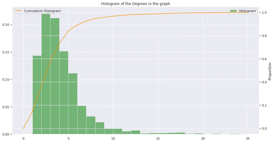
def hist(data, bins, title, labels, range = None):
  fig = plt.figure(figsize=(15, 8))
  ax = plt.axes()
  plt.ylabel("Proportion")
  values, base, _ = plt.hist( data  , bins = bins, normed=True, alpha = 0.5, color = "green", range = range, label = "Histogram")
  ax_bis = ax.twinx()
  values = np.append(values,0)
  ax_bis.plot( base, np.cumsum(values)/ np.cumsum(values)[-1], color='darkorange', marker='o', linestyle='-', markersize = 1, label = "Cumulative Histogram" )
  plt.xlabel(labels)
  plt.ylabel("Proportion")
  plt.title(title)
  ax_bis.legend();
  ax.legend();
  plt.show()
  return
如果有人想知道它是什么样子,请查看(使用seaborn激活):
此外,关于双网格线(白色线条),我过去总是很难得到漂亮的双网格线。以下是一个有趣的方法来解决这个问题:如何将次坐标轴的网格线放在主绘图区域后面?