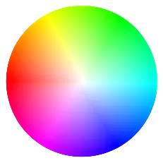
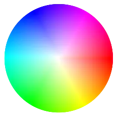
在Python中,使用matplotlib可以绘制HSV颜色轮吗?我想获取一个HSV颜色轮,作为光流的参考图像,就像以下图像一样。在此图像中,每个HSV颜色都可以表示为矢量,其中方向编码为色调,长度编码为饱和度,以便我可以轻松地将其与光流进行比较。我已经在网上搜索了很久,但没有找到满意的解决方案。任何帮助都将不胜感激!
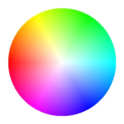
在Python中,使用matplotlib可以绘制HSV颜色轮吗?我想获取一个HSV颜色轮,作为光流的参考图像,就像以下图像一样。在此图像中,每个HSV颜色都可以表示为矢量,其中方向编码为色调,长度编码为饱和度,以便我可以轻松地将其与光流进行比较。我已经在网上搜索了很久,但没有找到满意的解决方案。任何帮助都将不胜感激!
def colour_wheel(samples=1024, clip_circle=True, method='Colour'):
    xx, yy = np.meshgrid(
        np.linspace(-1, 1, samples), np.linspace(-1, 1, samples))

    S = np.sqrt(xx ** 2 + yy ** 2)
    H = (np.arctan2(xx, yy) + np.pi) / (np.pi * 2)

    HSV = colour.utilities.tstack([H, S, np.ones(H.shape)])
    RGB = colour.HSV_to_RGB(HSV)

    if clip_circle == True:
        RGB[S > 1] = 0
        A = np.where(S > 1, 0, 1)
    else:
        A = np.ones(S.shape)

    if method.lower()== 'matplotlib':
        RGB = colour.utilities.orient(RGB, '90 CW')
    elif method.lower()== 'nuke':
        RGB = colour.utilities.orient(RGB, 'Flip')
        RGB = colour.utilities.orient(RGB, '90 CW')

    R, G, B = colour.utilities.tsplit(RGB)

    return colour.utilities.tstack([R, G, B, A])
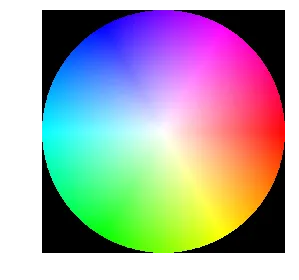
我们在这个交互式的 Jupyter Notebook Matplotlib 小部件中使用它:
该代码库在此处可用:https://github.com/colour-science/gamut-mapping-ramblings
fig = plt.figure()
ax = fig.add_subplot(projection='polar')

rho = np.linspace(0,1,100) # Radius of 1, distance from center to outer edge
phi = np.linspace(0, math.pi*2.,1000 ) # in radians, one full circle

RHO, PHI = np.meshgrid(rho,phi) # get every combination of rho and phi

h = (PHI-PHI.min()) / (PHI.max()-PHI.min()) # use angle to determine hue, normalized from 0-1
h = np.flip(h)
s = RHO               # saturation is set as a function of radias
v = np.ones_like(RHO) # value is constant

# convert the np arrays to lists. This actually speeds up the colorsys call
h,s,v = h.flatten().tolist(), s.flatten().tolist(), v.flatten().tolist()
c = [colorsys.hsv_to_rgb(*x) for x in zip(h,s,v)]
c = np.array(c)

ax.scatter(PHI, RHO, c=c)
_ = ax.axis('off')
phi = np.linspace(math.pi, math.pi*3.,1000 ) # in radians, one full circle