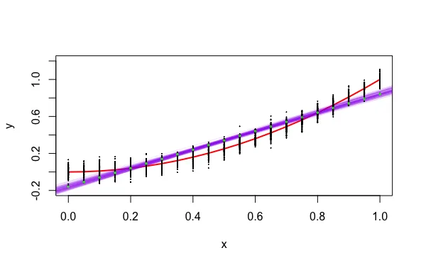
我相对来说是R语言的新手。我想知道如何创建以下这个图形。我已经卡在这里已经超过两个小时了。
我该怎么做呢?到目前为止,这就是我所拥有的内容:
# create the true relationship
f <- function(x) x^2  # true model
x <- seq(0, 1, by = 0.01)
y <- f(x)

# plot the true function
plot(x, y, type = "l", col = "red", ylim = c(-0.2, 1.2), lwd = 4)

# fit 100 models
set.seed(1)
for (i in 1:100)
{
    errors <- rnorm(n, 0, sigma)       # random errors, have standard deviation sigma
    obs_y <- f(obs_x) + errors         # observed y = true_model + error
    model <- lm(obs_y ~ obs_x)         # fit a linear model to the observed values
    points(obs_x[i], mean(obs_y[i]), col = "green")       # mean values
    abline(model, col = "purple")    # plot the fitted model
}
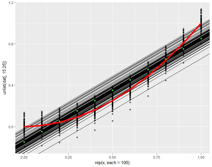
这将创建以下内容:
在这里,绿点明显关闭了...而且我没有黑点...
谢谢!