如何使并排的两个div元素保持相同的高度?

544

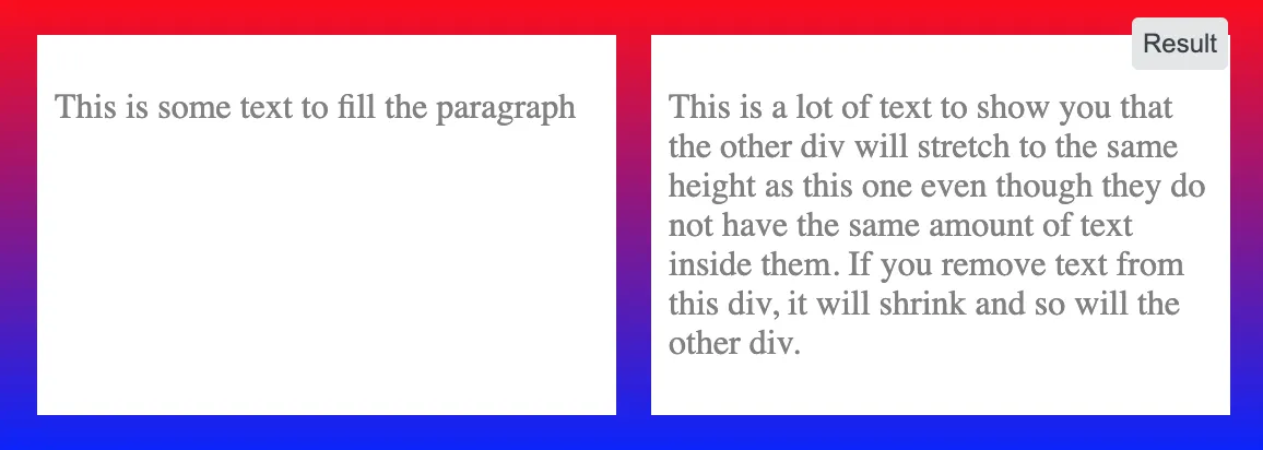
我有两个并排的div元素。我希望它们的高度相同,并且在一个调整大小时保持相同。如果其中一个因为放置文本而增长,则另一个应该增长以匹配高度。但我无法想出解决办法,有什么建议吗?

<div style="overflow: hidden">
    <div style="
        border: 1px solid #cccccc;
        float: left;
        padding-bottom: 1000px;
        margin-bottom: -1000px;
    ">
        Some content!<br />
        Some content!<br />
        Some content!<br />
        Some content!<br />
        Some content!<br />
    </div>

    <div style="
        border: 1px solid #cccccc;
        float: left;
        padding-bottom: 1000px;
        margin-bottom: -1000px;
    ">
        Some content!
    </div>
</div>


你希望如果其中一个变大了,另一个保持相同的高度尺寸吗? - Wai Wong
一个示例,它不是一个解决方案,但可以在可编辑的环境中找到:http://jsfiddle.net/PCJUQ/ - MvanGeest
24个回答

732

Flexbox

使用 flexbox 只需要一个声明:

.row {
  display: flex; /* equal height of the children */
}

.col {
  flex: 1; /* additionally, equal width */
  
  padding: 1em;
  border: solid;
}
<div class="row">
  <div class="col">Lorem ipsum dolor sit amet, consectetur adipisicing elit.</div>
  <div class="col">Lorem ipsum dolor sit amet, consectetur adipisicing elit. Ad omnis quae expedita ipsum nobis praesentium velit animi minus amet perspiciatis laboriosam similique debitis iste ratione nemo ea at corporis aliquam.</div>
</div>

为了支持旧版浏览器,可能需要使用前缀,请参见浏览器支持情况


19
Flexbox非常好用。如果你正在开发一个响应式设计,并且想让第二个div在小屏幕下向下移动,你需要在你的媒体查询中将.row设置为display:block。 - Nick Zulu
11
我认为在这种情况下,你应该设置 flex-direction: column :http://jsfiddle.net/sdsgW/1/ - Pavlo
2
有没有可能让一个特定的子 div 确定其他 div 的高度?这样,如果其他子 div 的内容发生变化,也不能改变该特定 div 的高度。 - Narek Malkhasyan
这看起来很丑,因为子div不能分别向左和向右浮动。只有当它们填满父元素的整个宽度时才有效。 - clockw0rk
3
这对我没用,包括评论中的建议。在.row中加入align-items: stretch;就解决了问题。 - Mark
显示剩余5条评论

158

这是一个常见的问题,许多人都遇到过,但幸运的是,像Ed Eliot在其博客中这样聪明的头脑已经在网上发布了他们的解决方案。

基本上你要做的就是通过添加padding-bottom: 100%使两个div/column变得非常高,然后使用margin-bottom: -100% "欺骗浏览器" 让它们看起来不那么高。 Ed Eliot在他的博客中更好地解释了这一点,其中还包括许多示例。

.container {
    overflow: hidden;
}
.column {
    float: left;
    margin: 20px;
    background-color: grey;
    padding-bottom: 100%;
    margin-bottom: -100%;
}
<div class="container">

    <div class="column">
        Some content!<br>
        Some content!<br>
        Some content!<br>
        Some content!<br>
        Some content!<br>
    </div>

    <div class="column">
        Something
    </div>

</div>


1
对于 One True Layout 的解释有点不够清晰,但是在查看了第一个链接后,我从其中一个示例中成功地实现了它。然而,这种方法真的很糟糕,因为你必须使用图像来表示列的底部边框,并且跨浏览器支持也存在问题。但是它确实有效,并且不依赖于 JavaScript,所以我将其标记为正确的。谢谢! - NibblyPig
1
@strongriley 请查看Ed Eliot的博客:http://www.ejeliot.com/blog/61 它应该可以在IE6中工作。也许问题是由其他地方引起的? - mqchen
1
如果窗口太窄,div放置在彼此下方,则会出现问题。 - WhyNotHugo
容器应该具有 overflow: hidden; 属性。 - tsega
1
如果将padding-bottom属性设置为100%,您如何定义实际希望出现在表格单元格中的单元格填充,例如padding:7px 10px?(PS我还需要在row上使用overflow:hidden - user1063287
显示剩余2条评论

60

CSS在这个领域一直没有任何解决方案 — 你只能使用 <table> 标签(或使用 CSS 的 display:table* 值来模拟),因为那是唯一实现“保持一组元素相同高度”的地方。

<div style="display: table-row;">

    <div style="border:1px solid #cccccc; display: table-cell;">
        Some content!<br/>
        Some content!<br/>
        Some content!<br/>
        Some content!<br/>
        Some content!<br/>
    </div>

    <div style="border:1px solid #cccccc;  display: table-cell;">
        Some content!
    </div>

</div>

这适用于所有版本的Firefox、Chrome和Safari,至少从版本8开始适用于Opera,以及IE 8及以上版本。


2
这个答案非常完美!只是一个小提醒:有些客户可能需要“table”而不是“table-row”。 - tiborka
@user2025810:哎呀,我从来没有在那个上面测试过 :) 不过知道这点还是挺好的,谢谢。 (考虑到它的PDF重点,我打赌它支持CSS 2.1的一些与打印相关的特性,在浏览器中实现得不太好。) - Paul D. Waite
8
使用这种解决方案时,除非在父元素上添加"display: table"(这会搞乱一切),否则请勿为您的div使用百分比宽度。 - Alex G
我更喜欢这种方式。我包含了缺失的display:table父元素。 当使用媒体查询时,您可以将那些td更改为显示块,以在不需要两列时更改它们的行为。 - Rick Paul

50

使用jQuery

使用jQuery,您可以在一行超级简单的脚本中完成它。

// HTML
<div id="columnOne">
</div>

<div id="columnTwo">
</div>

// Javascript
$("#columnTwo").height($("#columnOne").height());

使用CSS

这有点有趣。这种技术称为伪列。你不需要实际设置相同的高度,而是设置一些图形元素来看起来高度相同。


1
我认为使用JavaScript是一个非常好的方法。问题在于,如果被禁用,它就会崩溃。不过我还是打算使用它,并尽可能构建最佳备选方案 ;--) 谢谢! - nicorellius
16
这意味着columnOne的高度始终大于columnTwo。 - Sébastien Richer
2
在为列设置高度之前,您应该比较它们的高度。我认为 JavaScript 是解决这个问题的最佳方法,几乎所有浏览器都启用了 JavaScript,如果没有启用,他们应该离开您的网站和其他许多网站。 - SalmanShariati
6
这仅适用于页面首次加载。如果调整窗口大小导致div调整大小,则它们将不会保持同步。 - ikariw

31

使用 CSS Flexbox 和 min-height 解决了我的问题

enter image description here

假设你有一个容器,里面有两个 div,你想让这两个 div 有相同的高度。

你需要在容器上设置 'display: flex' 和 'align-items: stretch'

然后只需要给子 div 设置 'min-height' 为 100% 即可。

请查看下面的代码:

.container {
  width: 100%;
  background: linear-gradient(red,blue);
  padding: 1em;
  /* important */
  display: flex;
  /* important */
  align-items: stretch;
  justify-content: space-around;
}

.child {
  width: 100%;
  background: white;
  color: grey;
  margin: 0 .5em;
  padding: .5em;
  /* optional */
  min-height: 100%;
}
<div class="container">
  
  <div class="child"><p>This is some text to fill the paragraph</p></div>
  <div class="child"><p>This is a lot of text to show you that the other div will stretch to the same height as this one even though they do not have the same amount of text inside them. If you remove text from this div, it will shrink and so will the other div.</p></div>
  
</div>


我不需要设置min-height:只要在.row中使用align-items: stretch;即可。 - Mark
重要的是不要在子元素中设置高度。 - Bobby
对于那些深陷债务,甚至无法将旧的div更改为Flexbox的人来说,这是您的出路。 - Randy Lam

17

我很惊讶没有人提到(非常古老但可靠的)Absolute Columns技术:http://24ways.org/2008/absolute-columns/

在我看来,它比Faux Columns和One True Layout的技术都要好得多。

总体思路是,一个具有position: absolute;属性的元素将相对于最近的具有position: relative;属性的父元素进行定位。然后通过为列分配top: 0px;bottom: 0px;(或您实际需要的像素/百分比)来拉伸其高度以填充100%的空间。以下是一个示例:

<!DOCTYPE html>
<html>
  <head>
    <style>
      #container
      {
        position: relative;
      }

      #left-column
      {
        width: 50%;
        background-color: pink;
      }

      #right-column
      {
        position: absolute;
        top: 0px;
        right: 0px;
        bottom: 0px;
        width: 50%;
        background-color: teal;
      }
    </style>
  </head>
  <body>
    <div id="container">
      <div id="left-column">
        <ul>
          <li>Foo</li>
          <li>Bar</li>
          <li>Baz</li>
        </ul>
      </div>
      <div id="right-column">
        Lorem ipsum
      </div>
    </div>
  </body>
</html>

1
如果右列的行数比左列多,那么内容会溢出。 - David

11
你可以使用jQuery的Equal Heights插件来实现,这个插件可以使所有div元素具有相同的高度。如果其中一个div变高,其他div也会变高。
以下是一个实现示例:
Usage: $(object).equalHeights([minHeight], [maxHeight]);

Example 1: $(".cols").equalHeights(); 
           Sets all columns to the same height.

Example 2: $(".cols").equalHeights(400); 
           Sets all cols to at least 400px tall.

Example 3: $(".cols").equalHeights(100,300); 
           Cols are at least 100 but no more than 300 pixels tall. Elements with too much content will gain a scrollbar.

这是链接

http://www.cssnewbie.com/equalheights-jquery-plugin/


10

在搜索这个答案的过程中,我刚刚发现了这个帖子。我刚刚编写了一个小的jQuery函数,希望能帮到你,非常好用:

JAVASCRIPT

var maxHeight = 0;
$('.inner').each(function() {
    maxHeight = Math.max(maxHeight, $(this).height());
});
$('.lhs_content .inner, .rhs_content .inner').css({height:maxHeight + 'px'});

HTML

<div class="lhs_content">
    <div class="inner">
        Content in here
    </div>
</div>
<div class="rhs_content">
    <div class="inner">
        More content in here
    </div>
</div>

2
我使用outerHeight来包含padding和边框。我认为这是最干净的解决方案。 - Sébastien Richer
我一直在寻找的完美解决方案。其他解决方案适用于行只有几列的情况,但是这种方法更适合复杂的HTML内容。小提示:在响应式页面中调整文档大小时,由于固定高度,内容高度不会改变。因此,在“each function”之前添加$('.inner').css({ height: "initial" });以将高度设置为默认值。 - bafsar

8
您可以使用Faux Columns技术。它基本上使用包含DIV中的背景图像来模拟两个等高度的DIV。使用此技术还允许您向容器添加阴影、圆角、自定义边框或其他花哨的图案。但是,它仅适用于固定宽度的框。在每个浏览器中都经过了充分测试并正常工作。

8

CSS Grid 的方式

现代的做法是利用 CSS Grid,这样就不需要在每两个项目之间声明一个 <div class="row"></div> 包装器了。同时,这也可以让您轻松控制项目行/列之间的间隙。

.grid-container {
  display: grid;
  grid-template-columns: repeat(2, 1fr); /* or simply "1fr 1fr;" */
  grid-row-gap: 10px; 
  grid-column-gap: 10px;
}

.grid-item {
  background-color: #f8f8f8;
  box-shadow: 0 0 3px #666;
  text-align: center;
}

.grid-item img {
  max-width: 100%;
}
<div class="grid-container">
  <div class="grid-item">1 <br />1.1<br />1.1.1</div>
  <div class="grid-item">2</div>
  <div class="grid-item">3
    <img src="https://lorempixel.com/420/320/abstract/1/Sample" alt="" />
    3.1
  </div>
  <div class="grid-item">4</div>
  <div class="grid-item">5 <br />1.1<br />1.1.1</div>
  <div class="grid-item">6<img src="https://lorempixel.com/400/300/abstract/" alt="" />
    6.1</div>
  <div class="grid-item">7</div>
  <div class="grid-item">8</div>
  <div class="grid-item">9 <br />1.1<br />1.1.1</div>
  <div class="grid-item">10</div>
  <div class="grid-item">11
    <img src="https://lorempixel.com/420/320/abstract/1/Sample" alt="" />
    11.1
  </div>
  <div class="grid-item">12</div>
</div>


网页内容由stack overflow 提供, 点击上面的
可以查看英文原文,
原文链接