如何使Flutter应用程序根据不同的屏幕尺寸具有响应性?

178

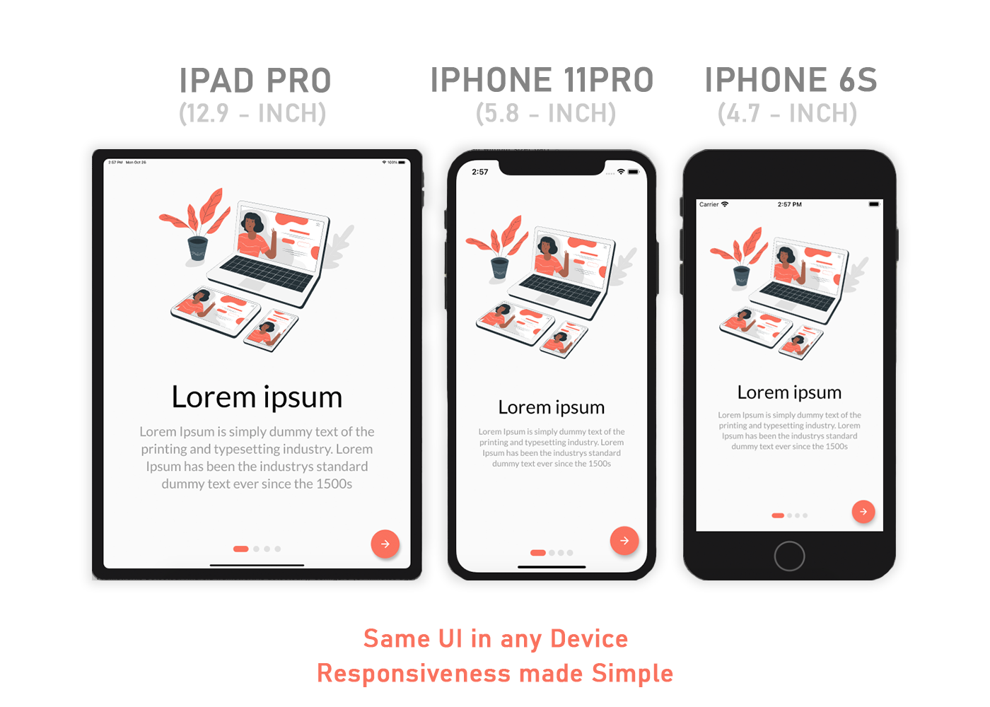
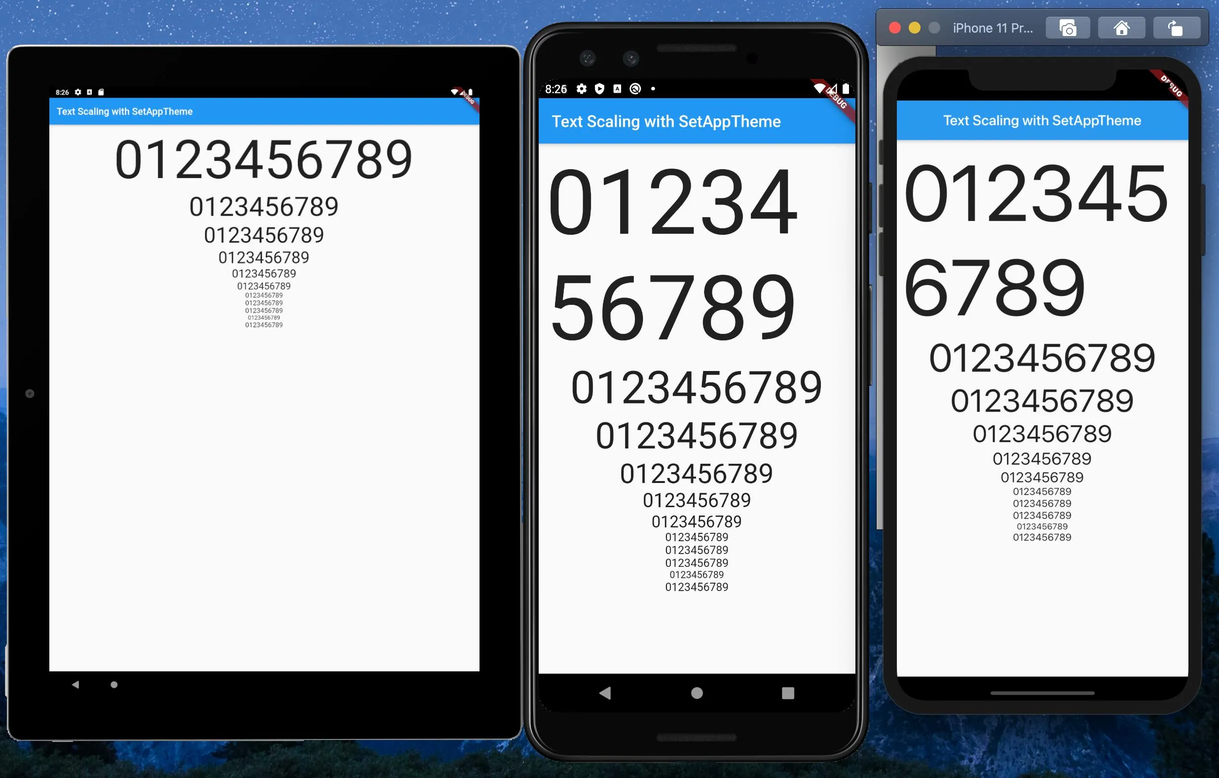
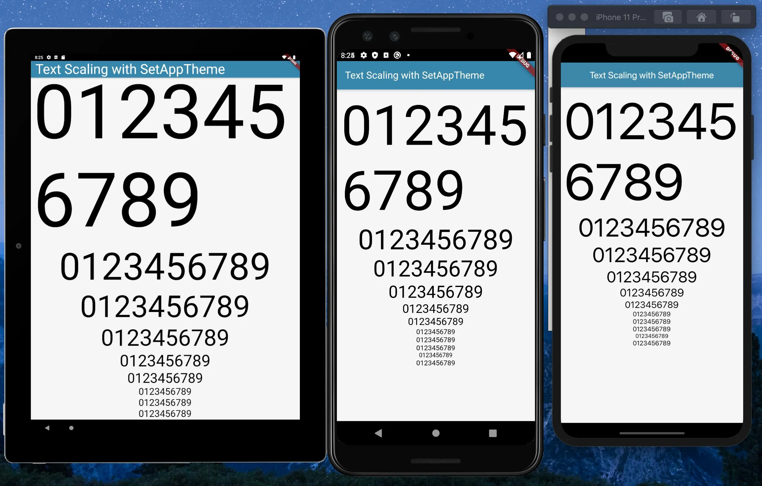
我在尝试使它适应各种屏幕大小时遇到了困难。如何让它变得响应式?

@override
       Widget build(BuildContext context) {
       return new Container(
       decoration: new BoxDecoration(color: Colors.white),
       child: new Stack(
        children: [
          new Padding(
            padding: const EdgeInsets.only(bottom: 350.0),
            child: new GradientAppBar(" "),
          ),
          new Positioned(
            bottom: 150.0,
            height: 260.0,
            left: 10.0,
            right: 10.0,
            child: new Padding(
              padding: new EdgeInsets.all(10.0),
              child: new Card(
                child: new Column(
                  mainAxisSize: MainAxisSize.min,
                  children: <Widget>[
                    const ListTile(
                      title: const Text(
                        'LOGIN',
                        textAlign: TextAlign.center,
                        style: const TextStyle(
                          fontSize: 16.50,
                          fontFamily: "Helvetica",
                          fontWeight: FontWeight.bold,
                          color: Colors.black87,
                          letterSpacing: 1.00,
                        ),
                      ),
                    ),
                    new ListTile(
                      leading: const Icon(Icons.person),
                      title: new TextField(
                        controller: _user1,
                        decoration: new InputDecoration(
                            labelText: '     Enter a username'),
                      ),
                    ),
                    new ListTile(
                      leading: const Icon(Icons.person_pin),
                      title: new TextField(
                        controller: _pass1,
                        decoration: new InputDecoration(
                            labelText: '     Enter a password'),
                        obscureText: true,
                      ),
                    ),
                  ],
                ),
              ),
            ),
          ),
          new Positioned(
            bottom: 70.0,
            left: 15.0,
            right: 05.0,
            child: new ButtonTheme.bar(
            // make buttons use the appropriate styles for cards
              child: new ButtonBar(
                children: <Widget>[
                  new FlatButton(
                    padding: new EdgeInsets.only(right: 13.0),
                    child: new Text(
                      'REGISTER HERE',
                      style: new TextStyle(
                          color: Colors.black87,
                          fontFamily: "Helvetica",
                          fontSize: 15.00,
                          fontWeight: FontWeight.bold),
                    ),
                    onPressed: () {
                      Navigator.of(context).pushNamed('/facebook');
                    },
                  ),
                  new FlatButton(
                    padding: new EdgeInsets.only(right: 22.0),
                    child: new Text(
                      'FORGOT PASSWORD?',
                      style: new TextStyle(
                          color: Colors.black87,
                          fontFamily: "Helvetica",
                          fontSize: 15.00,
                          fontWeight: FontWeight.bold),
                    ),
                    onPressed: () {
                      Navigator.of(context).pushNamed('/Forgot');
                    },
                  ),
                ],
              ),
            ),
          ),
          new Positioned(
            bottom: 73.0,
            height: 180.0,
            left: 20.0,
            right: 52.0,
            child: new Padding(
              padding: new EdgeInsets.all(0.00),
              child: new ButtonTheme(
                minWidth: 10.0,
                height: 20.0,
                padding: new EdgeInsets.only(right: 37.0),
                child: new ButtonBar(children: <Widget>[
                  new CupertinoButton(
                      borderRadius:
                          const BorderRadius.all(const Radius.circular(36.0)),
                      padding: new EdgeInsets.only(left: 70.0),
                      color: const Color(0xFF426DB7),
                      child: new Text(
                        "     LOGIN                            ",
                        style: new TextStyle(
                            color: Colors.white,
                            fontSize: 12.50,
                            fontFamily: "Handwriting",
                            fontWeight: FontWeight.w500,
                            letterSpacing: 0.00),
                      ),
                      onPressed: () {})
                ]),
              ),
            ),
          ),
        ],
      ),
    );
  }
}

6
我在这里写了一个简单的解决方案 https://jaycoding.tech/tutorials/guides/how-to-create-a-responsive-app-in-flutte-xmafdg ,因为我认为MediaQuery不足以解决问题。你可能想要去看一下。 - NduJay
4
你知道你的链接被以下网站分享了吗:Flutter Docs - Pratik Butani
@PratikButani - 在我看来,可能不应该将它们链接在一起... 这里没有明确的答案。再加上文档中缺乏具体的示例,链接到五年前的文章,以及来自Flutter团队的解决方案 = 可以理解为什么新手会感到困惑。 - undefined
还有@NduJay的链接已经失效。 - undefined
25个回答

131

使用 MediaQuery 类:

MediaQueryData queryData;
queryData = MediaQuery.of(context);

MediaQuery:创建一个子树,其中媒体查询解析为给定数据。

MediaQueryData:有关媒体的信息(例如窗口)。

获取设备像素比:

queryData.devicePixelRatio

获取设备屏幕的宽度和高度:

queryData.size.width
queryData.size.height

获取文本比例因子:

queryData.textScaleFactor

使用 AspectRatio 类:

来自文档:

尝试将子组件调整到特定的宽高比。

该小部件首先尝试布局约束所允许的最大宽度。然后,通过将给定的宽高比应用于宽度(作为宽度与高度之比的比率),来确定小部件的高度。

例如,16:9 的宽高比将具有 16.0/9.0 的值。如果最大宽度为无限,则初始宽度是通过将宽高比应用于最大高度来确定的。

现在考虑第二个例子,这次宽高比为 2.0,并且布局约束要求宽度在 0.0 到 100.0 之间,高度在 0.0 到 100.0 之间。我们将选择 100.0 的宽度(允许的最大宽度)和 50.0 的高度(以匹配宽高比)。

//example
new Center(
 child: new AspectRatio(
  aspectRatio: 100 / 100,
  child: new Container(
    decoration: new BoxDecoration(
      shape: BoxShape.rectangle,
      color: Colors.orange,
      )
    ),
  ),
),

你还可以使用以下方法


6
我可以获取设备的宽度和高度,如何通过“queryData”设置测试字体大小、内边距和外边距? - Farhana Naaz Ansari

57

这个类将帮助并使用init方法初始化该类。

import 'package:flutter/widgets.dart';

class SizeConfig {
  static MediaQueryData _mediaQueryData;
  static double screenWidth;
  static double screenHeight;
  static double blockSizeHorizontal;
  static double blockSizeVertical;
  static double _safeAreaHorizontal;
  static double _safeAreaVertical;
  static double safeBlockHorizontal;
  static double safeBlockVertical;

  void init(BuildContext context){
    _mediaQueryData = MediaQuery.of(context);
    screenWidth = _mediaQueryData.size.width;
    screenHeight = _mediaQueryData.size.height;
    blockSizeHorizontal = screenWidth/100;
    blockSizeVertical = screenHeight/100;
    _safeAreaHorizontal = _mediaQueryData.padding.left +
        _mediaQueryData.padding.right;
    _safeAreaVertical = _mediaQueryData.padding.top +
        _mediaQueryData.padding.bottom;
    safeBlockHorizontal = (screenWidth - _safeAreaHorizontal)/100;
    safeBlockVertical = (screenHeight - _safeAreaVertical)/100;
  }
}

那么在您的小部件维度中执行以下操作

Widget build(BuildContext context) {
    SizeConfig().init(context);
    return Container(
    height: SizeConfig.safeBlockVertical * 10, //10 for example
    width: SizeConfig.safeBlockHorizontal * 10, //10 for example
    );}

本帖所有内容归作者所有: https://medium.com/flutter-community/flutter-effectively-scale-ui-according-to-different-screen-sizes-2cb7c115ea0a


如何使用SizeConfig类添加底部的EdgeInsets? - Farwa
我认为将容器内部填充处理一下就可以了。你可以试一下,告诉我是否有帮助! - user10768752
如何将此代码更新为 null 安全呢? - vontdeux
2
@vontdeux,你可以将所有的 static 替换为 late,但我不确定这是否是最好的方法。 - Nathan Tew

45

制作适应不同屏幕尺寸的响应式UI最简单的方法是使用Sizer插件。 Sizer Screenshot

使用这个插件可以在任何屏幕尺寸的设备上制作响应式UI,包括平板电脑。查看该插件⬇️
https://pub.dev/packages/sizer

.h  - for widget height
.w  - for widget width
.sp - for font size

按照以下方式使用.h.w.sp

示例:

Container(
  height: 10.0.h,  //10% of screen height
  width: 80.0.w,   //80% of screen width
  child: Text('Sizer', style: TextStyle(fontSize: 12.0.sp)),
);

我使用这个插件已经构建了许多响应式应用程序。


3
这种方法很不错,我会尝试并观察其表现,如果能够满足我的要求,我就会开始生产。 - Wambert Orion
2
非常感谢 @urmish patel,这是使应用程序响应最简单的方法。 - Tarun Sharma
4
我正在使用这个软件包,但它总是出现“The method '*' was called on null”错误。 - Arvina Kori
1
它使用试错方法运作,但我不能在生产中使用它,因为我有特定的字体大小,无法使用百分比。 - Maruf Hassan
3
总是收到一个示例“高度”或“宽度”字段未初始化的错误,有人能指导我做错了什么吗? - Deepak Khiwani
显示剩余3条评论

24

我所做的是获取屏幕的宽度和高度,计算出一个100x100的网格来定位和缩放元素,并将其保存为可重用的静态变量。在大多数情况下,这种方法效果非常好。像这样:

AppConfig.width = MediaQuery.of(context).size.width;
AppConfig.height = MediaQuery.of(context).size.height;
AppConfig.blockSize = AppConfig.width / 100;
AppConfig.blockSizeVertical = AppConfig.height / 100;

然后我根据这些值来缩放一切,就像这样:

double elementWidth = AppConfig.blockSize * 10.0;   // 10% of the screen width
double fontSize = AppConfig.blockSize * 1.2;

有时候安全区域(如刘海屏等)会破坏布局,所以你也可以考虑这个:

AppConfig.safeAreaHorizontal = MediaQuery.of(context).padding.left +
    MediaQuery.of(context).padding.right;

double screenWidthWithoutSafeArea = AppConfig.width - AppConfig.safeAreaHorizontal;

这在最近的一些项目中运作得非常好。


1
如何计算字体大小?基于宽度还是高度计算更好? - Harsh Bhavsar
我是根据宽度来计算它们的。但说实话,我没有尝试过在支持横屏和竖屏模式的应用程序中使用它。但你可能仍然可以在两种方向上进行不同的计算。 - dy_
1
这样做怎么确切地解决了屏幕密度差异问题?你说将屏幕分成100 * 100的网格块,听起来好像产生的块都是相等大小的(即正方形),但实际上并不是。如果您拥有一个垂直像素数(屏幕高度)比水平像素数(屏幕宽度)多两倍的设备,则生成的块将变成矩形-这意味着代码仍然会产生您一开始尝试解决的同样问题。测试您的代码以适应多种屏幕密度以证明此点。所以对我来说,这并不是一个解决方案。 - SilSur
@SilSur,当然,任何设备和密度上的块大小都不一样,但这正是它能运行的原因(在大多数情况下)。我只需要为屏幕上添加的每个小部件决定是否要根据块的宽度或高度(或两者)来计算其位置和大小。我曾在可在任何iPhone、iPad或Android手机/平板电脑上运行的应用程序中使用过此方法,而无需进行特定于设备的更正。横向和纵向。但您是正确的,这种方法仍不能完美地解决复杂的UI问题。我仍在寻找更好的方法来处理这些问题。 - dy_
1
@HarshBhavsar 我认为你可以通过屏幕宽度计算字体大小,甚至对于所有内容,都可以使用屏幕宽度来计算大小,但请确保检查方向,因为在横向模式下,屏幕宽度将是屏幕高度,反之亦然。已经有一个包可以实现响应式Flutter Screen Utils,你可以看一下。 - Shoaib Khan

20

查看 MediaQuery 类。

例如,要了解当前媒体的大小(例如包含应用程序的窗口),可以从通过 MediaQuery.of 返回的 MediaQueryData 中读取 MediaQueryData.size 属性:MediaQuery.of(context).size

因此,您可以执行以下操作:

 new Container(
                      height: MediaQuery.of(context).size.height/2,
..            )

你的意思是用 mediaQuery 代替 positioned 吗? - praveen Dp
我不明白你在尝试做什么。 - Shady Aziza
使用定位、内部填充(stack)。我已经根据屏幕尺寸进行了调整。现在要使其响应式,我应该使用媒体查询来代替什么? - praveen Dp

12

您可以将宽度或高度的百分比作为缩放大小的输入。

fontSize: MediaQuery.of(_ctxt).size.height * 0.065

在末尾的乘数具有值,可以使文本在活动模拟器中看起来很好。

以下是我设置的方式,以便所有缩放尺寸都集中在一个地方。这样,您可以轻松调整它们,并使用热重新加载快速重新运行而无需查找代码中的Media.of()调用。

  1. 创建文件以存储所有映射appScale.dart

    class AppScale {
      BuildContext _ctxt;
    
      AppScale(this._ctxt);
    
      double get labelDim => scaledWidth(.04);
      double get popupMenuButton => scaledHeight(.065); 

      double scaledWidth(double widthScale) {
        return MediaQuery.of(_ctxt).size.width * widthScale;
      }
    
      double scaledHeight(double heightScale) {
        return MediaQuery.of(_ctxt).size.height * heightScale;
      }
    }

  • 在需要缩放值的任何地方引用它。
  • 
        AppScale _scale = AppScale(context);
    
        // ... 
    
        Widget label1 = Text(
          "Some Label",
          style: TextStyle(fontSize: _scale.labelDim),
        );


    感谢这篇帖子中的答案


    10
    经过大量研究和测试,我已经为一款正在从Android/iOS转换到Flutter的应用程序开发出了解决方案。
    在Android和iOS中,我使用了一个“缩放因子”应用于基本字体大小,渲染相对于屏幕大小的文本大小。
    这篇文章非常有帮助:https://medium.com/flutter-community/flutter-effectively-scale-ui-according-to-different-screen-sizes-2cb7c115ea0a 我创建了一个StatelessWidget来获取Material Design排版样式的字体大小。使用MediaQuery获取设备尺寸,计算出缩放因子,然后重置Material Design文本大小。该Widget可用于定义自定义的Material Design主题。
    使用的模拟器: Pixel C - 9.94英寸平板电脑 Pixel 3 - 5.46英寸手机 iPhone 11 Pro Max - 5.8英寸手机 使用标准字体大小 使用缩放字体大小 set_app_theme.dart(SetAppTheme Widget)
    import 'package:flutter/material.dart';
    import 'dart:math';
    
    class SetAppTheme extends StatelessWidget {
    
      final Widget child;
    
      SetAppTheme({this.child});
    
      @override
      Widget build(BuildContext context) {
    
        final _divisor = 400.0;
    
        final MediaQueryData _mediaQueryData = MediaQuery.of(context);
    
        final _screenWidth = _mediaQueryData.size.width;
        final _factorHorizontal = _screenWidth / _divisor;
    
        final _screenHeight = _mediaQueryData.size.height;
        final _factorVertical = _screenHeight / _divisor;
    
        final _textScalingFactor = min(_factorVertical, _factorHorizontal);
    
        final _safeAreaHorizontal = _mediaQueryData.padding.left + _mediaQueryData.padding.right;
        final _safeFactorHorizontal = (_screenWidth - _safeAreaHorizontal) / _divisor;
    
        final _safeAreaVertical = _mediaQueryData.padding.top + _mediaQueryData.padding.bottom;
        final _safeFactorVertical = (_screenHeight - _safeAreaVertical) / _divisor;
    
        final _safeAreaTextScalingFactor = min(_safeFactorHorizontal, _safeFactorHorizontal);
    
        print('Screen Scaling Values:' + '_screenWidth: $_screenWidth');
        print('Screen Scaling Values:' + '_factorHorizontal: $_factorHorizontal ');
    
        print('Screen Scaling Values:' + '_screenHeight: $_screenHeight');
        print('Screen Scaling Values:' + '_factorVertical: $_factorVertical ');
    
        print('_textScalingFactor: $_textScalingFactor ');
    
        print('Screen Scaling Values:' + '_safeAreaHorizontal: $_safeAreaHorizontal ');
        print('Screen Scaling Values:' + '_safeFactorHorizontal: $_safeFactorHorizontal ');
    
        print('Screen Scaling Values:' + '_safeAreaVertical: $_safeAreaVertical ');
        print('Screen Scaling Values:' + '_safeFactorVertical: $_safeFactorVertical ');
    
        print('_safeAreaTextScalingFactor: $_safeAreaTextScalingFactor ');
    
        print('Default Material Design Text Themes');
        print('display4: ${Theme.of(context).textTheme.display4}');
        print('display3: ${Theme.of(context).textTheme.display3}');
        print('display2: ${Theme.of(context).textTheme.display2}');
        print('display1: ${Theme.of(context).textTheme.display1}');
        print('headline: ${Theme.of(context).textTheme.headline}');
        print('title: ${Theme.of(context).textTheme.title}');
        print('subtitle: ${Theme.of(context).textTheme.subtitle}');
        print('body2: ${Theme.of(context).textTheme.body2}');
        print('body1: ${Theme.of(context).textTheme.body1}');
        print('caption: ${Theme.of(context).textTheme.caption}');
        print('button: ${Theme.of(context).textTheme.button}');
    
        TextScalingFactors _textScalingFactors = TextScalingFactors(
            display4ScaledSize: (Theme.of(context).textTheme.display4.fontSize * _safeAreaTextScalingFactor),
            display3ScaledSize: (Theme.of(context).textTheme.display3.fontSize * _safeAreaTextScalingFactor),
            display2ScaledSize: (Theme.of(context).textTheme.display2.fontSize * _safeAreaTextScalingFactor),
            display1ScaledSize: (Theme.of(context).textTheme.display1.fontSize * _safeAreaTextScalingFactor),
            headlineScaledSize: (Theme.of(context).textTheme.headline.fontSize * _safeAreaTextScalingFactor),
            titleScaledSize: (Theme.of(context).textTheme.title.fontSize * _safeAreaTextScalingFactor),
            subtitleScaledSize: (Theme.of(context).textTheme.subtitle.fontSize * _safeAreaTextScalingFactor),
            body2ScaledSize: (Theme.of(context).textTheme.body2.fontSize * _safeAreaTextScalingFactor),
            body1ScaledSize: (Theme.of(context).textTheme.body1.fontSize * _safeAreaTextScalingFactor),
            captionScaledSize: (Theme.of(context).textTheme.caption.fontSize * _safeAreaTextScalingFactor),
            buttonScaledSize: (Theme.of(context).textTheme.button.fontSize * _safeAreaTextScalingFactor));
    
        return Theme(
          child: child,
          data: _buildAppTheme(_textScalingFactors),
        );
      }
    }
    
    final ThemeData customTheme = ThemeData(
      primarySwatch: appColorSwatch,
      // fontFamily: x,
    );
    
    final MaterialColor appColorSwatch = MaterialColor(0xFF3787AD, appSwatchColors);
    
    Map<int, Color> appSwatchColors =
    {
      50  : Color(0xFFE3F5F8),
      100 : Color(0xFFB8E4ED),
      200 : Color(0xFF8DD3E3),
      300 : Color(0xFF6BC1D8),
      400 : Color(0xFF56B4D2),
      500 : Color(0xFF48A8CD),
      600 : Color(0xFF419ABF),
      700 : Color(0xFF3787AD),
      800 : Color(0xFF337799),
      900 : Color(0xFF285877),
    };
    
    _buildAppTheme (TextScalingFactors textScalingFactors) {
    
      return customTheme.copyWith(
    
        accentColor: appColorSwatch[300],
        buttonTheme: customTheme.buttonTheme.copyWith(buttonColor: Colors.grey[500],),
        cardColor: Colors.white,
        errorColor: Colors.red,
        inputDecorationTheme: InputDecorationTheme(border: OutlineInputBorder(),),
        primaryColor: appColorSwatch[700],
        primaryIconTheme: customTheme.iconTheme.copyWith(color: appColorSwatch),
        scaffoldBackgroundColor: Colors.grey[100],
        textSelectionColor: appColorSwatch[300],
        textTheme: _buildAppTextTheme(customTheme.textTheme, textScalingFactors),
        appBarTheme: customTheme.appBarTheme.copyWith(
            textTheme: _buildAppTextTheme(customTheme.textTheme, textScalingFactors)),
    
    //    accentColorBrightness: ,
    //    accentIconTheme: ,
    //    accentTextTheme: ,
    //    appBarTheme: ,
    //    applyElevationOverlayColor: ,
    //    backgroundColor: ,
    //    bannerTheme: ,
    //    bottomAppBarColor: ,
    //    bottomAppBarTheme: ,
    //    bottomSheetTheme: ,
    //    brightness: ,
    //    buttonBarTheme: ,
    //    buttonColor: ,
    //    canvasColor: ,
    //    cardTheme: ,
    //    chipTheme: ,
    //    colorScheme: ,
    //    cupertinoOverrideTheme: ,
    //    cursorColor: ,
    //    dialogBackgroundColor: ,
    //    dialogTheme: ,
    //    disabledColor: ,
    //    dividerColor: ,
    //    dividerTheme: ,
    //    floatingActionButtonTheme: ,
    //    focusColor: ,
    //    highlightColor: ,
    //    hintColor: ,
    //    hoverColor: ,
    //    iconTheme: ,
    //    indicatorColor: ,
    //    materialTapTargetSize: ,
    //    pageTransitionsTheme: ,
    //    platform: ,
    //    popupMenuTheme: ,
    //    primaryColorBrightness: ,
    //    primaryColorDark: ,
    //    primaryColorLight: ,
    //    primaryTextTheme: ,
    //    secondaryHeaderColor: ,
    //    selectedRowColor: ,
    //    sliderTheme: ,
    //    snackBarTheme: ,
    //    splashColor: ,
    //    splashFactory: ,
    //    tabBarTheme: ,
    //    textSelectionHandleColor: ,
    //    toggleableActiveColor: ,
    //    toggleButtonsTheme: ,
    //    tooltipTheme: ,
    //    typography: ,
    //    unselectedWidgetColor: ,
      );
    }
    
    class TextScalingFactors {
    
      final double display4ScaledSize;
      final double display3ScaledSize;
      final double display2ScaledSize;
      final double display1ScaledSize;
      final double headlineScaledSize;
      final double titleScaledSize;
      final double subtitleScaledSize;
      final double body2ScaledSize;
      final double body1ScaledSize;
      final double captionScaledSize;
      final double buttonScaledSize;
    
      TextScalingFactors({
    
        @required this.display4ScaledSize,
        @required this.display3ScaledSize,
        @required this.display2ScaledSize,
        @required this.display1ScaledSize,
        @required this.headlineScaledSize,
        @required this.titleScaledSize,
        @required this.subtitleScaledSize,
        @required this.body2ScaledSize,
        @required this.body1ScaledSize,
        @required this.captionScaledSize,
        @required this.buttonScaledSize
      });
    }
    
    TextTheme _buildAppTextTheme(
    
        TextTheme _customTextTheme,
        TextScalingFactors _scaledText) {
    
      return _customTextTheme.copyWith(
    
        display4: _customTextTheme.display4.copyWith(fontSize: _scaledText.display4ScaledSize),
        display3: _customTextTheme.display3.copyWith(fontSize: _scaledText.display3ScaledSize),
        display2: _customTextTheme.display2.copyWith(fontSize: _scaledText.display2ScaledSize),
        display1: _customTextTheme.display1.copyWith(fontSize: _scaledText.display1ScaledSize),
        headline: _customTextTheme.headline.copyWith(fontSize: _scaledText.headlineScaledSize),
        title: _customTextTheme.title.copyWith(fontSize: _scaledText.titleScaledSize),
        subtitle: _customTextTheme.subtitle.copyWith(fontSize: _scaledText.subtitleScaledSize),
        body2: _customTextTheme.body2.copyWith(fontSize: _scaledText.body2ScaledSize),
        body1: _customTextTheme.body1.copyWith(fontSize: _scaledText.body1ScaledSize),
        caption: _customTextTheme.caption.copyWith(fontSize: _scaledText.captionScaledSize),
        button: _customTextTheme.button.copyWith(fontSize: _scaledText.buttonScaledSize),
    
      ).apply(bodyColor: Colors.black);
    }


    主要.dart(演示应用程序)

    import 'package:flutter/material.dart';
    import 'package:scaling/set_app_theme.dart';
    
    
    void main() => runApp(MyApp());
    
    
    class MyApp extends StatelessWidget {
    
      @override
      Widget build(BuildContext context) {
    
        return MaterialApp(
          home: SetAppTheme(child: HomePage()),
        );
      }
    }
    
    
    class HomePage extends StatelessWidget {
    
      final demoText = '0123456789';
    
      @override
      Widget build(BuildContext context) {
    
        return SafeArea(
          child: Scaffold(
            appBar: AppBar(
              title: Text('Text Scaling with SetAppTheme',
                style: TextStyle(color: Colors.white),),
            ),
            body: SingleChildScrollView(
              child: Center(
                child: Padding(
                  padding: const EdgeInsets.all(8.0),
                  child: Column(
                    children: <Widget>[
                      Text(
                        demoText,
                        style: TextStyle(
                          fontSize: Theme.of(context).textTheme.display4.fontSize,
                        ),
                      ),
                      Text(
                        demoText,
                        style: TextStyle(
                          fontSize: Theme.of(context).textTheme.display3.fontSize,
                        ),
                      ),
                      Text(
                        demoText,
                        style: TextStyle(
                          fontSize: Theme.of(context).textTheme.display2.fontSize,
                        ),
                      ),
                      Text(
                        demoText,
                        style: TextStyle(
                          fontSize: Theme.of(context).textTheme.display1.fontSize,
                        ),
                      ),
                      Text(
                        demoText,
                        style: TextStyle(
                          fontSize: Theme.of(context).textTheme.headline.fontSize,
                        ),
                      ),
                      Text(
                        demoText,
                        style: TextStyle(
                          fontSize: Theme.of(context).textTheme.title.fontSize,
                        ),
                      ),
                      Text(
                        demoText,
                        style: TextStyle(
                          fontSize: Theme.of(context).textTheme.subtitle.fontSize,
                        ),
                      ),
                      Text(
                        demoText,
                        style: TextStyle(
                          fontSize: Theme.of(context).textTheme.body2.fontSize,
                        ),
                      ),
                      Text(
                        demoText,
                        style: TextStyle(
                          fontSize: Theme.of(context).textTheme.body1.fontSize,
                        ),
                      ),
                      Text(
                        demoText,
                        style: TextStyle(
                          fontSize: Theme.of(context).textTheme.caption.fontSize,
                        ),
                      ),
                      Text(
                        demoText,
                        style: TextStyle(
                          fontSize: Theme.of(context).textTheme.button.fontSize,
                        ),
                      ),
                    ],
                  ),
                ),
              ),
            ),
          ),
        );
      }
    }
    

    6

    在pubspec.yaml中设置依赖关系

    flutter_responsive_screen: ^1.0.0
    

    例子:

    Function hp = Screen(MediaQuery.of(context).size).hp;
    Function wp = Screen(MediaQuery.of(context).size).wp;
    
    Example :
    return Container(height: hp(27),weight: wp(27));
    

    9
    下次你发布"解决方案"时,或许解释一下内部运行机制会更好?无论如何,我查看了此依赖的 GitHub 页面。它基本上只是一个单一类(仅有16行代码),接受输入的宽高值并按屏幕宽高的百分比进行缩放。本质上与@datayeah的解决方案相同——唯一的区别在于这个更整洁。与datayeah一样,这里也存在相同的问题——对于屏幕密度不同的设备进行1:1缩放来说根本不是一个好的解决方案。屏幕密度问题并没有因为这个"解决方案"而得到解决。 - SilSur

    6

    我一直在严厉批评其他人(@datayeah和Vithani Ravi)的解决方案,因此我想分享我的尝试来解决可变屏幕密度缩放问题,或者保持沉默。因此,我从一个坚实/固定的基础出发解决这个问题:我以2:1(高度:宽度)的固定比例为基础进行所有缩放。我有一个帮助类“McGyver”,在整个应用程序中处理所有繁重的工作(和有用的代码调整)。这个“McGyver”类只包含静态方法和静态常量类成员。

    比例缩放方法:我根据2:1的宽高比独立缩放宽度和高度。我获取宽度和高度的输入值,并将每个值除以相应的宽度和高度常量,最后计算一个调整因子,通过该因子来缩放相应的宽度和高度输入值。实际代码如下:

    import 'dart:math';
    import 'package:flutter/material.dart';
    
    class McGyver {
    
      static const double _fixedWidth = 410;    // Set to an Aspect Ratio of 2:1 (height:width)
      static const double _fixedHeight = 820;   // Set to an Aspect Ratio of 2:1 (height:width) 
    
      // Useful rounding method (@andyw solution -> https://dev59.com/-l4c5IYBdhLWcg3wAWPv#53500405)
      static double roundToDecimals(double val, int decimalPlaces){
        double mod = pow(10.0, decimalPlaces);
        return ((val * mod).round().toDouble() / mod);
      }
    
      // The 'Ratio-Scaled' Widget method (takes any generic widget and returns a "Ratio-Scaled Widget" - "rsWidget")
      static Widget rsWidget(BuildContext ctx, Widget inWidget, double percWidth, double percHeight) {
    
        // ---------------------------------------------------------------------------------------------- //
        // INFO: Ratio-Scaled "SizedBox" Widget - Scaling based on device's height & width at 2:1 ratio.  //
        // ---------------------------------------------------------------------------------------------- //
    
        final int _decPlaces = 5;
        final double _fixedWidth = McGyver._fixedWidth;
        final double _fixedHeight = McGyver._fixedHeight;
    
        Size _scrnSize = MediaQuery.of(ctx).size;                // Extracts Device Screen Parameters.
        double _scrnWidth = _scrnSize.width.floorToDouble();     // Extracts Device Screen maximum width.
        double _scrnHeight = _scrnSize.height.floorToDouble();   // Extracts Device Screen maximum height.
    
        double _rsWidth = 0;
        if (_scrnWidth == _fixedWidth) {   // If input width matches fixedWidth then do normal scaling.
          _rsWidth = McGyver.roundToDecimals((_scrnWidth * (percWidth / 100)), _decPlaces);
        } else {   // If input width !match fixedWidth then do adjustment factor scaling.
          double _scaleRatioWidth = McGyver.roundToDecimals((_scrnWidth / _fixedWidth), _decPlaces);
          double _scalerWidth = ((percWidth + log(percWidth + 1)) * pow(1, _scaleRatioWidth)) / 100;
          _rsWidth = McGyver.roundToDecimals((_scrnWidth * _scalerWidth), _decPlaces);
        }
    
        double _rsHeight = 0;
        if (_scrnHeight == _fixedHeight) {   // If input height matches fixedHeight then do normal scaling.
          _rsHeight = McGyver.roundToDecimals((_scrnHeight * (percHeight / 100)), _decPlaces);
        } else {   // If input height !match fixedHeight then do adjustment factor scaling.
          double _scaleRatioHeight = McGyver.roundToDecimals((_scrnHeight / _fixedHeight), _decPlaces);
          double _scalerHeight = ((percHeight + log(percHeight + 1)) * pow(1, _scaleRatioHeight)) / 100;
          _rsHeight = McGyver.roundToDecimals((_scrnHeight * _scalerHeight), _decPlaces);
        }
    
        // Finally, hand over Ratio-Scaled "SizedBox" widget to method call.
        return SizedBox(
          width: _rsWidth,
          height: _rsHeight,
          child: inWidget,
        );
      }
    
    }
    

    接下来,您需要使用“rsWidget()”方法的简单静态调用来单独缩放小部件(对于我的完美主义倾向者而言,这是我所有UI小部件):

      // Step 1: Define your widget however you like (this widget will be supplied as the "inWidget" arg to the "rsWidget" method in Step 2)...
      Widget _btnLogin = RaisedButton(color: Colors.blue, elevation: 9.0, 
                                      shape: RoundedRectangleBorder(borderRadius: BorderRadius.circular(McGyver.rsDouble(context, ScaleType.width, 2.5))),
                                      child: McGyver.rsText(context, "LOGIN", percFontSize: EzdFonts.button2_5, textColor: Colors.white, fWeight: FontWeight.bold),
                                      onPressed: () { _onTapBtnLogin(_tecUsrId.text, _tecUsrPass.text); }, );
    
      // Step 2: Scale your widget by calling the static "rsWidget" method...
      McGyver.rsWidget(context, _btnLogin, 34.5, 10.0)   // ...and Bob's your uncle!!
    

    很酷的是,“rsWidget()”方法返回一个小部件!因此,您可以将缩放后的小部件分配给另一个变量,例如_rsBtnLogin,以在各个地方使用;或者您可以直接在build()方法中使用完整的McGyver.rsWidget()方法调用(正好放置在小部件树中需要的位置),它将按照应有的方式完美地工作。

    对于那些更敏锐的编程人员:您会注意到,在我的RaisedButton()中使用了两种额外的比例缩放方法McGyver.rsText()McGyver.rsDouble()(未在上面的代码中定义)- 因此我基本上为这个缩放的东西疯狂地奋斗...因为我要求我的应用程序在任何比例尺度或屏幕密度下都绝对像素完美!!我对我的int、double、填充、文本(所有需要UI一致性的内容)进行比例缩放。我只根据宽度缩放我的文本,但指定用于所有其他缩放的轴(如上面代码示例中McGyver.rsDouble()调用所使用的ScaleType.width枚举值)。

    我知道这很疯狂 - 并且在主线程上需要很多工作 - 但我希望有人能看到我的尝试,并帮助我找到一个更好(更轻量级)的解决方案,以解决屏幕密度1:1缩放的噩梦。


    1
    @Abbas.M - 是的,我对比例缩放代码行进行了小改动[请参见更新的代码],我认为这是我能够接近真正的1:1比例缩放解决方案的最佳方法 - 我尝试了相当多的选项来获得这个结果。虽然这个更新的代码仍然存在一些奇怪的[边缘情况]缩放问题,但在多密度屏幕上的UI相似性确实令人信服 - 在使用更新的代码的屏幕之间观察到非常微小的差异。请告诉我您的想法 - 非常感谢您的反馈。 - SilSur
    关于主线程的显而易见的事情是,将init和调用app init主块移动,因为屏幕大小在应用程序初始化后不会改变,所以您只需要在应用程序初始化时一次性地命中主线程,而不是在每个小部件渲染时。 - Fred Grott
    @SilSur,你的解决方案看起来非常棒。你介意分享整个McGyver类吗? - David
    @David - McGyver类是一个非常庞大的类(并且是项目特定的)。我在这个例子中使用的那个类有很多与UI缩放问题无关的函数。因此,上传整个类对我来说是过度杀伤力/低效的。然而,我对这个类进行了改进,并发布了代码的不同版本到另一个SO问题。也许你可以根据提供的URL更新你的缩放代码,使其符合改进后的代码。 - SilSur

    4
    另一种方法 :) 更容易适用于Flutter Web
    class SampleView extends StatelessWidget {
    @override
    Widget build(BuildContext context) {
     return Center(
      child: Container(
        width: 200,
        height: 200,
        color: Responsive().getResponsiveValue(
            forLargeScreen: Colors.red,
            forTabletScreen : Colors.pink,
            forMediumScreen: Colors.green,
            forShortScreen: Colors.yellow,
            forMobLandScapeMode: Colors.blue,
            context: context),
        // You dodn't need to provide the values for every 
        //parameter(except shortScreen & context)
        // but default its provide the value as ShortScreen for Larger and 
        //mediumScreen
        ),
       );
     }
    }
    

    实用性:

    import 'package:flutter/widgets.dart';
    
    class Responsive {
      // function reponsible for providing value according to screensize
      getResponsiveValue(
          {dynamic forShortScreen,
            dynamic forMediumScreen,
            dynamic forLargeScreen,
            dynamic forMobLandScapeMode,
            dynamic forTabletScreen,
            BuildContext context}) {
    
        if (isLargeScreen(context)) {
    
          return forLargeScreen ?? forShortScreen;
        } else if (isMediumScreen(context)) {
    
          return forMediumScreen ?? forShortScreen;
        }
        else if (isTabletScreen(context)) {
    
          return forTabletScreen ??  forMediumScreen ?? forShortScreen;
    
        }
        else if (isSmallScreen(context) && isLandScapeMode(context)) {
    
          return forMobLandScapeMode ?? forShortScreen;
    
        } else {
          return forShortScreen;
        }
      }
    
      isLandScapeMode(BuildContext context) {
        if (MediaQuery.of(context).orientation == Orientation.landscape) {
          return true;
        } else {
          return false;
        }
      }
    
      static bool isLargeScreen(BuildContext context) {
        return getWidth(context) > 1200;
      }
    
      static bool isSmallScreen(BuildContext context) {
        return getWidth(context) < 800;
      }
    
    
      static bool isMediumScreen(BuildContext context) {
        return getWidth(context) > 800 && getWidth(context) < 1200;
      }
      static bool isTabletScreen(BuildContext context) {
        return getWidth(context) > 450 && getWidth(context) < 800;
      }
    
      static double getWidth(BuildContext context) {
        return MediaQuery.of(context).size.width;
      }
    

    }


    网页内容由stack overflow 提供, 点击上面的
    可以查看英文原文,
    原文链接