在Flutter中,有效地根据不同屏幕大小扩展此UI的最佳做法

3

我正在使用Flutter开发一个UI,目前在模拟器上看起来很好,但我担心如果屏幕大小不同会出现问题。防止这种情况发生的最佳实践是什么,尤其是在使用GridView时。

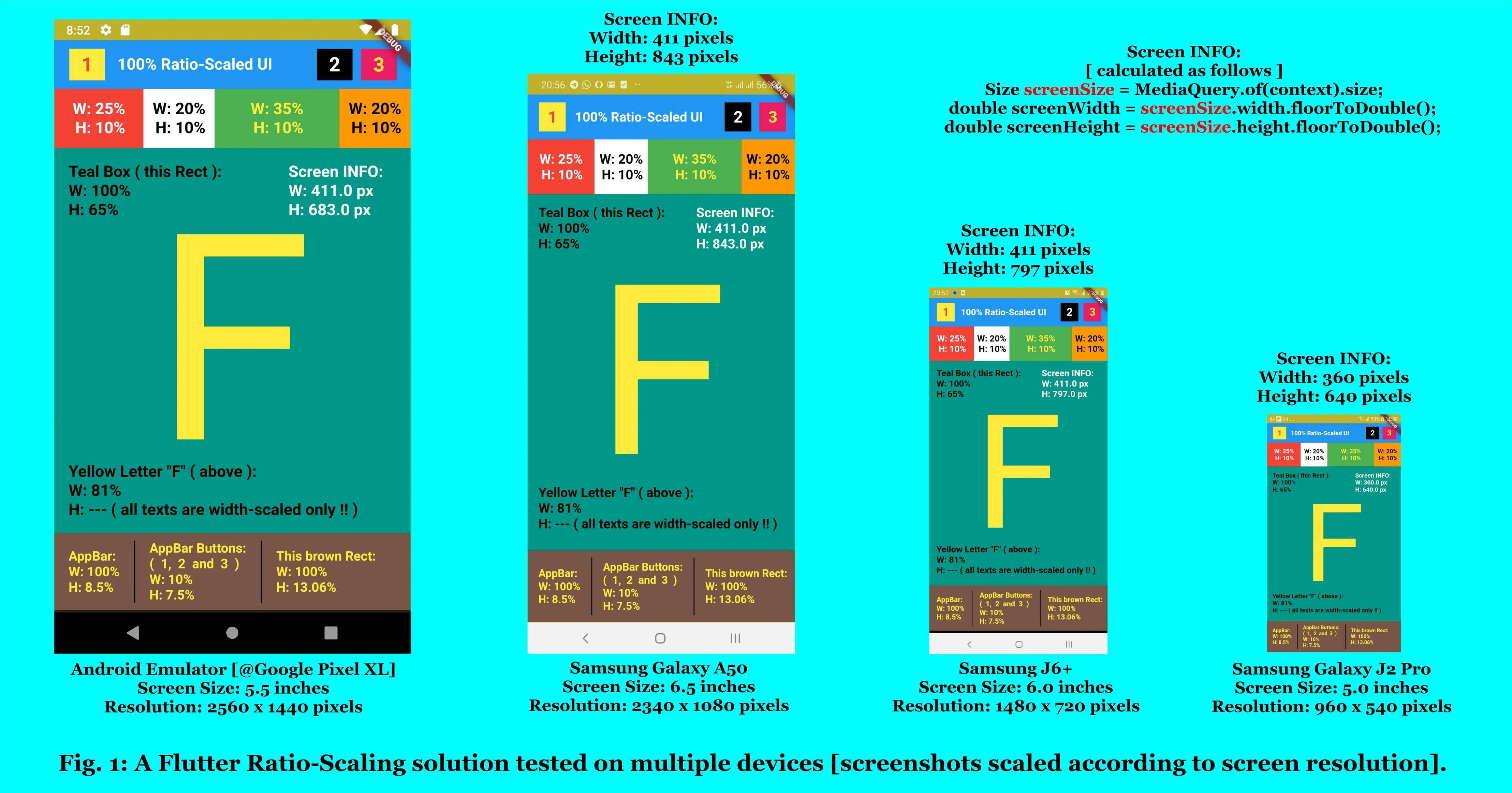
这是我正在尝试制作的UI(目前只有左侧部分):

UI

我现在正在使用的代码可以正常工作。每个项都在一个Container中,其中2个是一个Gridview

          Expanded(
            child: Container(
              child: Column(
                crossAxisAlignment: CrossAxisAlignment.start,
                children: <Widget>[
                  SizedBox(height: 100),
                  Container( // Top text
                    margin: const EdgeInsets.only(left: 20.0),
                    child: Column(
                      crossAxisAlignment: CrossAxisAlignment.start,
                      children: <Widget>[
                        Text("Hey,",
                            style: TextStyle(
                                fontWeight: FontWeight.bold, fontSize: 25)),
                        Text("what's up ?", style: TextStyle(fontSize: 25)),
                        SizedBox(height: 10),
                      ],
                    ),
                  ),
                  Container( // First gridview
                      height: MediaQuery.of(context).size.height/2,
                      child: GridView.count(
                          crossAxisCount: 3,
                          scrollDirection: Axis.horizontal,
                          crossAxisSpacing: 10,
                          mainAxisSpacing: 10,
                          padding: const EdgeInsets.all(10),
                          children: List.generate(9, (index) {
                            return Center(
                                child: ButtonTheme(
                                    minWidth: 100.0,
                                    height: 125.0,
                                    child: RaisedButton(
                                      splashColor: Color.fromRGBO(230, 203, 51, 1),
                                        color: (index!=0)?Colors.white:Color.fromRGBO(201, 22, 25, 1),
                                        child: Column(
                                            mainAxisAlignment:
                                                MainAxisAlignment.center,
                                            children: <Widget>[
                                              Image.asset(
                                                'assets/in.png',
                                                fit: BoxFit.cover,
                                              ),
                                              Text("Eat In",
                                                  style: TextStyle(
                                                      fontWeight:
                                                          FontWeight.bold))
                                            ]),
                                        onPressed: () {
                                        },
                                        shape: RoundedRectangleBorder(
                                            borderRadius:
                                                new BorderRadius.circular(
                                                    20.0)))));
                          }))),
                  Container( // Bottom Text
                    margin: const EdgeInsets.only(left: 20.0),
                    child: Column(
                      crossAxisAlignment: CrossAxisAlignment.start,
                      children: <Widget>[
                        SizedBox(height: 10),
                        Text("Popular",
                            style: TextStyle(
                                fontWeight: FontWeight.bold, fontSize: 25)),
                        SizedBox(height: 10),
                      ],
                    ),
                  ),
                  Container( // Second Gridview
                      height: MediaQuery.of(context).size.height/5,
                      child: GridView.count(
                          crossAxisCount: 2,
                          scrollDirection: Axis.horizontal,
                          children: List.generate(9, (index) {
                            return Center(
                                child: ButtonTheme(
                                    minWidth: 100.0,
                                    height: 125.0,
                                    child: FlatButton(
                                        color: Colors.white,
                                        child: Column(
                                            mainAxisAlignment:
                                                MainAxisAlignment.center,
                                            children: <Widget>[
                                              Image.asset(
                                                'assets/logo.png',
                                                fit: BoxFit.cover,
                                              ),
                                              Text("Name")
                                            ]),
                                        onPressed: () {},
                                        shape: RoundedRectangleBorder(
                                            borderRadius:
                                                new BorderRadius.circular(
                                                    20.0)))));
                          })))
                ],
              ),
            ),
            flex: 3,
          )

如何确保代码能够适应更小的屏幕高度,以达到最佳实践?

5个回答

6

比例缩放解决方案 [Flutter 移动应用程序]

我相信您正在寻找一种缩放解决方案,它在适应不同屏幕密度时保持 UI 比例(即比率)完好无损。实现这一目标的方法是将比例缩放解决方案应用于您的项目。[点击下面的图片以获得更好的视图]

enter image description here


比例缩放流程概述:

第 1 步: 在像素级别上定义一个固定的缩放比例 [高:宽 => 2:1 的比例]。
第 2 步: 指定您的应用程序是否为全屏应用程序(即定义状态栏在高度缩放中是否起作用)。
第 3 步: 使用以下过程 [代码] 基于百分比缩放整个 UI(从应用栏到最小的文本)。


重要代码单元:
=> McGyver [玩笑:'MacGyver' 的变体] - 负责重要的比例缩放功能的类。

// Imports: Third-Party.
import 'dart:math';
import 'package:flutter/material.dart';
import 'package:flutter/services.dart';

// Imports: Local [internal] packages.
import 'package:pixel_perfect/utils/stringr.dart';
import 'package:pixel_perfect/utils/enums_all.dart';

// Exports: Local [internal] packages.
export 'package:pixel_perfect/utils/enums_all.dart';


// 'McGyver' - the ultimate cool guy (the best helper class any app can ask for).
class McGyver {

  static final TAG_CLASS_ID = "McGyver";

  static double _fixedWidth;    // Defined in pixels !!
  static double _fixedHeight;   // Defined in pixels !!
  static bool _isFullScreenApp = false;   // Define whether app is a fullscreen app [true] or not [false] !!

  static void hideSoftKeyboard() {
    SystemChannels.textInput.invokeMethod("TextInput.hide");
  }

  static double roundToDecimals(double numToRound, int deciPlaces) {

    double modPlus1 = pow(10.0, deciPlaces + 1);
    String strMP1 = ((numToRound * modPlus1).roundToDouble() / modPlus1).toStringAsFixed(deciPlaces + 1);
    int lastDigitStrMP1 = int.parse(strMP1.substring(strMP1.length - 1));

    double mod = pow(10.0, deciPlaces);
    String strDblValRound = ((numToRound * mod).roundToDouble() / mod).toStringAsFixed(deciPlaces);
    int lastDigitStrDVR = int.parse(strDblValRound.substring(strDblValRound.length - 1));

    return (lastDigitStrMP1 == 5 && lastDigitStrDVR % 2 != 0) ? ((numToRound * mod).truncateToDouble() / mod) : double.parse(strDblValRound);
  }

  static Orientation setScaleRatioBasedOnDeviceOrientation(BuildContext ctx) {
    Orientation scaleAxis;
    if(MediaQuery.of(ctx).orientation == Orientation.portrait) {
      _fixedWidth = 420;                  // Ration: 1 [width]
      _fixedHeight = 840;                 // Ration: 2 [height]
      scaleAxis = Orientation.portrait;   // Shortest axis == width !!
    } else {
      _fixedWidth = 840;                   // Ration: 2 [width]
      _fixedHeight = 420;                  // Ration: 1 [height]
      scaleAxis = Orientation.landscape;   // Shortest axis == height !!
    }
    return scaleAxis;
  }

  static int rsIntW(BuildContext ctx, double scaleValue) {

    // -------------------------------------------------------------- //
    // INFO: Ratio-Scaled integer - Scaling based on device's width.  //
    // -------------------------------------------------------------- //

    final double _origVal = McGyver.rsDoubleW(ctx, scaleValue);
    return McGyver.roundToDecimals(_origVal, 0).toInt();
  }

  static int rsIntH(BuildContext ctx, double scaleValue) {

    // -------------------------------------------------------------- //
    // INFO: Ratio-Scaled integer - Scaling based on device's height. //
    // -------------------------------------------------------------- //

    final double _origVal = McGyver.rsDoubleH(ctx, scaleValue);
    return McGyver.roundToDecimals(_origVal, 0).toInt();
  }

  static double rsDoubleW(BuildContext ctx, double wPerc) {

    // ------------------------------------------------------------------------------------------------------- //
    // INFO: Ratio-Scaled double - scaling based on device's screen width in relation to fixed width ration.   //
    // INPUTS: - 'ctx'     [context] -> BuildContext                                                           //
    //         - 'wPerc'   [double]  -> Value (as a percentage) to be ratio-scaled in terms of width.          //
    // OUTPUT: - 'rsWidth' [double]  -> Ratio-scaled value.                                                    //
    // ------------------------------------------------------------------------------------------------------- //

    final int decimalPlaces = 14;   //* NB: Don't change this value -> has big effect on output result accuracy !!

    Size screenSize = MediaQuery.of(ctx).size;                  // Device Screen Properties (dimensions etc.).
    double scrnWidth = screenSize.width.floorToDouble();        // Device Screen maximum Width (in pixels).

    McGyver.setScaleRatioBasedOnDeviceOrientation(ctx);   //* Set Scale-Ratio based on device orientation.

    double rsWidth = 0;   //* OUTPUT: 'rsWidth' == Ratio-Scaled Width (in pixels)
    if (scrnWidth == _fixedWidth) {

      //* Do normal 1:1 ratio-scaling for matching screen width (i.e. '_fixedWidth' vs. 'scrnWidth') dimensions.
      rsWidth = McGyver.roundToDecimals(scrnWidth * (wPerc / 100), decimalPlaces);

    } else {

      //* Step 1: Calculate width difference based on width scale ration (i.e. pixel delta: '_fixedWidth' vs. 'scrnWidth').
      double wPercRatioDelta = McGyver.roundToDecimals(100 - ((scrnWidth / _fixedWidth) * 100), decimalPlaces);   // 'wPercRatioDelta' == Width Percentage Ratio Delta !!

      //* Step 2: Calculate primary ratio-scale adjustor (in pixels) based on input percentage value.
      double wPxlsInpVal = (wPerc / 100) * _fixedWidth;   // 'wPxlsInpVal' == Width in Pixels of Input Value.

      //* Step 3: Calculate secondary ratio-scale adjustor (in pixels) based on primary ratio-scale adjustor.
      double wPxlsRatDelta = (wPercRatioDelta / 100) * wPxlsInpVal;   // 'wPxlsRatDelta' == Width in Pixels of Ratio Delta (i.e. '_fixedWidth' vs. 'scrnWidth').

      //* Step 4: Finally -> Apply ratio-scales and return value to calling function / instance.
      rsWidth = McGyver.roundToDecimals((wPxlsInpVal - wPxlsRatDelta), decimalPlaces);

    }
    return rsWidth;
  }

  static double rsDoubleH(BuildContext ctx, double hPerc) {

    // ------------------------------------------------------------------------------------------------------- //
    // INFO: Ratio-Scaled double - scaling based on device's screen height in relation to fixed height ration. //
    // INPUTS: - 'ctx'      [context] -> BuildContext                                                          //
    //         - 'hPerc'    [double]  -> Value (as a percentage) to be ratio-scaled in terms of height.        //
    // OUTPUT: - 'rsHeight' [double]  -> Ratio-scaled value.                                                   //
    // ------------------------------------------------------------------------------------------------------- //

    final int decimalPlaces = 14;   //* NB: Don't change this value -> has big effect on output result accuracy !!

    Size scrnSize = MediaQuery.of(ctx).size;                  // Device Screen Properties (dimensions etc.).
    double scrnHeight = scrnSize.height.floorToDouble();      // Device Screen maximum Height (in pixels).
    double statsBarHeight = MediaQuery.of(ctx).padding.top;   // Status Bar Height (in pixels).

    McGyver.setScaleRatioBasedOnDeviceOrientation(ctx);   //* Set Scale-Ratio based on device orientation.

    double rsHeight = 0;   //* OUTPUT: 'rsHeight' == Ratio-Scaled Height (in pixels)
    if (scrnHeight == _fixedHeight) {

      //* Do normal 1:1 ratio-scaling for matching screen height (i.e. '_fixedHeight' vs. 'scrnHeight') dimensions.
      rsHeight = McGyver.roundToDecimals(scrnHeight * (hPerc / 100), decimalPlaces);

    } else {

      //* Step 1: Calculate height difference based on height scale ration (i.e. pixel delta: '_fixedHeight' vs. 'scrnHeight').
      double hPercRatioDelta = McGyver.roundToDecimals(100 - ((scrnHeight / _fixedHeight) * 100), decimalPlaces);   // 'hPercRatioDelta' == Height Percentage Ratio Delta !!

      //* Step 2: Calculate height of Status Bar as a percentage of the height scale ration (i.e. 'statsBarHeight' vs. '_fixedHeight').
      double hPercStatsBar = McGyver.roundToDecimals((statsBarHeight / _fixedHeight) * 100, decimalPlaces);   // 'hPercStatsBar' == Height Percentage of Status Bar !!

      //* Step 3: Calculate primary ratio-scale adjustor (in pixels) based on input percentage value.
      double hPxlsInpVal = (hPerc / 100) * _fixedHeight;   // 'hPxlsInpVal' == Height in Pixels of Input Value.

      //* Step 4: Calculate secondary ratio-scale adjustors (in pixels) based on primary ratio-scale adjustor.
      double hPxlsStatsBar = (hPercStatsBar / 100) * hPxlsInpVal;     // 'hPxlsStatsBar' == Height in Pixels of Status Bar.
      double hPxlsRatDelta = (hPercRatioDelta / 100) * hPxlsInpVal;   // 'hPxlsRatDelta' == Height in Pixels of Ratio Delat (i.e. '_fixedHeight' vs. 'scrnHeight').

      //* Step 5: Check if '_isFullScreenApp' is true and adjust 'Status Bar' scalar accordingly.
      double hAdjStatsBarPxls = _isFullScreenApp ? 0 : hPxlsStatsBar;   // Set to 'zero' if FULL SCREEN APP !!

      //* Step 6: Finally -> Apply ratio-scales and return value to calling function / instance.
      rsHeight = McGyver.roundToDecimals(hPxlsInpVal - (hPxlsRatDelta + hAdjStatsBarPxls), decimalPlaces);

    }
    return rsHeight;
  }

  static Widget rsWidget(BuildContext ctx, Widget inWidget,
                    double percWidth, double percHeight, {String viewID}) {

    // ---------------------------------------------------------------------------------------------- //
    // INFO: Ratio-Scaled "SizedBox" Widget - Scaling based on device's width & height.         //
    // ---------------------------------------------------------------------------------------------- //

    return SizedBox(
      width: Scalar.rsDoubleW(ctx, percWidth),
      height: Scalar.rsDoubleH(ctx, percHeight),
      child: inWidget,
    );
  }

  //* SPECIAL 'rsWidget' that has both its height & width ratio-scaled based on 'width' alone !!
  static Widget rsWidgetW(BuildContext ctx, Widget inWidget,
                    double percWidth, double percHeight, {String viewID}) {

    // ---------------------------------------------------------------------------------------------- //
    // INFO: Ratio-Scaled "SizedBox" Widget - Scaling based on device's width ONLY !!          //
    // ---------------------------------------------------------------------------------------------- //

    return SizedBox(
      width: Scalar.rsDoubleW(ctx, percWidth),
      height: Scalar.rsDoubleW(ctx, percHeight),
      child: inWidget,
    );
  }

  static Widget rsText(BuildContext ctx, String text, {double fontSize,
                      Color textColor, Anchor txtLoc, FontWeight fontWeight}) {

    // ---------------------------------------------------------------------------------------- //
    // INFO: Ratio-Scaled Text Widget - Default Font Weight == NORMAL !!                        //
    // ---------------------------------------------------------------------------------------- //

    // Scale the Font Size (based on device's screen width).
    double txtScaleFactor = MediaQuery.of(ctx).textScaleFactor;
    double _rsFontSize = (fontSize != null) ? McGyver.rsDoubleW(ctx, fontSize) : McGyver.rsDoubleW(ctx, 2.5);

    TextAlign _txtLoc;
    if (txtLoc == Anchor.left) {
      _txtLoc = TextAlign.left;
    } else if (txtLoc == Anchor.middle) {
      _txtLoc = TextAlign.center;
    } else {
      _txtLoc = TextAlign.right;
    }

    return Text(
      text,
      textAlign: _txtLoc,
      style: TextStyle(
        fontFamily: Stringr.strAppFontFamily,
        fontSize: (_rsFontSize / txtScaleFactor) * 1.0,
        color: (textColor != null) ? textColor : Colors.black,
        fontWeight: (fontWeight != null) ? fontWeight : FontWeight.normal,
      ),
    );
  }

}

McGyver类涵盖了所述的比例缩放过程下的步骤1和2。接下来要做的就是按照以下方式在构建过程中应用第3步...

AppBar代码片段: [创建上面图片 - 图1 - 中的AppBar的代码]

Container(
  color: Colors.blue[500],
  width: McGyver.rsDoubleW(con, 100.5),
  height: McGyver.rsDoubleH(con, 8.5),
  child: Row(
    children: <Widget>[
      //* Hamburger Button => Button 1.
      Padding(
        padding: EdgeInsets.fromLTRB(_padLeft, _padTop, 0, _padBottom),
        child: Container(
          color: Colors.yellow,
          width: _appBarBtnsWidth,
          height: _appBarBtnsHeight,
          child: Center(child: McGyver.rsText(context, "1", fontSize: 5.5, fontWeight: FontWeight.bold, textColor: Colors.red),),
        ),
      ),
      //* AppBar Info Text (center text).
      Padding(
        padding: EdgeInsets.only(left: McGyver.rsDoubleW(con, 3.5), right: McGyver.rsDoubleW(con, 3.5)),
        child: Container(
          // color: Colors.pink,
          width: McGyver.rsDoubleW(context, 52.5),
          child: McGyver.rsText(con, "100% Ratio-Scaled UI", fontSize: 4.5, textColor: Colors.white, fontWeight: FontWeight.bold, txtLoc: Anchor.left),
        ),
      ),
      //* Right Button Group - LEFT Button => Button 2.
      Padding(
        padding: EdgeInsets.fromLTRB(McGyver.rsDoubleW(con, 0), _padTop, McGyver.rsDoubleH(con, 1.5), _padBottom),
        child: Container(
          color: Colors.black,
          width: _appBarBtnsWidth,
          height: _appBarBtnsHeight,
          child: Center(child: McGyver.rsText(context, "2", fontSize: 5.5, fontWeight: FontWeight.bold, textColor: Colors.white),),
        ),
      ),
      //* Right Button Group - RIGHT Button => Button 3.
      Padding(
        padding: EdgeInsets.fromLTRB(McGyver.rsDoubleW(con, 0), _padTop, 0, _padBottom),
        child: Container(
          color: Colors.pink,
          width: _appBarBtnsWidth,
          height: _appBarBtnsHeight,
          child: Center(child: McGyver.rsText(context, "3", fontSize: 5.5, fontWeight: FontWeight.bold, textColor: Colors.yellow),),
        ),
      ),
    ],
  ),
),
比例缩放代码的局限性
这种比例缩放方案在所有测试的设备上(7个物理设备和1个模拟器)都表现出了惊人的效果,但它显然存在以下几个问题:

  1. 文本
  2. 填充
  3. 边缘纵横比
  • 文本缩放因子被取消(由此代码停用),所以在使用McGyver.rsText()功能时文本不使用SP。您希望您的UI在任何比例或屏幕密度下具有准确的比例。
  • 在Flutter(以及Android一般)中,填充存在一些奇怪的缩放[在幕后发生的]。
  • 极其奇怪的纵横比(即宽高像素密度)的设备也会导致UI的比例略微失真。

除了这三个问题外,这种比例缩放方法对我来说已经足够好,可以在我所有的flutter项目中作为唯一的缩放解决方案。我希望它能帮助其他和我一样探索的程序员。欢迎对这种方法/代码进行任何改进。


2
对不起,这是一个过度工程化的结果,可能存在数百个潜在的错误。 - Oliver Dixon
5
@OliverDixon - 嗯,很明显UX规模对你来说不是一个严重的问题。所以请尽管使用更加简洁的代码解决方案,这样你就可以更容易地处理 - 但在你继续之前,请帮我列出几个可能存在的bug(2或3个就够了),因为我非常感谢所有能够改进我目前可用解决方案的意见。谢谢提前 :) - SilSur

1

最好使用MediaQuery.of(context).size,因为在使用外部包时,您将无法维护小部件的大小以适应方向更改,这可能是一个很大的缺点,如果您的应用程序需要方向更改以获得更好的视觉效果:

Widget build(BuildContext context) {
AppBar appBar = AppBar(title: const Text("Home"));
height = MediaQuery.of(context).size.height -
    appBar.preferredSize.height -
    MediaQuery.of(context).padding.top; // for responsive adjustment
width = MediaQuery.of(context).size.width; // for responsive adjustment
debugPrint("$height, width: ${MediaQuery.of(context).size.width}");
return Scaffold(appBar: appBar, body: ResponsivePage(height,width));
}

1
使用flutter小部件LayoutBuilder时,每次使用它都会给您一个BoxConstraint,它可以告诉您可用于下一级小部件的空间(maxHeight、maxWidth等),您可以使用该详细信息来在子元素之间划分空间。 例如 如果您想将可用宽度分为3个Containers,请执行以下操作:
Row(
          children: <Widget>[
            Container(
              width: constraints.maxWidth / 3,
            ),
            Container(
              width: constraints.maxWidth / 3,
            ),
            Container(
              width: constraints.maxWidth / 3,
            ),
          ],
        ),

您可以使用相同的方式改变字体大小。

0

看一下这个包: https://pub.dev/packages/scaled_app

runAppScaled替换runApp,整个UI将自动缩放。

当你想快速适应不同的屏幕尺寸时,非常有帮助。


0
使用sizedbox.expandFittedBox小部件的完美解决方案。
   class ScalingBox extends StatelessWidget {
      @override
      Widget build(BuildContext context) {
        double logicWidth = 600;
        double logicHeight = 600;
        return SizedBox.expand(
            child: Container(
                color: Colors.blueGrey,
                child: FittedBox(
                    fit: BoxFit.contain,
                    alignment: Alignment.center,
                    child: SizedBox(
                      width: logicWidth,
                      height: logicHeight,
                      child: Contents(),// your content here
                    ))));
      }
    }

我在一篇文章中找到了它。 https://stasheq.medium.com/scale-whole-app-or-widget-contents-to-a-screen-size-in-flutter-e3be161b5ab4

网页内容由stack overflow 提供, 点击上面的
可以查看英文原文,
原文链接