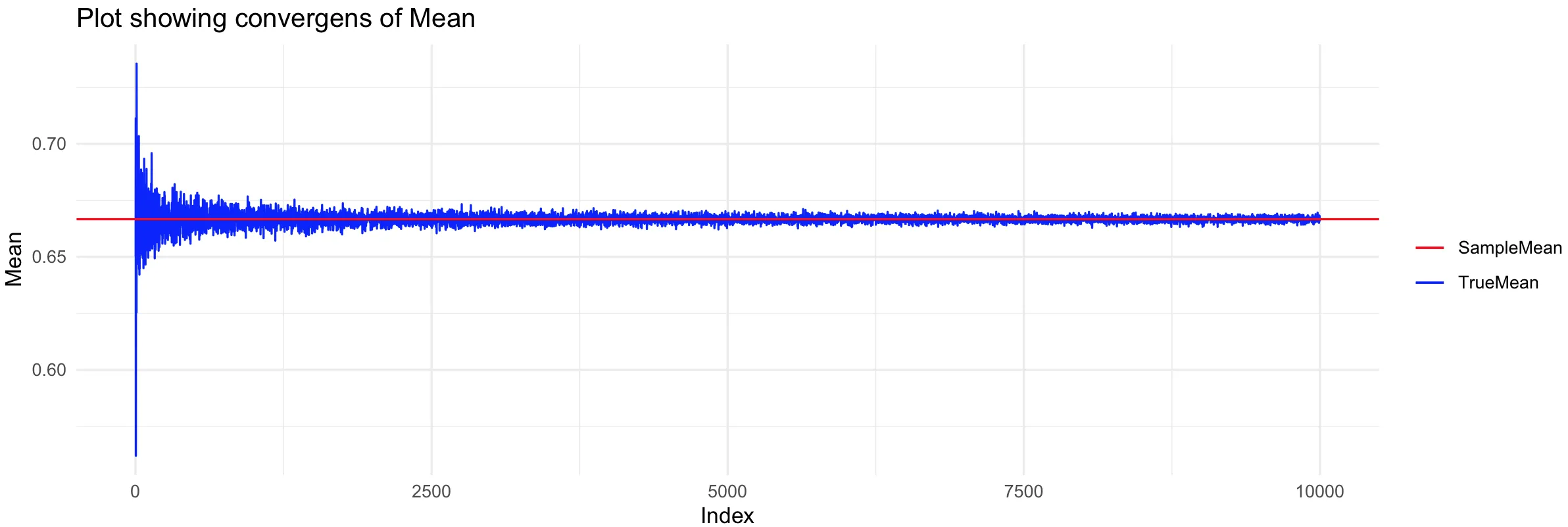
经过昨天和今天的网上搜索,我唯一找到一个让图例正常工作的方法是遵循'Brian Diggs'在这篇文章中提供的解决方案: Add legend to ggplot2 line plot
这给了我以下代码:
library(ggplot2)
ggplot()+
  geom_line(data=myDf, aes(x=count, y=mean, color="TrueMean"))+
  geom_hline(yintercept = myTrueMean, color="SampleMean")+
  scale_colour_manual("",breaks=c("SampleMean", "TrueMean"),values=c("red","blue"))+
  labs(title = "Plot showing convergens of Mean", x="Index", y="Mean")+
  theme_minimal()
如果我删除hline的颜色,一切都可以正常工作,但是如果我添加一个不是实际颜色的值(例如"SampleMean")到hline的颜色中,我会收到一个错误,指出它不是颜色(仅适用于hline)。
如何添加一个如此常见的图例却成为一个大问题?一定有更简单的方法吗?
要创建原始数据:
#Initial variables
myAlpha=2
myBeta=2
successes=14
n=20
fails=n-successes

#Posterior values
postAlpha=myAlpha+successes
postBeta=myBeta+fails

#Calculating the mean and SD
myTrueMean=(myAlpha+successes)/(myAlpha+successes+myBeta+fails)
myTrueSD=sqrt(((myAlpha+successes)*(myBeta+fails))/((myAlpha+successes+myBeta+fails)^2*(myAlpha+successes+myBeta+fails+1)))

#Simulate the data
simulateBeta=function(n,tmpAlpha,tmpBeta){
  tmpValues=rbeta(n, tmpAlpha, tmpBeta)
  tmpMean=mean(tmpValues)
  tmpSD=sd(tmpValues)
  returnVector=c(count=n, mean=tmpMean, sd=tmpSD)
  return(returnVector)
}

#Make a df for the data
myDf=data.frame(t(sapply(2:10000, simulateBeta, postAlpha, postBeta)))