我遇到了以下问题:
我想在一个图中显示时间序列的不同特征(具有多个子图),为了对齐图表区域和方便创建,我使用ggplot2及其facet_grid函数。
然而,我只想更改一个坐标轴标签(例如,将上部图形更改为百分比)。
此外,我希望调整每个图的高度,使上部图大约是下部图的两倍大小。
非常感谢您的帮助!
示例:
这将导致类似于以下内容的结果: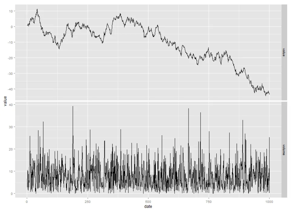
我想在一个图中显示时间序列的不同特征(具有多个子图),为了对齐图表区域和方便创建,我使用ggplot2及其facet_grid函数。
然而,我只想更改一个坐标轴标签(例如,将上部图形更改为百分比)。
此外,我希望调整每个图的高度,使上部图大约是下部图的两倍大小。
非常感谢您的帮助!
示例:
require(ggplot2)

#simulate some data
df <- data.frame(date=c(1:1000),
              value=cumsum(rnorm(1000)),
              volume=abs(rnorm(1000)*10))

#melt for ggplot
df_melt <- melt(df, id=c("date"),measure.vars=c("value","volume"))

#plot
ggplot(df_melt, aes(x=date, y=value)) + geom_line() +
       facet_grid(variable~., scales = "free")
这将导致类似于以下内容的结果:
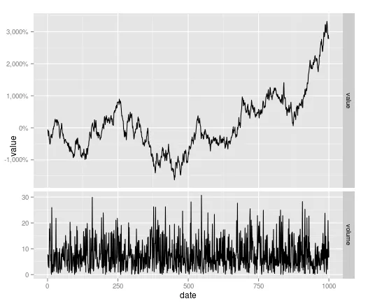
g <- ggplotGrob(p) ;g$heights[[3]] <- unit(2, "null") ; grid:::grid.draw(g),(其中p是您的绘图)。问题1)这可能会有所帮助,基本思路是覆盖其中一个轴标签。 - user20650