如问题所建议的,可能的解决方案可以在
vspan函数中找到。然而,使用
hspan为y轴添加多个阴影区域似乎更容易,而对于x轴的情况则需要进行一些微调。后者需要更多的细节调整。在我的建议解决方案之后可以找到更多详细信息。
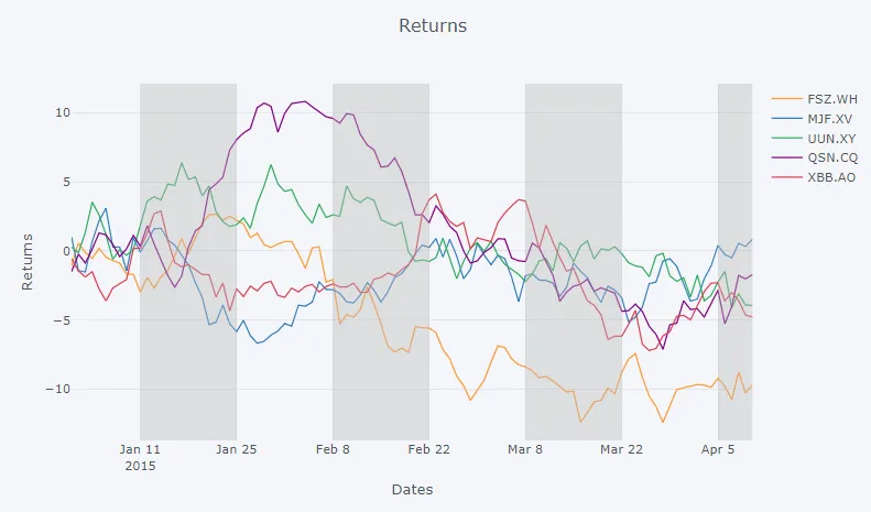
以下图表由下面的代码片段和函数
multiShades生成:
图表:
代码片段:
import plotly
import cufflinks as cf
from plotly.offline import download_plotlyjs, init_notebook_mode, plot, iplot
import pandas as pd
import numpy as np
from IPython.display import HTML
from IPython.core.display import display, HTML
import copy
init_notebook_mode(connected=True)
np.random.seed(123)
cf.set_config_file(theme='pearl')
df = cf.datagen.lines()
fig = df.iplot(asFigure=True, kind='scatter',
xTitle='Dates',yTitle='Returns',title='Returns',
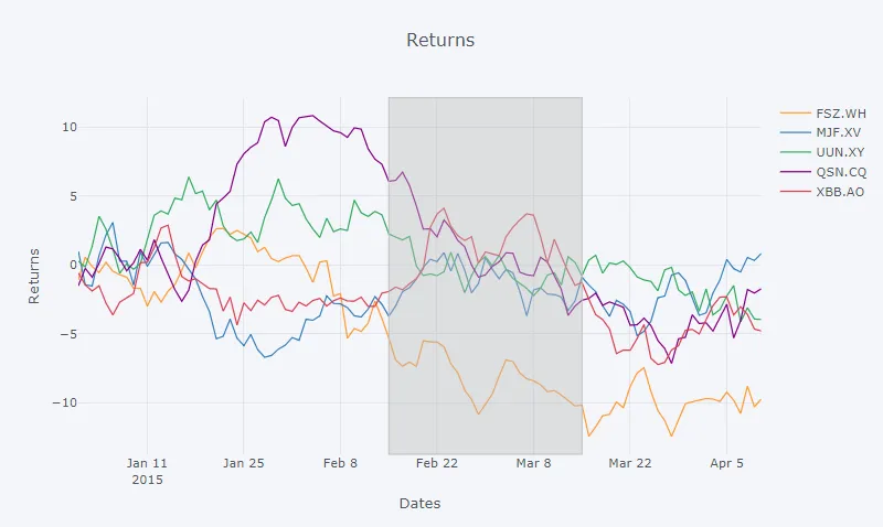
vspan={'x0':'2015-01-11','x1':'2015-02-22','color':'rgba(30,30,30,0.3)','fill':True,'opacity':.4})
xStart = ['2015-01-11', '2015-02-08', '2015-03-08', '2015-04-05']
xStop = ['2015-01-25', '2015-02-22', '2015-03-22', '2015-04-10']
def multiShades(plot, x0, x1):
""" Adds shaded areas for specified dates in a plotly plot.
The lines of the areas are set to transparent using rgba(0,0,0,0)
"""
x0 = xStart
x1 = xStop
xElem = fig['layout']['shapes'][0]
shp_lst=[]
for i in range(0,len(x0)):
shp_lst.append(copy.deepcopy(xElem))
shp_lst[i]['x0'] = x0[i]
shp_lst[i]['x1'] = x1[i]
shp_lst[i]['line']['color'] = 'rgba(0,0,0,0)'
fig['layout']['shapes']= tuple(shp_lst)
return(fig)
fig = multiShades(plot=fig, x0=xStart, x1=xStop)
iplot(fig)
一些细节:
函数vspan将以字典形式填充元组fig['layout']['shapes']:
{'fillcolor': 'rgba(187, 187, 187, 0.4)',
 'line': {'color': '#BBBBBB', 'dash': 'solid', 'width': 1},
 'type': 'rect',
 'x0': '2015-01-11',
 'x1': '2015-02-22',
 'xref': 'x',
 'y0': 0,
 'y1': 1,
 'yref': 'paper'}
我的函数只是简单地接受那个字典,制作多个副本,根据函数参数编辑这些副本,并用函数的新元组替换原始元组。
挑战:
当添加更多形状时,这种方法可能会变得有点棘手。此外,日期必须硬编码 - 至少在有人找到
如何检索主刻度和网格线的值?的答案之前。
plotly顶部使用的cufflinks无法进行这些更改。 - El Ruso