用R绘制世界地图

4

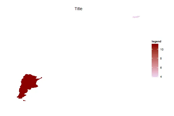
我正在尝试使用 R 和 ggplot2 来在世界地图上可视化一些国家的数据。我正在使用以下代码(示例):

WorldData <- map_data('world')
df <-data.frame(region=c('Hungary','Lithuania','Argentina'),value=c(4,10,11))
Total <- merge(WorldData,df,by='region')

并且用ggplot绘制图表:

p <- ggplot()
p <- p + geom_polygon(data=Total, aes(x=long, y=lat, group = group,fill=Total$value),colour="white") + 
         scale_fill_continuous(low = "thistle2", high = "darkred", guide="colorbar")
P1 <- p + theme_bw()  + labs(fill = "legend" ,title = "Title", x="", y="")
P1 + scale_y_continuous(breaks=c()) + scale_x_continuous(breaks=c()) + theme(panel.border =  element_blank())

输出如下所示: enter image description here 
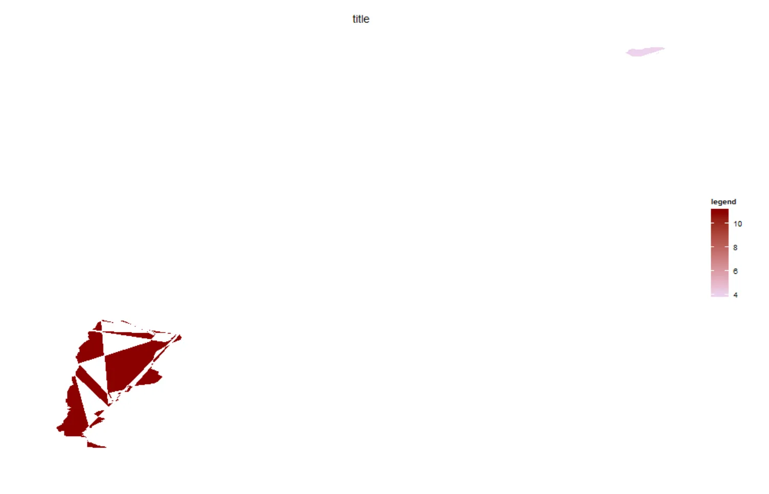
我认为问题出在`merge`中,因为当我将`geom_polygon`中的数据选项更改为`WorldData`,将`fill`选项更改为`1`时,我得到了以下结果: enter image description here 
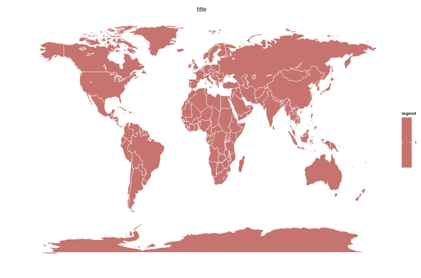
这是因为我在`df`中没有所有国家的数据吗? 我该如何解决这个问题?
编辑:我想绘制整张地图。(我的描述不够清晰)
3个回答

11

您也可以像其他GIS环境一样使用“图层”(这也将使您无需合并数据)。 这可以通过许多方式实现,但我喜欢使用geom_map

library(ggplot2)
library(dplyr)

WorldData <- map_data('world') %>% filter(region != "Antarctica") %>% fortify

df <- data.frame(region=c('Hungary','Lithuania','Argentina'), 
                 value=c(4,10,11), 
                 stringsAsFactors=FALSE)

p <- ggplot() +
    geom_map(data = WorldData, map = WorldData,
                  aes(x = long, y = lat, group = group, map_id=region),
                  fill = "white", colour = "#7f7f7f", size=0.5) + 
    geom_map(data = df, map=WorldData,
                  aes(fill=value, map_id=region),
                  colour="#7f7f7f", size=0.5) +
    coord_map("rectangular", lat0=0, xlim=c(-180,180), ylim=c(-60, 90)) +
    scale_fill_continuous(low="thistle2", high="darkred", guide="colorbar") +
    scale_y_continuous(breaks=c()) +
    scale_x_continuous(breaks=c()) +
    labs(fill="legend", title="Title", x="", y="") +
    theme_bw()
p 

还有一个投影(通过coord_map)以便您获得一致的输出并消除南极洲。


太棒了!我一整天都在尝试制作这个,只有一个问题,我的地图缺少一些国家的信息,我希望它们显示为灰色或其他颜色,我该怎么做? - esteban

3
问题在于每个多边形中的点的顺序。需要按顺序绘制WorldData中的点(这部分由order列部分表示),而merge不会保留这个顺序。您可以通过添加以下行来解决这个问题:
Total <- Total[order(Total$order), ]

在你的绘图之前,需要对Total数据框按照order列进行升序排序。

2
这是因为merge()在合并之前会对数据进行排序,但要正确绘制多边形,需要保留原始地图数据的顺序。与其使用合并,建议像这样构建数据框:
Total <- WorldData[WorldData$region %in% df$region, ]
Total$value <- df$value[match(Total$region, df$region)]

完整代码如下:
library(ggplot2)
library(maps)

WorldData <- map_data('world')
head(WorldData, 100)
df <-data.frame(region=c('Hungary','Lithuania','Argentina'),value=c(4,10,11))

Total <- WorldData[WorldData$region %in% df$region, ]
Total$value <- df$value[match(Total$region, df$region)]

ggplot(Total, aes(x=long, y=lat, group = group, fill = value)) + 
  geom_polygon(colour = "white") +
  scale_fill_continuous(low = "thistle2", 
                        high = "darkred", 
                        guide="colorbar") +
  theme_bw()  + 
  labs(fill = "legend" ,title = "Title", x="", y="") +
  scale_y_continuous(breaks=c()) + 
  scale_x_continuous(breaks=c()) + 
  theme(panel.border =  element_blank())

enter image description here


网页内容由stack overflow 提供, 点击上面的
可以查看英文原文,
原文链接