我需要画一张有多条边(不同权重)指向同一节点的有向图。也就是说,我有节点A和B,以及边(A,B)长度为2和边(B,A)长度为3。
我已经尝试了使用G=nx.Digraph和G=nx.Multidigraph两种方式。当我绘制图形时,我只能看到一条边和一个标签。
是否有任何方法可以解决这个问题?
我需要画一张有多条边(不同权重)指向同一节点的有向图。也就是说,我有节点A和B,以及边(A,B)长度为2和边(B,A)长度为3。
我已经尝试了使用G=nx.Digraph和G=nx.Multidigraph两种方式。当我绘制图形时,我只能看到一条边和一个标签。
是否有任何方法可以解决这个问题?
import matplotlib.pyplot as plt
import networkx as nx
G = nx.DiGraph()
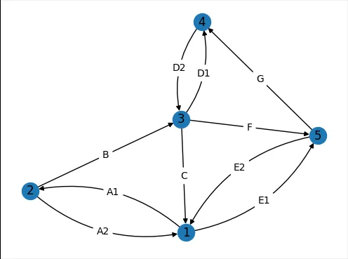
edge_list = [(1,2,{'w':'A1'}),(2,1,{'w':'A2'}),(2,3,{'w':'B'}),(3,1,{'w':'C'}),
(3,4,{'w':'D1'}),(4,3,{'w':'D2'}),(1,5,{'w':'E1'}),(5,1,{'w':'E2'}),
(3,5,{'w':'F'}),(5,4,{'w':'G'})]
G.add_edges_from(edge_list)
pos=nx.spring_layout(G,seed=5)
fig, ax = plt.subplots()
nx.draw_networkx_nodes(G, pos, ax=ax)
nx.draw_networkx_labels(G, pos, ax=ax)
fig.savefig("1.png", bbox_inches='tight',pad_inches=0)
NetworkX的draw_networkx_edges函数能够通过edgelist参数仅绘制部分边缘。为了使用这个功能,我们将边缘分成两个列表并分别绘制它们。感谢AMangipinto's answer提供的connectionstyle='arc3, rad = 0.1'。
curved_edges = [edge for edge in G.edges() if reversed(edge) in G.edges()]
straight_edges = list(set(G.edges()) - set(curved_edges))
nx.draw_networkx_edges(G, pos, ax=ax, edgelist=straight_edges)
arc_rad = 0.25
nx.draw_networkx_edges(G, pos, ax=ax, edgelist=curved_edges, connectionstyle=f'arc3, rad = {arc_rad}')
fig.savefig("2.png", bbox_inches='tight',pad_inches=0)
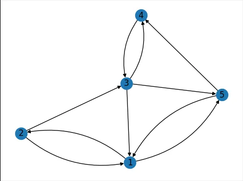
NetworkX的draw_networkx_edge_labels函数假设边是直线,没有参数可以改变这一点。由于NetworkX是开源的,我复制了该函数并创建了一个修改过的my_draw_networkx_edge_labels函数。此函数在附录中。
假设您将此函数保存到名为my_networkx.py的文件中,您可以按如下方式绘制边标签:
import my_networkx as my_nx
edge_weights = nx.get_edge_attributes(G,'w')
curved_edge_labels = {edge: edge_weights[edge] for edge in curved_edges}
straight_edge_labels = {edge: edge_weights[edge] for edge in straight_edges}
my_nx.my_draw_networkx_edge_labels(G, pos, ax=ax, edge_labels=curved_edge_labels,rotate=False,rad = arc_rad)
nx.draw_networkx_edge_labels(G, pos, ax=ax, edge_labels=straight_edge_labels,rotate=False)
fig.savefig("3.png", bbox_inches='tight',pad_inches=0)
我们再次将曲线与直线分开。结果是这个答案中的第一张图。
NetworkX的draw_networkx_edge_labels函数假定边是直线,找到标签的位置:
(x, y) = (
    x1 * label_pos + x2 * (1.0 - label_pos),
    y1 * label_pos + y2 * (1.0 - label_pos),
)
ctrl_1):
由于这个定义,函数该曲线被创建为使中间控制点(C1)位于从起始点(C0)和结束点(C2)等距离的位置,并且C1到连接C0-C2的线的距离是C0-C2距离的rad倍。
my_draw_networkx_edge_labels需要一个额外的参数叫做rad。pos_1 = ax.transData.transform(np.array(pos[n1]))
pos_2 = ax.transData.transform(np.array(pos[n2]))
linear_mid = 0.5*pos_1 + 0.5*pos_2
d_pos = pos_2 - pos_1
rotation_matrix = np.array([(0,1), (-1,0)])
ctrl_1 = linear_mid + rad*rotation_matrix@d_pos
以“ax.transData”开头的函数是必需的,因为轴域中的90度角与显示中的90度角不对应。因此,我们必须将坐标转换到显示坐标系中并从中进行转换。
bezier_mid可以使用贝塞尔曲线规则计算:
ctrl_mid_1 = 0.5*pos_1 + 0.5*ctrl_1
ctrl_mid_2 = 0.5*pos_2 + 0.5*ctrl_1
bezier_mid = 0.5*ctrl_mid_1 + 0.5*ctrl_mid_2
(x, y) = ax.transData.inverted().transform(bezier_mid)
my_draw_networkx_edge_labels:def my_draw_networkx_edge_labels(
G,
pos,
edge_labels=None,
label_pos=0.5,
font_size=10,
font_color="k",
font_family="sans-serif",
font_weight="normal",
alpha=None,
bbox=None,
horizontalalignment="center",
verticalalignment="center",
ax=None,
rotate=True,
clip_on=True,
rad=0
):
"""Draw edge labels.
Parameters
----------
G : graph
A networkx graph
pos : dictionary
A dictionary with nodes as keys and positions as values.
Positions should be sequences of length 2.
edge_labels : dictionary (default={})
Edge labels in a dictionary of labels keyed by edge two-tuple.
Only labels for the keys in the dictionary are drawn.
label_pos : float (default=0.5)
Position of edge label along edge (0=head, 0.5=center, 1=tail)
font_size : int (default=10)
Font size for text labels
font_color : string (default='k' black)
Font color string
font_weight : string (default='normal')
Font weight
font_family : string (default='sans-serif')
Font family
alpha : float or None (default=None)
The text transparency
bbox : Matplotlib bbox, optional
Specify text box properties (e.g. shape, color etc.) for edge labels.
Default is {boxstyle='round', ec=(1.0, 1.0, 1.0), fc=(1.0, 1.0, 1.0)}.
horizontalalignment : string (default='center')
Horizontal alignment {'center', 'right', 'left'}
verticalalignment : string (default='center')
Vertical alignment {'center', 'top', 'bottom', 'baseline', 'center_baseline'}
ax : Matplotlib Axes object, optional
Draw the graph in the specified Matplotlib axes.
rotate : bool (deafult=True)
Rotate edge labels to lie parallel to edges
clip_on : bool (default=True)
Turn on clipping of edge labels at axis boundaries
Returns
-------
dict
`dict` of labels keyed by edge
Examples
--------
>>> G = nx.dodecahedral_graph()
>>> edge_labels = nx.draw_networkx_edge_labels(G, pos=nx.spring_layout(G))
Also see the NetworkX drawing examples at
https://networkx.org/documentation/latest/auto_examples/index.html
See Also
--------
draw
draw_networkx
draw_networkx_nodes
draw_networkx_edges
draw_networkx_labels
"""
import matplotlib.pyplot as plt
import numpy as np
if ax is None:
ax = plt.gca()
if edge_labels is None:
labels = {(u, v): d for u, v, d in G.edges(data=True)}
else:
labels = edge_labels
text_items = {}
for (n1, n2), label in labels.items():
(x1, y1) = pos[n1]
(x2, y2) = pos[n2]
(x, y) = (
x1 * label_pos + x2 * (1.0 - label_pos),
y1 * label_pos + y2 * (1.0 - label_pos),
)
pos_1 = ax.transData.transform(np.array(pos[n1]))
pos_2 = ax.transData.transform(np.array(pos[n2]))
linear_mid = 0.5*pos_1 + 0.5*pos_2
d_pos = pos_2 - pos_1
rotation_matrix = np.array([(0,1), (-1,0)])
ctrl_1 = linear_mid + rad*rotation_matrix@d_pos
ctrl_mid_1 = 0.5*pos_1 + 0.5*ctrl_1
ctrl_mid_2 = 0.5*pos_2 + 0.5*ctrl_1
bezier_mid = 0.5*ctrl_mid_1 + 0.5*ctrl_mid_2
(x, y) = ax.transData.inverted().transform(bezier_mid)
if rotate:
# in degrees
angle = np.arctan2(y2 - y1, x2 - x1) / (2.0 * np.pi) * 360
# make label orientation "right-side-up"
if angle > 90:
angle -= 180
if angle < -90:
angle += 180
# transform data coordinate angle to screen coordinate angle
xy = np.array((x, y))
trans_angle = ax.transData.transform_angles(
np.array((angle,)), xy.reshape((1, 2))
)[0]
else:
trans_angle = 0.0
# use default box of white with white border
if bbox is None:
bbox = dict(boxstyle="round", ec=(1.0, 1.0, 1.0), fc=(1.0, 1.0, 1.0))
if not isinstance(label, str):
label = str(label) # this makes "1" and 1 labeled the same
t = ax.text(
x,
y,
label,
size=font_size,
color=font_color,
family=font_family,
weight=font_weight,
alpha=alpha,
horizontalalignment=horizontalalignment,
verticalalignment=verticalalignment,
rotation=trans_angle,
transform=ax.transData,
bbox=bbox,
zorder=1,
clip_on=clip_on,
)
text_items[(n1, n2)] = t
ax.tick_params(
axis="both",
which="both",
bottom=False,
left=False,
labelbottom=False,
labelleft=False,
)
return text_items
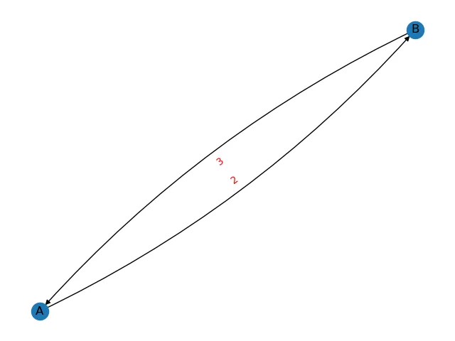
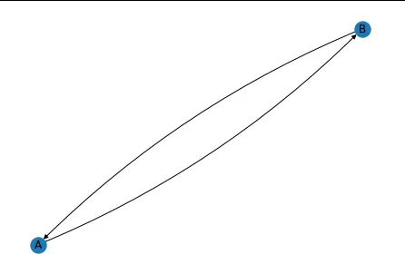
对上面回复的改进是在nx.draw中添加connectionstyle,这可以让我们在图中看到两条平行线:
import networkx as nx
import matplotlib.pyplot as plt
G = nx.DiGraph() #or G = nx.MultiDiGraph()
G.add_node('A')
G.add_node('B')
G.add_edge('A', 'B', length = 2)
G.add_edge('B', 'A', length = 3)

pos = nx.spring_layout(G)
nx.draw(G, pos, with_labels=True, connectionstyle='arc3, rad = 0.1')
edge_labels=dict([((u,v,),d['length'])
             for u,v,d in G.edges(data=True)])

plt.show()
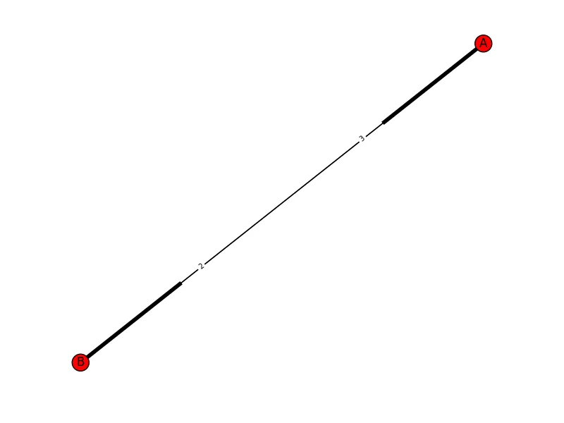
connectionstyle参数和Francesco关于nx.draw_networkx_edge_label的回答。由于权重在中间重叠,只显示一个(但实际上有两个在叠在一起),所以我必须微调label_pos参数。 - mdexp请尝试以下方法:
import networkx as nx
import matplotlib.pyplot as plt
G = nx.DiGraph() #or G = nx.MultiDiGraph()
G.add_node('A')
G.add_node('B')
G.add_edge('A', 'B', length = 2)
G.add_edge('B', 'A', length = 3)

pos = nx.spring_layout(G)
nx.draw(G, pos)
edge_labels=dict([((u,v,),d['length'])
             for u,v,d in G.edges(data=True)])
nx.draw_networkx_edge_labels(G, pos, edge_labels=edge_labels, label_pos=0.3, font_size=7)
plt.show()
这将返回一个带有两条边和边缘上显示长度的图形:
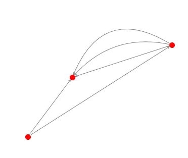
G=nx.MultiGraph ([(1,2),(1,2),(1,2),(3,1),(3,2)])
pos = nx.random_layout(G)
nx.draw_networkx_nodes(G, pos, node_color = 'r', node_size = 100, alpha = 1)
ax = plt.gca()
for e in G.edges:
    ax.annotate("",
                xy=pos[e[0]], xycoords='data',
                xytext=pos[e[1]], textcoords='data',
                arrowprops=dict(arrowstyle="->", color="0.5",
                                shrinkA=5, shrinkB=5,
                                patchA=None, patchB=None,
                                connectionstyle="arc3,rad=rrr".replace('rrr',str(0.3*e[2])
                                ),
                                ),
                )
plt.axis('off')
plt.show()
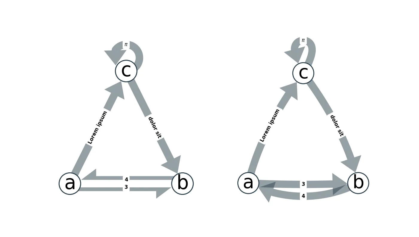
这两种方法都与当前的 networkx 绘图工具不太兼容:
matplotlib 构建的绘图工具,我在我的模块 netgraph 中实现了这两种方法。 netgraph 完全兼容 networkx 和 igraph 图形对象,因此生成漂亮的图形应该很容易且快速。#!/usr/bin/env python
import numpy as np
import matplotlib.pyplot as plt
import networkx as nx
from netgraph import Graph # pip install netgraph
triangle = nx.DiGraph([('a', 'b'), ('a', 'c'), ('b', 'a'), ('c', 'b'), ('c', 'c')])
node_positions = {
'a' : np.array([0.2, 0.2]),
'b' : np.array([0.8, 0.2]),
'c' : np.array([0.5, 0.8]),
}
edge_labels = {
('a', 'b') : 3,
('a', 'c') : 'Lorem ipsum',
('b', 'a') : 4,
('c', 'b') : 'dolor sit',
('c', 'c') : r'$\pi$'
}
fig, (ax1, ax2) = plt.subplots(1, 2, figsize=(14,14))
Graph(triangle, node_labels=True, edge_labels=edge_labels,
edge_label_fontdict=dict(size=12, fontweight='bold'),
node_layout=node_positions, edge_layout='straight',
node_size=6, edge_width=4, arrows=True, ax=ax1)
Graph(triangle, node_labels=True, edge_labels=edge_labels,
edge_label_fontdict=dict(size=12, fontweight='bold'),
node_layout=node_positions, edge_layout='curved',
node_size=6, edge_width=4, arrows=True, ax=ax2)
plt.show()
将以下代码添加到AMangipinto的解决方案中,以在两个方向上添加边缘标签(请参见链接中的图片):
edge_labels = dict([((u, v,), f'{d["length"]}\n\n{G.edges[(v,u)]["length"]}')
                for u, v, d in G.edges(data=True) if pos[u][0] > pos[v][0]])

nx.draw_networkx_edge_labels(G, pos, edge_labels=edge_labels, font_color='red')