使用ggplot绘制两个数值之间的变化条形图

3
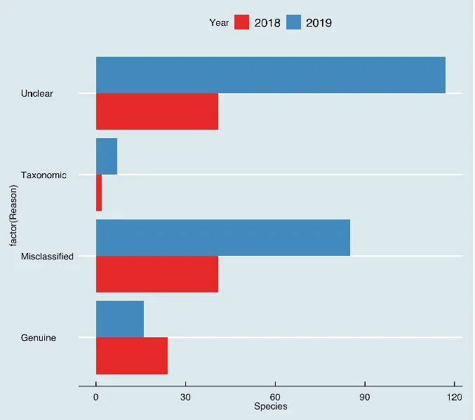
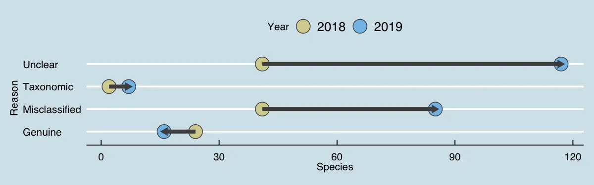
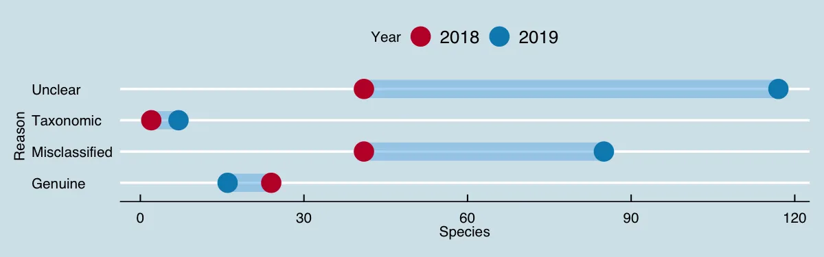
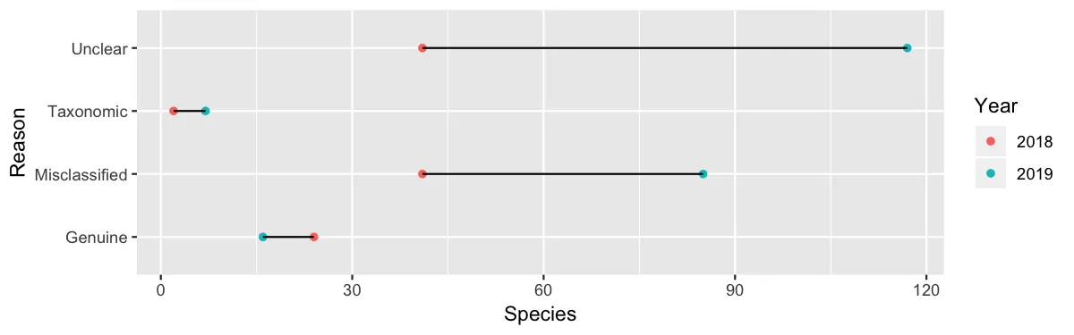
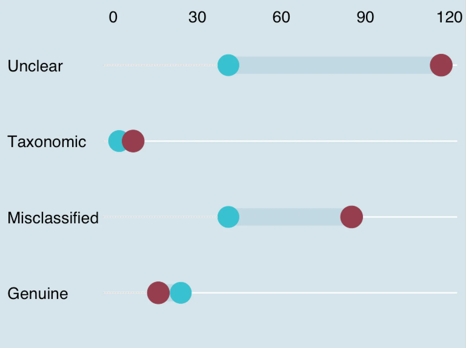
我想绘制数值之间的变化,就像《经济学家》杂志一样,将其作为单个条形图呈现:

enter image description here

这个图表被称为“哑铃图”,如果您知道要搜索什么,那么问题很可能是重复的。
以下是一个代码示例,用于为两个类别制作条形图。能够按照上面的示例绘制它将是非常好的。
library(ggplot2)
library(ggthemes)
Animals <- read.table(
  header=TRUE, text='Year        Reason Species
1   2018       Genuine      24
2   2019      Genuine      16
3   2019 Misclassified      85
4   2018 Misclassified      41
5   2018     Taxonomic       2
6   2019     Taxonomic       7
7   2018       Unclear      41
8   2019       Unclear     117')

Animals$Year <- as.character(Animals$Year)

ggplot(Animals, aes(factor(Reason), Species, fill = Year)) + 
  geom_bar(stat="identity", position = "dodge") + 
  scale_fill_brewer(palette = "Set1") + 
  theme_economist() + 
  coord_flip()

具有将颜色减少为粉红色(例如)的能力将是一个额外优势。

enter image description here

2个回答

2

这里是一个可能的解决方案,我使用了第二个辅助数据框以及geom_segment()来在两个时间点之间绘制连接线。我还包括了一些视觉自定义,如颜色、点类型、透明度和箭头。根据需要可以删除或修改这些内容。

最初的回答:

下面是一个可能的解决方案,其中我使用了一个辅助数据框和geom_segment()来绘制两个时间点之间的连接线。我还添加了一些视觉效果,比如颜色、点类型、透明度和箭头,这些都可以根据需要进行删除或修改。

# Auxiliary data.frame to draw segments.
adat = reshape2::dcast(data=Animals, 
                       formula=Reason ~ Year, 
                       value.var="Species")
adat
#          Reason 2018 2019
# 1       Genuine   24   16
# 2 Misclassified   41   85
# 3     Taxonomic    2    7
# 4       Unclear   41  117

# Colors selected from 
# https://yutannihilation.github.io/allYourFigureAreBelongToUs/ggthemes/economist_pal/
year_colors = c("2018"="#D7D29E", "2019"="#82C0E9")

p1 = ggplot() +
    theme_economist() +
    geom_point(data=Animals, 
               aes(y=Reason, x=Species, fill=Year),
               size=6, shape=21, color="grey30") +
    geom_segment(data=adat, 
                 aes(y=Reason, yend=Reason, x=`2018`, xend=`2019`),
                 size=1.8, color="grey30",
                 lineend="butt", linejoin="mitre",
                 arrow=arrow(length = unit(0.02, "npc"), type="closed")) +
    scale_fill_manual(values=year_colors)

p2 = ggplot() +
     theme_economist() +
     geom_segment(data=adat, 
                  aes(y=Reason, yend=Reason, x=`2018`, xend=`2019`),
                  size=6, color="#82C0E9", alpha=0.6, lineend="butt") +
     geom_point(data=Animals, 
                aes(y=Reason, x=Species, color=Year),
                size=6) +
     xlab("Species") +
     scale_color_manual(values=c("2018"="#C10534", "2019"="#008BBC"))

ggsave("segment_plot_1.png", plot=p1, width=8, height=2.5, dpi=150)
ggsave("segment_plot_2.png", plot=p2, width=8, height=2.5, dpi=150)

# Basic version.
p3 = ggplot() +
     geom_point(data=Animals, aes(y=Reason, x=Species, color=Year)) +
     geom_segment(data=adat, aes(y=Reason, yend=Reason, x=`2018`, xend=`2019`))

ggsave("segment_plot_3.png", plot=p3, width=8, height=2.5, dpi=150)

enter image description here

enter image description here

enter image description here


这很美丽。 - Bulat
你知道将类似这样的东西转换为函数的最佳方法吗?如果有相关资源链接,将不胜感激。再次感谢。 - Bulat

2

我在 ggalt 包中找到了 geom 函数,它可以实现类似以下功能:

Original Answer 翻译成“最初的回答”

library(ggalt)
library(data.table)
Animals <- data.table(Animals)
Animals.wide <- dcast(Animals, Reason ~ Year, value.var = "Species")
colnames(Animals.wide) <- c("Reason", "species.2018", "species.2019")
p <- ggplot(
  Animals.wide,
  aes(
    y = Reason,
    x = species.2018,
    xend = species.2019
  )
)

# > Animals.wide
#          Reason species.2018 species.2019
# 1:       Genuine           24           16
# 2: Misclassified           41           85
# 3:     Taxonomic            2            7
# 4:       Unclear           41          117

p <- p + geom_dumbbell(
    size = 10,
    color = "#C1D9E4",
    colour_x = "#39C1D1",
    colour_xend = "#953D4D",
    dot_guide = TRUE, 
    dot_guide_size = 0.25,
    position = position_dodgev(height = 0.4),
    show.legend = TRUE
)
p <- p + scale_x_continuous(position = "top") 
p <- p + theme_economist()
p <- p + xlab("Species")
p <- p + ylab(NA)
p <- p + theme(
  legend.position = "top",
  axis.text.y = element_text(size = 20),
  axis.title.y = element_blank(),
  axis.title.x = element_blank(),
  axis.line.x = element_blank(),
  axis.ticks.x = element_blank(),
  axis.text.x = element_text(size = 20, margin = margin(-0.4, unit = "cm"))
)
p

这个解决方案不如@bdemarest的方案灵活,但几乎可以胜任这项工作。

在此输入图片描述

Original Answer翻译成"最初的回答"


网页内容由stack overflow 提供, 点击上面的
可以查看英文原文,
原文链接