如果您只想为单个图表更新网格背景,可以执行以下操作:
from matplotlib import pyplot as plt
fig, ax = plt.subplots()
ax.set_facecolor('#EBEBEB')
但是,如果您想要为所有图表使用完整的ggplot样式,则Matplotlib带有一个ggplot主题,因此最简单的方法是启用该主题:
from matplotlib import pyplot as plt

plt.style.use('ggplot')
Seaborn 也有类似的主题:
import seaborn as sns

sns.set_style('darkgrid')
最后,如果您愿意,您也可以手动设置
rcParams:
from matplotlib import pyplot as plt
from matplotlib.ticker import AutoMinorLocator
import numpy as np
ggplot_styles = {
'axes.edgecolor': 'white',
'axes.facecolor': 'EBEBEB',
'axes.grid': True,
'axes.grid.which': 'both',
'axes.spines.left': False,
'axes.spines.right': False,
'axes.spines.top': False,
'axes.spines.bottom': False,
'font.size': 12,
'grid.color': 'white',
'grid.linewidth': '1.4',
'xtick.color': '555555',
'xtick.major.bottom': True,
'xtick.minor.bottom': False,
'ytick.color': '555555',
'ytick.major.left': True,
'ytick.minor.left': False,
}
plt.rcParams.update(ggplot_styles)
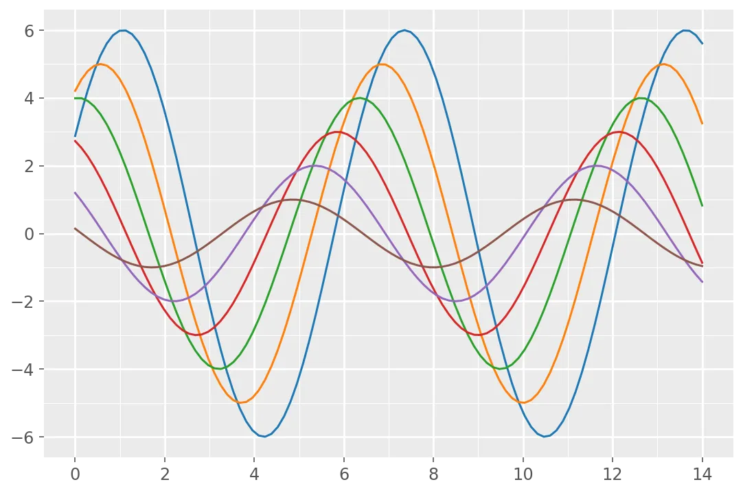
fig, ax = plt.subplots(figsize=(9, 6))
x = np.linspace(0, 14, 100)
for i in range(1, 7):
ax.plot(x, np.sin(x + i * .5) * (7 - i))
ax.xaxis.set_minor_locator(AutoMinorLocator(2))
ax.yaxis.set_minor_locator(AutoMinorLocator(2))
ax.grid(which='minor', linewidth=0.5)
style模块感兴趣,该模块位于主分支上(并将在1.4中推出),可更好地控制rcparams。 - tacaswell