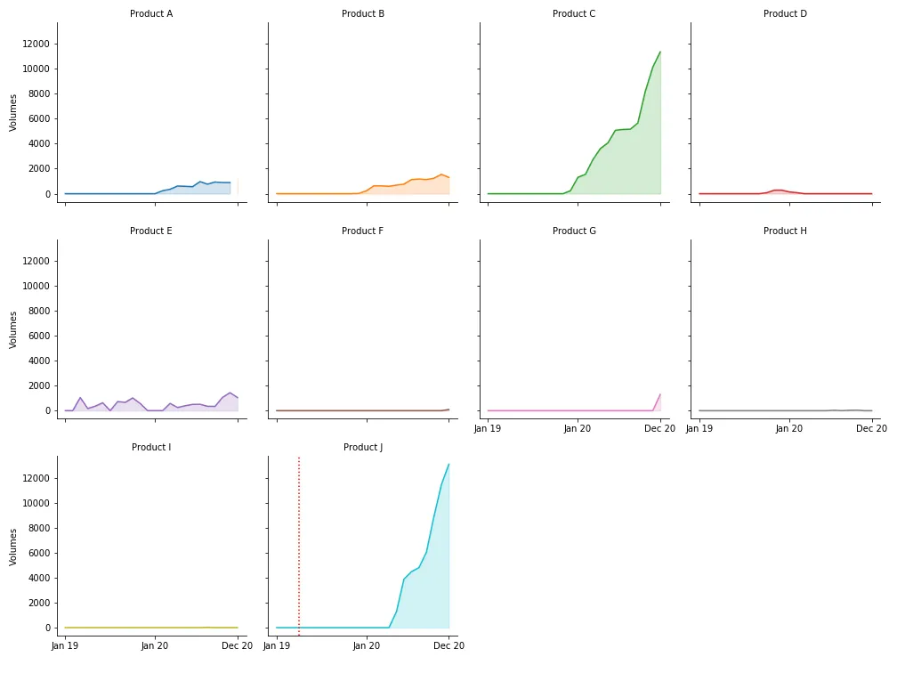
我想在每个子图中添加一条垂直线,以标记每个产品的单独启动日期。每条垂直线都应显示日期。但我太新手了,无法弄清楚这个问题。我尝试使用 .axvline 的示例:
这是代码:
g = sns.FacetGrid(df2, col='Product', hue='Vendor', col_wrap=4, height=3.5)
g = g.map(plt.plot, 'Date', 'Volumes')
g = g.map(plt.fill_between, 'Date', 'Volumes', alpha=0.2).set_titles("{col_name} Product")
g = g.set_titles("{col_name}")
g = g.set(xticks=[0, 12, 23])
g = g.set(xlabel='')

plt.axvline(x='Apr 19', color='r', linestyle=':')
我找到了以下方法,但是我无法理解它的实际用途或将其应用于自己的目的:
根据事件出现情况向 Seaborn Facet Grid 图中添加垂直线
我创建了两个列表,分别包含产品名称和相应的发布日期:
product_names = ['Product A', 'Product B','Product C', 'Product D','Product E', 'Product F',
                 'Product G', 'Product H','Product I', 'Product J',]

launch_dates = ['2019-02-01', '2019-09-01', '2019-12-01', '2019-12-01',
                '2020-02-01', '2020-05-01', '2020-07-01', '2020-07-01',
                '2020-08-01', '2020-07-15']

launch_dates = [datetime.strptime(d, "%Y-%m-%d") for d in launch_dates]
那么,我应该如何迭代所有的因素以添加所提到的垂直线?