在不同的子图(facetgrid)中绘制每一列的seaborn直方图

7

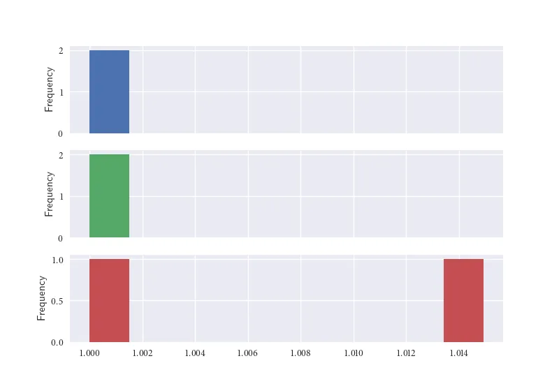
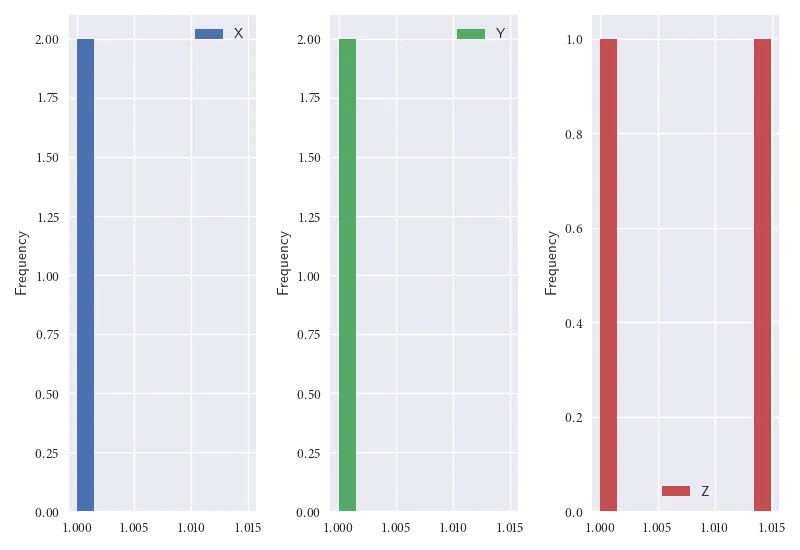
我的结构如下pandas DataFrame:

n    X              Y          Z
0   1.000000    1.000000    1.014925    
1   1.000000    1.000000    1.000000    

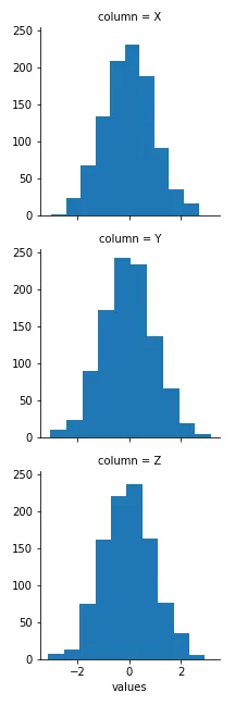
我想从每列创建M个单独的子图(直方图)。一个直方图来自X,一个来自Y,最后一个来自Z。

我希望它在不同的图中呈现。我查看了https://seaborn.pydata.org/generated/seaborn.FacetGrid.html,但我不理解如何根据我的数据绘制它的语法/逻辑。

3个回答

9
你可以使用pandas dataframe内置的plot方法,并加上选项subplots=True根据列进行绘图。
from io import StringIO
import pandas as pd
import matplotlib.pyplot as plt
plt.style.use('seaborn')

# Here I read your example data in
df = pd.read_fwf(StringIO("""
    X              Y          Z
0   1.000000    1.000000    1.014925    
1   1.000000    1.000000    1.000000
"""), header=1, index_col=0)

# Plotting as desired
df.plot.hist(subplots=True, legend=False)

在此输入图片描述

df.plot 接受许多其他参数,让您可以轻松地改变图表,例如:

df.plot.hist(subplots=True, legend=True, layout=(1, 3))

enter image description here


两个答案都是正确的,我接受你的答案,因为你先回答了这个问题。 - BraveDistribution

9
使用seaborn.FacetGrid可能需要您重构数据。
让我们看一个例子:
np.random.seed(0)
df = pd.DataFrame(np.random.randn(1000, 3), columns=['X', 'Y', 'Z'])
print(df.head(10))

          X         Y         Z
0  1.764052  0.400157  0.978738
1  2.240893  1.867558 -0.977278
2  0.950088 -0.151357 -0.103219
3  0.410599  0.144044  1.454274
4  0.761038  0.121675  0.443863
5  0.333674  1.494079 -0.205158
6  0.313068 -0.854096 -2.552990
7  0.653619  0.864436 -0.742165
8  2.269755 -1.454366  0.045759
9 -0.187184  1.532779  1.469359

df_melted = df.melt(var_name='column')

print(df_melted.head(10))

  column     value
0      X  1.764052
1      X  2.240893
2      X  0.950088
3      X  0.410599
4      X  0.761038
5      X  0.333674
6      X  0.313068
7      X  0.653619
8      X  2.269755
9      X -0.187184


g = sns.FacetGrid(df_melted, row='column')
g.map(plt.hist, 'value')

[out]

[输出]

在这里输入图片描述


1

sns.pairplot(your_df)会做这个,但它也会为每一列显示成对散点图,因此可能比你需要的更多。在进行探索性数据分析时非常有用。您还可以通过在调用中添加corner=True来使其更加简洁。

或者类似于:

# Update as needed
n_rows=1
n_cols=3

# Create the subplots
fig, axes = plt.subplots(nrows=n_rows, ncols=n_cols, figsize=(10, 10))
for i, column in enumerate(df):
    sns.histplot(df, ax=axes[i // n_cols, i % n_cols]).set_title(column)

https://seaborn.pydata.org/generated/seaborn.pairplot.htma


网页内容由stack overflow 提供, 点击上面的
可以查看英文原文,
原文链接