我目前正在进行数据分析,并希望通过seaborn箱形图展示一些数据分布。
我的分类数据'seg1'在我的数据集中有3个取值('Z1'、'Z3'和'Z4')。然而,组'Z4'的数据对于我来说太奇异了,我想制作仅显示类别'Z1'和'Z3'的箱形图。
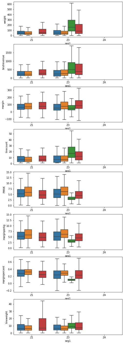
过滤绘图的数据源没有起作用,因为类别'Z4'仍然显示了没有数据点。
除了必须创建一个只包含('Z1'、'Z3')的新CategoricalDtype并将我的数据重新投射到这个新类别上之外,是否还有其他解决方案?
我只想隐藏'Z4'类别。
我正在使用seaborn 0.10.1和matplotlib 3.3.1。
谢谢您提前的回答。
以下是我的尝试和一些可重现的数据。
虚拟数据
dummy_cat = pd.CategoricalDtype(['a', 'b', 'c'])
df = pd.DataFrame({'col1': ['a', 'b', 'a', 'b'], 'col2': [12., 5., 3., 2]})
df.col1 = df.col1.astype(dummy_cat)
sns.boxplot(data=df, x='col1', y='col2')
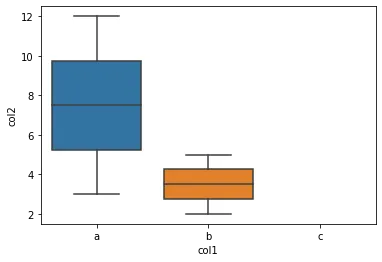
不应用任何过滤器
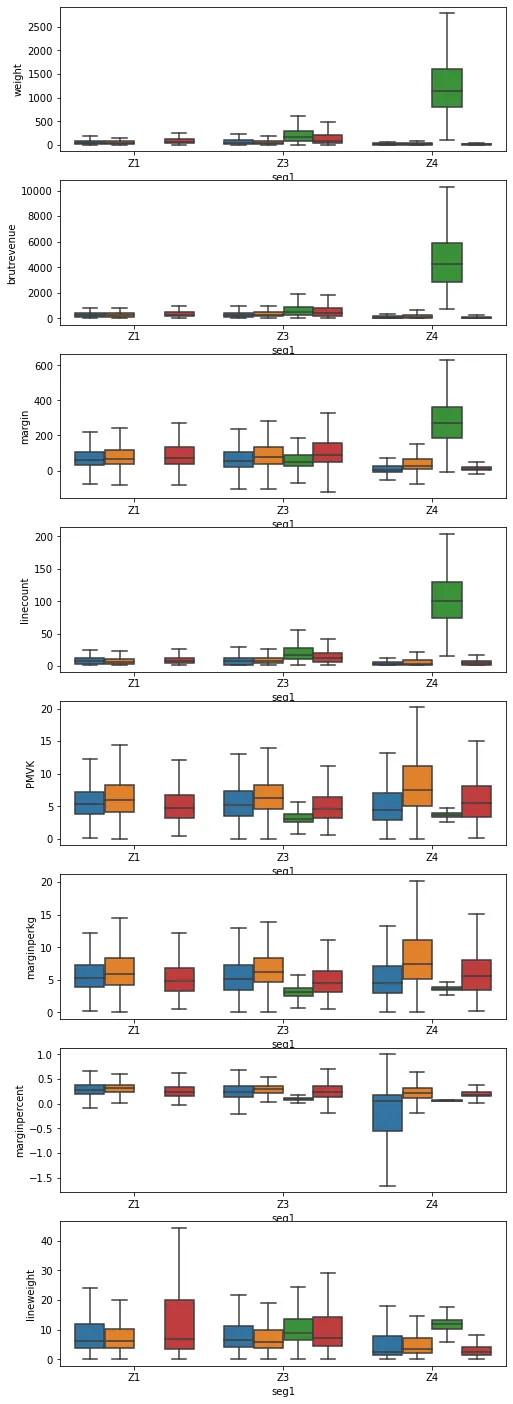
fig, axs = plt.subplots(figsize=(8, 25), nrows=len(indicators2), squeeze=False)
for j, indicator in enumerate(indicators2):
    sns.boxplot(data=orders, y=indicator, x='seg1', hue='origin2', ax=axs[j, 0], showfliers=False)
这会产生以下结果:
筛选数据源
mask_filter = orders.seg1.isin(['Z1', 'Z3'])

fig, axs = plt.subplots(figsize=(8, 25), nrows=len(indicators2), squeeze=False)
for j, indicator in enumerate(indicators2):
    sns.boxplot(data=orders.loc[mask_filter], y=indicator, x='seg1', hue='origin2', ax=axs[j, 0], showfliers=False)
这将产生:

df.col1 = df.col1.astype(str)? - JohanCxlim:ax.set_xlim(-0.5, 1.5)。 - JohanC