饼图ggplot:文本方向与图形不同。

3

我有这样的数据集

data=data.frame(Var1 = c('a', 'b'), Freq=c(31, 48))

我想制作一个ggplot饼图。我按照以下步骤进行:

library(ggplot2)
tbl <- transform(data,
                 freq = cumsum(Freq),
                 perc = Freq/sum(Freq),
                 pos = (cumsum(Freq) - 0.5 * Freq) / sum(Freq))
ggplot(data=tbl, aes(x="", y=perc, fill = factor(Var1))) + 
  geom_bar(width = 0.8, stat="identity") + 
  coord_polar(theta="y",start = 0,  direction = 1) +
  geom_text(aes(label=paste(round(perc*100),"%",sep=""), y=pos), 
            color="grey20" ,size=15) +
  scale_fill_manual(tbl$Var1,values = c("coral2", "red")) + 
  theme_bw() + 
  theme (panel.border = element_blank(),legend.title = element_blank(),
         axis.ticks = element_blank(),axis.title.x = element_blank(), 
         axis.title.y = element_blank(), axis.text.x = element_blank(),
         axis.line=element_blank(),panel.grid.major=element_blank(),
         legend.background = element_rect(fill="transparent"), legend.position=c(0.5,0.1), 
         legend.direction="vertical", legend.text=element_text(size = 20)) 

我得到了饼图 enter image description here 
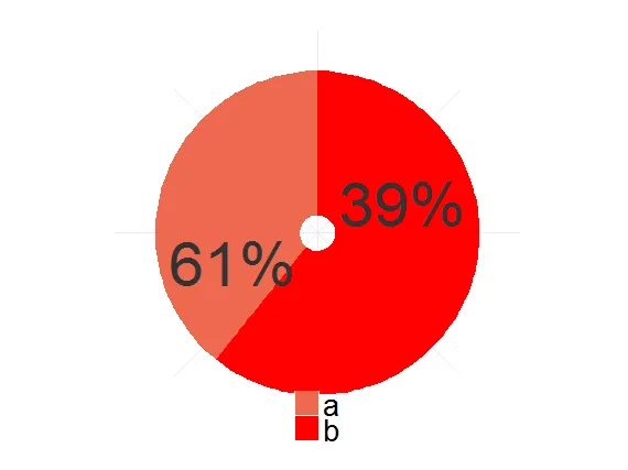
正如您所看到的,文本方向和图形不同。 我使用coord_polar(theta="y",start = 0, direction = 1),其中direction = 1表示顺时针方向。 但实际上,馅饼的方向是逆时针的。 我做错了什么?
1个回答

3
你的问题在于如何计算文本位置,与极坐标无关。
让我们来看一下从转换数据创建的数据框:
> tbl
  Var1 Freq freq      perc       pos
1    a   31   31 0.3924051 0.1962025
2    b   48   79 0.6075949 0.6962025

ggplot(data=tbl, aes(x="", y=perc, fill = factor(Var1))) + 
  geom_bar(width = 0.8, stat="identity") + 
  geom_text(aes(label=paste(round(perc*100),"%",sep=""),y=pos), color="grey20" ,size=15)

plot

这些显然不是文本标签的预期位置。手动计算堆叠条形图的标签位置并不完全简单,但实际上你可以让ggplot为你完成这项工作,使用position_stack()并指定你喜欢的vjust值。以下是一种实现方法:

ggplot(data = tbl,
       aes(x = "", y = perc, fill = Var1)) +
  geom_col() +
  geom_text(aes(label = scales::percent(perc, accuracy = 1)),
            position = position_stack(vjust = 0.5),
            color = "grey20", size = 15) +
  coord_polar(theta = "y", direction = -1) +
  scale_fill_manual(values = c("a" = "coral2", "b" = "red")) +
  theme_void() +
  theme(legend.position = "bottom",
        legend.direction = "vertical")

需要注意以上代码的几点:

  1. 使用geom_col()代替geom_bar(stat = "identity");它们是等效的,前者更加简洁;

  2. 使用来自scales包的percent()创建百分数标签;这比自己操作round()paste() 更加直观;

  3. coord_polar()具有start=0direction=1作为其默认参数。如果您不更改默认设置,则无需指定它们;

  4. 通常更安全的做法是使用命名向量来指定手动比例尺中的映射值,以防您在多个数据集中使用相同的代码,并且并非所有值都出现在每种情况下;

  5. 如果发现自己多次重复使用XXX = element_blank(),那么可能是时候切换到theme_void()并仅指定规则的异常情况了。

plot


非常感谢!只有一个问题。accuracy未知,我不得不从github加载scalesdevtools::install_github("r-lib/scales") - Edward
1
奇怪...我正在使用来自CRAN的1.0.0版本的scales,它确实具有“accuracy”参数。 - Z.Lin

网页内容由stack overflow 提供, 点击上面的
可以查看英文原文,
原文链接