如何适应对数刻度

6

我有以下几点:

0 4194304
1 497420
2 76230
3 17220
4 3595
5 1697
6 491
7 184
8 54
9 15
10 4
11 4
12 1
13 1
14 1
15 1
16 1
17 1
18 1
19 1
20 1
21 1

如果我将它们在y轴上用对数坐标系绘制,它们看起来大致是线性的。如何拟合一条直线到这个对数比例尺上,以便我可以拟合数据?
我的当前代码非常粗糙。对于每个x,y对,我都这样做。
xcoords.append(x)
ycoords.append(math.log(y))

然后最后我执行

plt.plot(xcoords,ycoords)
plt.show()

如果我没记错的话,这个被称为 _对数回归_,或者类似于那样的东西。 - rodrigo
2
这可能与您有关:https://dev59.com/SHA75IYBdhLWcg3wK10p - James Mills
3个回答

1

本解决方案使用来自numpy (文档) 的最小二乘拟合方法。

本页面提供了线性回归在线性数据上的示例用法

由于您有对数线性数据,因此我们首先对数据进行转换,然后运行线性拟合。

import numpy as np
import matplotlib.pyplot as plt

d = '''
0 4194304
1 497420
 ... (put all the rest of the data in here)
'''

D = np.loadtxt(d.split('\n'))

x = D[:,0]
y = D[:,1]
y_ln = np.log(y)

n = D.shape[0]

A = np.array(([[x[j], 1] for j in range(n)]))
B = np.array(y_ln[0:n])

X = np.linalg.lstsq(A,B)[0]
a=X[0]; b=X[1]

# so now your fitted line is log(y) = a*x + b
# lets show it on a graph.
plt.figure()
plt.plot(x, a*x+b, '--')
plt.plot(x, y_ln, 'o')
plt.ylabel('log y')
plt.xlabel('x values')
plt.show()

# or use the original scales by transforming the data back again:

plt.figure()
plt.plot(x, np.exp(a*x+b), '--')
plt.plot(x, y, 'o')
plt.ylabel('y')
plt.xlabel('x values')
plt.yscale('log')
plt.show()

fitting all the data

然而,你的数据似乎有两个阶段,因此单一线性拟合无法很好地捕捉数据。相反,你可以将其描述为两个不同的阶段,这可能是适当的,也可能不适当,具体取决于你的数据来源以及你是否能解释两个阶段变化的点。因此,让我们只拿出数据的第一部分并进行拟合。
n = 13
A = np.array(([[x[j], 1] for j in range(n)]))
B = np.array(yl[0:n])
A = np.array(([[x[j], 1] for j in range(n)]))
B = np.array(y_ln[0:n])

X = np.linalg.lstsq(A,B)[0]
a=X[0]; b=X[1]

plt.figure()
plt.plot(x[0:n], np.exp(a*x[0:n]+b), '--')
plt.plot(x, y, 'o')
plt.ylabel('y')
plt.xlabel('x values')
plt.yscale('log')
plt.show()

fitting part of the data

这更适合数据的前半部分(但可能并不特别有意义——这取决于生成数据点的过程)。

1

不必更改数据,您可以将其绘制在半对数图上。例如,您可以执行以下操作:

    import matplotlib.pyplot as plt

    xArray = range(22)
    yArray = [4194304,497420,76230,17220,3595,1697,491,184,54,15,4,4,1,1,1,1,1,1,1,1,1,1]

    plt.semilogy(xArray,yArray)
    plt.show

关于代码拟合 - 请尝试以下步骤:

    import matplotlib.pyplot as plt
    from scipy.optimize import curve_fit
    from numpy import square

    xArray = range(22)
    yArray = [4194304,497420,76230,17220,3595,1697,491,
              184,54,15,4,4,1,1,1,1,1,1,1,1,1,1]

    def f(x,a,b,c):
        return a*(square(x))+(b*x)+c

    popt, pcov = curve_fit(f, xArray, yArray)

    fittedA = popt[0]
    fittedB = popt[1]
    fittedC = popt[1]

    yFitted = f(xArray,fittedA,fittedB,fittedC)

    plt.figure()
    plt.semilogy(xArray,yFitted)
    plt.show

你需要想出一个更适合的函数来替代我在f()函数中使用的二次函数,以获得更好的拟合效果,但这应该可以满足你的需求。

0
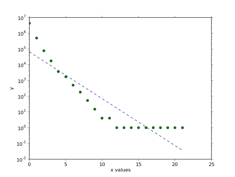
你可以尝试去除零(x[0:12]),从(x[0:12],log_y[0:12])生成函数插值,生成相同范围内的更大线性空间,在空间范围内 x 是 12 项,new_x 是 50 项,并使用 f(new_x) 绘制如下图表。该内容与编程有关。
>>> x
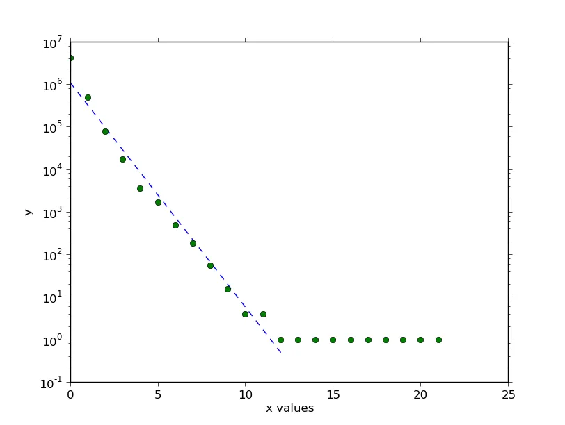
[0, 1, 2, 3, 4, 5, 6, 7, 8, 9, 10, 11, 12, 13, 14, 15, 16, 17, 18, 19, 20, 21]
>>> y
[4194304, 497420, 76230, 17220, 3595, 1697, 491, 184, 54, 15, 4, 4, 1, 1, 1, 1, 1, 1, 1, 1, 1, 1]
>>> log_y
[15.249237972318797, 13.117190018630332, 11.24151036498232, 9.753826777981722, 8.187299270155147, 7.436617265234227, 6.19644412779452, 5.214935757608986, 3.9889840465642745, 2.70805020110221, 1.3862943611198906, 1.3862943611198906, 0.0, 0.0, 0.0, 0.0, 0.0, 0.0, 0.0, 0.0, 0.0, 0.0]
>>> f2=interp1d(x[0:12],log_y[0:12],kind='cubic')
>>> x_new_fit=np.linspace(0,x[11],50)
>>> plt.plot(x_new_fit,f2(x_new_fit),'-')
[<matplotlib.lines.Line2D object at 0x3a6e950>]
>>> plt.show()

尝试使用不同类型的插值方法,以实现不同种类的平滑效果。

>>> 
>>> f1=interp1d(x[0:12],log_y[0:12],kind='quadratic')>>> plt.plot(x[0:12],log_y[0:12],'-',x_new_fit,f2(x_new_fit),'-',x_new_fit,f1(x_new_fit),'--')
[<matplotlib.lines.Line2D object at 0x3a97dd0>, <matplotlib.lines.Line2D object at 0x3a682d0>, <matplotlib.lines.Line2D object at 0x3a687d0>]
>>> plt.show()
>>> 

网页内容由stack overflow 提供, 点击上面的
可以查看英文原文,
原文链接