我有一个数据框,长这样:
glimpse(spottingIntensityByMonth)
# Observations: 27
# Variables: 3
# $ yearMonth <dttm> 2015-05-01, 2015-06-01, 2015-07-01, 2015-08-01, 2015-09-01, 2015-10-01, 2...
# $ nClassificationsPerDayPerSpotter <dbl> 3.322581, 13.212500, 13.621701,
    6.194700, 18.127778, 12.539589, 8.659722, ...
# $ nSpotters <int> 8, 8, 22, 28, 24, 22, 24, 27, 25, 29, 32, 32, 21, 14, 18, 13, 20, 19, 15, ...
我正在尝试使用ggplot2进行绘图,如下所示:
ggplot() +
    geom_col(data = spottingIntensityByMonth,
             mapping = aes(x = yearMonth,
                           y = nClassificationsPerDayPerSpotter)
             ) +
    xlab("Month of year") +
    scale_y_continuous(name = "Daily classifications per Spotter") +
    geom_line(data = spottingIntensityByMonth,
              mapping = aes(x = yearMonth,
                            y = nSpotters)
              ) +
    theme_bw()
这会生成一个如下所示的图:
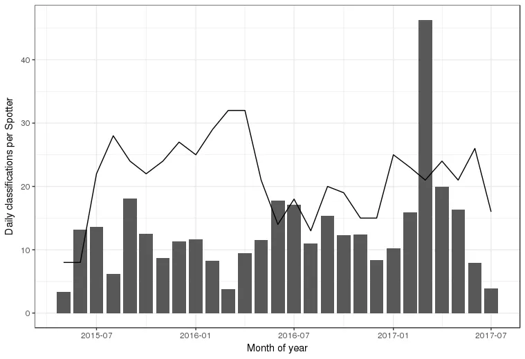
现在我想添加一些说明,说明线和列的含义。我该怎么做?谢谢!
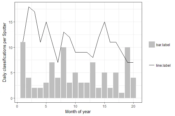
scale_*_manual()函数允许您以命名向量的形式指定自己的调色板,例如c("a" = "red", "b" = "green"),其中 "a" 和 "b" 是相关变量中的值。在这种情况下,由于我不想填充/颜色因y.bar/y.line内的值而有所变化,因此就让每个变量在填充/颜色方面采用单一值。这有点不正规,但我发现它在实践中非常有效。 - Z.Lin