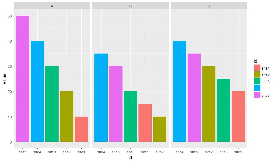
在每个区域中,将条形图从高到低重新排序:ggplot2

10
在下面的 df 中,我想要按照每个分面内的从高到低重新排序条形图。
我尝试过:
df <- df %>% tidyr::gather("var", "value", 2:4)
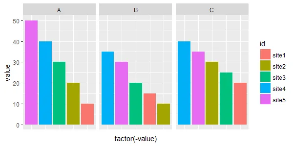
ggplot(df, aes (x = reorder(id, -value), y = value, fill = id))+
  geom_bar(stat="identity")+facet_wrap(~var, ncol =3)

它给了我enter image description here

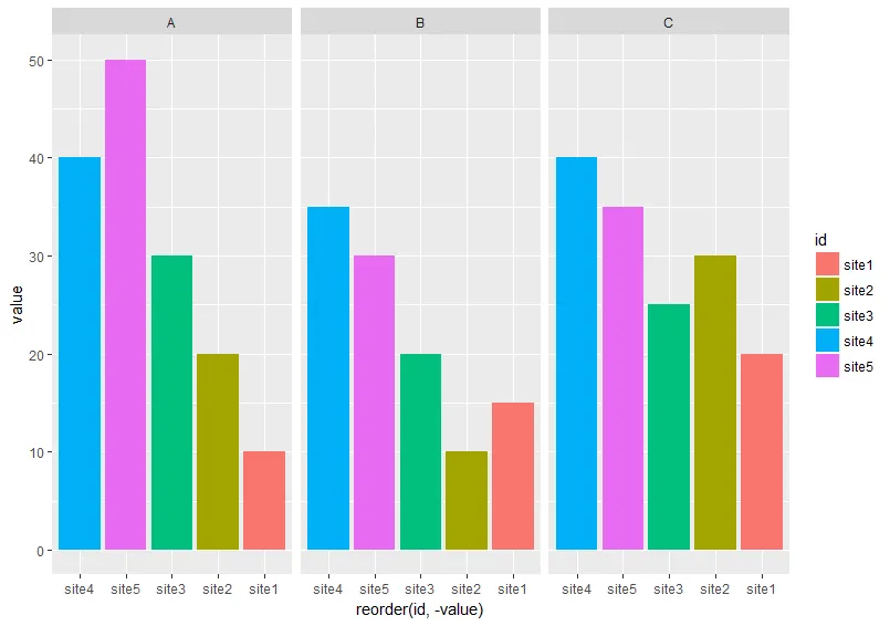
它没有按照每个方面将条形图从高到低排序。

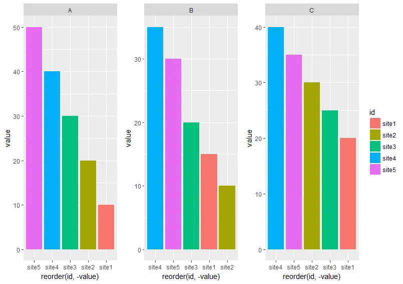
我想出了另一种方法来达到我想要的目的。我必须逐个变量绘制图表,然后使用grid.arrange()组合所有图表。

#I got this function from @eipi10's answer
#https://dev59.com/oZnga4cB1Zd3GeqPXVgm#38640937  
#Function to extract legend
# https://github.com/hadley/ggplot2/wiki/Share-a-legend-between-two-ggplot2-graphs
g_legend<-function(a.gplot) {
  tmp <- ggplot_gtable(ggplot_build(a.gplot))
  leg <- which(sapply(tmp$grobs, function(x) x$name) == "guide-box")
  legend <- tmp$grobs[[leg]]
  return(legend)
}

p1 <- ggplot(df[df$var== "A", ], aes (x = reorder(id, -value), y = value, fill = id))+
  geom_bar(stat="identity") + facet_wrap(~var, ncol =3)

fin_legend <- g_legend(p1)
p1 <- p1 + guides(fill= F)

p2 <- ggplot(df[df$var== "B", ], aes (x = reorder(id, -value), y = value, fill = id))+
  geom_bar(stat="identity") + facet_wrap(~var, ncol =3)+guides(fill=FALSE) 

p3 <- ggplot(df[df$var== "C", ], aes (x = reorder(id, -value), y = value, fill = id))+
  geom_bar(stat="identity") + facet_wrap(~var, ncol =3)+guides(fill=FALSE) 


grid.arrange(p1, p2, p3, fin_legend, ncol =4, widths = c(1.5, 1.5, 1.5, 0.5))

这个结果是我想要的: enter image description here

我想知道是否有一种简单的方法可以帮助我按照所有维度从高到低排序条形图,而不必分别绘制每个变量,然后将它们组合起来。任何建议都将不胜感激。

数据

df <-  read.table(text = c("
id  A   B   C
site1   10  15  20
site2   20  10  30
site3   30  20  25
site4   40  35  40
site5   50  30  35"), header = T)
2个回答

14
下面的方法使用了一个特别准备好的变量作为x轴,使用了`labels`参数来显示正确的x轴标签,但是用了`facet_wrap()`函数:

数据准备

我更加熟悉于`data.table`,所以在这里将其用于开发。您可以随意使用您喜欢的任何数据处理包。

编辑:删除了第二个虚拟变量,只需要`ord`。

library(data.table)   
# reshape from wide to long
molten <- melt(setDT(df), id.vars = "id")
# create dummy var which reflects order when sorted alphabetically
molten[, ord := sprintf("%02i", frank(molten, variable, -value, ties.method = "first"))]

molten
#       id variable value ord
# 1: site1        A    10  05
# 2: site2        A    20  04
# 3: site3        A    30  03
# 4: site4        A    40  02
# 5: site5        A    50  01
# 6: site1        B    15  09
# 7: site2        B    10  10
# 8: site3        B    20  08
# 9: site4        B    35  06
#10: site5        B    30  07
#11: site1        C    20  15
#12: site2        C    30  13
#13: site3        C    25  14
#14: site4        C    40  11
#15: site5        C    35  12

创建图表

library(ggplot2)
# `ord` is plotted on x-axis instead of `id`
ggplot(molten, aes(x = ord, y = value, fill = id)) +
  # geom_col() is replacement for geom_bar(stat = "identity")
  geom_col() +
  # independent x-axis scale in each facet, 
  # drop absent factor levels (not the case here)
  facet_wrap(~ variable, scales = "free_x", drop = TRUE) +
  # use named character vector to replace x-axis labels
  scale_x_discrete(labels = molten[, setNames(as.character(id), ord)]) + 
  # replace x-axis title
  xlab("id")

在此输入图片描述

数据


这里的“数据”是指计算机系统中存储和处理的信息。
df <- read.table(text = "
id  A   B   C
site1   10  15  20
site2   20  10  30
site3   30  20  25
site4   40  35  40
site5   50  30  35", header = T)

非常感谢您对代码每一行的详细解释。非常感谢,Uwe。 - shiny
1
非常棒的解决方案!!!希望这个逻辑能够内置到 ggplot 分面函数中。 - RDRR

5

如果您愿意放弃X轴标签,可以通过使用实际的y值作为x美学,然后在每个小区中删除未使用的因子水平来实现:

ggplot(df, aes (x = factor(-value), y = value, fill = id))+
    geom_bar(stat="identity", na.rm = TRUE)+
    facet_wrap(~var, ncol =3, scales = "free_x", drop = TRUE) +
    theme(
        axis.text.x = element_blank(),
        axis.ticks.x = element_blank()
    )

结果:

这里输入图像描述

这里丢失的x轴标签可能影响不大,因为您仍然可以依靠颜色(而且由于在不同部分之间不一致,x轴本来就容易引起混淆)。


1
这真是纯粹的天才!非常感谢你! - Олег Місько

网页内容由stack overflow 提供, 点击上面的
可以查看英文原文,
原文链接