我想创建一个条形图,其中的条形从高到低排序,并在分面时保留此顺序。幸运的是,包
{tidytext}有一个名为reorder_within()的函数,可以实现这一点。然而,我找不到一种方法来应用这种在分面内的高到低重新排序和手动重新定位特定的条形。
示例
下面的代码是从这篇博客中采用的。
假设我们想按十年计算婴儿姓名。
第1步--数据
我们将可视化top_names,它是babynames数据集的一个子集。
library(babynames)
library(dplyr, warn.conflicts = FALSE)

top_names <-
  babynames %>%
  filter(between(year, 1950, 1990)) %>%
  mutate(decade = (year %/% 10) * 10) %>%
  group_by(decade) %>%
  count(name, wt = n, sort = TRUE) %>%
  ungroup()

top_names
#> # A tibble: 123,205 x 3
#>    decade name         n
#>     <dbl> <chr>    <int>
#>  1   1950 James   846042
#>  2   1950 Michael 839459
#>  3   1960 Michael 836934
#>  4   1950 Robert  832336
#>  5   1950 John    799658
#>  6   1950 David   771242
#>  7   1960 David   736583
#>  8   1960 John    716284
#>  9   1970 Michael 712722
#> 10   1960 James   687905
#> # ... with 123,195 more rows
步骤2 -- 准备绘图数据
本文档由reprex包 (v2.0.0)于2021-08-11创建
library(tidytext)
library(ggplot2)

data_for_plot <-
  top_names %>%
  group_by(decade) %>%
  top_n(15) %>%
  ungroup() %>%
  mutate(decade = as.factor(decade),
         name = reorder_within(name, n, decade))
#> Selecting by n

data_for_plot
#> # A tibble: 75 x 3
#>    decade name                n
#>    <fct>  <fct>           <int>
#>  1 1950   James___1950   846042
#>  2 1950   Michael___1950 839459
#>  3 1960   Michael___1960 836934
#>  4 1950   Robert___1950  832336
#>  5 1950   John___1950    799658
#>  6 1950   David___1950   771242
#>  7 1960   David___1960   736583
#>  8 1960   John___1960    716284
#>  9 1970   Michael___1970 712722
#> 10 1960   James___1960   687905
#> # ... with 65 more rows
第三步--可视化
p_so_far_so_good <- data_for_plot %>%
  ggplot(aes(name, n, fill = decade)) +
  geom_col(show.legend = FALSE) +
  facet_wrap(~decade, scales = "free_y") +
  coord_flip() +
  scale_x_reordered() +
  scale_y_continuous(expand = c(0,0))

p_so_far_so_good
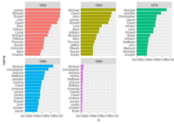
目前为止,一切顺利!
现在,在每个年代中,我想将除了前15个之外的所有条形图分组在一起。而前15个应该保持原样,其余部分应该被分为“其他”。此外,我想以一种方式可视化这种新的分类,使其保留条形图的从高到低的顺序,并将“其他”条形图固定在最底部。我已经发布了这样一个问题,但那里给出的解决方案对于内部细节并不适用。
我的失败尝试#1
进行一些操作来创建每个组的“其他”类别。
data_for_plot_with_other <-
  top_names %>%
  group_by(decade) %>%
  arrange(decade, desc(n)) %>%
  mutate(name = ifelse(row_number() < 5, name, "other")) %>%
  group_by(decade, name) %>%
  summarise(across(n, sum)) %>%
  arrange(name == "other", -n, .by_group = TRUE) %>%
  ungroup() %>%
  mutate(decade = as.factor(decade),
         name = reorder_within(name, n, decade))

> data_for_plot_with_other %>% print(n = 20)
## # A tibble: 75 x 3
##    decade name                   n
##    <fct>  <fct>              <int>
##  1 1950   James___1950      846042
##  2 1950   Michael___1950    839459
##  3 1950   Robert___1950     832336
##  4 1950   John___1950       799658
##  5 1950   David___1950      771242
##  6 1950   Mary___1950       627098
##  7 1950   William___1950    592423
##  8 1950   Linda___1950      565481
##  9 1950   Richard___1950    536393
## 10 1950   Patricia___1950   460643
## 11 1950   Thomas___1950     455154
## 12 1950   Susan___1950      438419
## 13 1950   Deborah___1950    431302
## 14 1950   Mark___1950       383076
## 15 1950   other___1950    30863329 ## see how "other" closes the decade = 1950 group
## 16 1960   Michael___1960    836934
## 17 1960   David___1960      736583
## 18 1960   John___1960       716284
## 19 1960   James___1960      687905
## 20 1960   Robert___1960     653556
# ... with 55 more rows
可视化
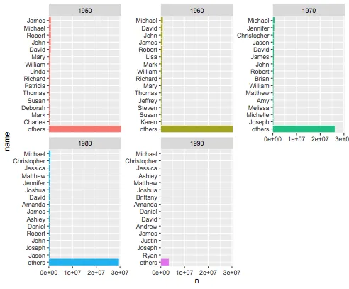
data_for_plot_with_other %>%
  ggplot(aes(name, n, fill = factor(decade))) +
  geom_col(show.legend = FALSE) +
  facet_wrap(~decade, scales = "free_y") +
  coord_flip() +
  scale_x_reordered() +
  scale_y_continuous(expand = c(0,0))
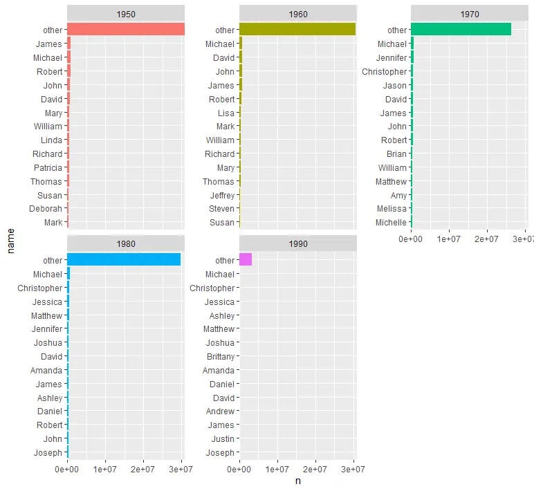
这不是我想要的。
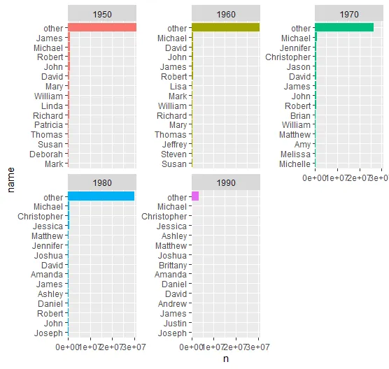
我想要的是像下面这样的东西:
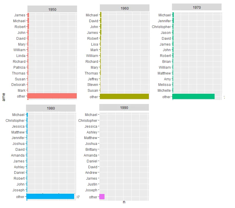
我的失败尝试 #2
在这个答案的启发下,我还尝试重新设置因子name的级别。
我构建了一个帮助函数,检测子字符串other_并将其移动到(组)的末尾。
move_to_end <- function(x, match_to_pattern = "other_") {
  which_idx <- grep(pattern = match_to_pattern, x = x)
  c(x[-which_idx], x[which_idx])
}

data_for_plot_with_other %>%
  group_by(decade) %>%
  mutate(across(name, ~fct_relevel(.x, move_to_end))) %>%
  ## then the visualization as before
  ggplot(aes(name, n, fill = factor(decade))) +
  geom_col(show.legend = FALSE) +
  facet_wrap(~decade, scales = "free_y") +
  coord_flip() +
  scale_x_reordered() +
  scale_y_continuous(expand = c(0,0))
仍然是相同的输出。
总结
如何在各个方面将条形图按高到低排序,并始终将“其他”条形放在最底部?

dat和我的data_for_plot_with_other之间的区别归结为reorder_within()的调用方式。当我没有分组时,我调用了reorder_within(name, n, decade),而你在按decade分组时,则调用了reorder_within(name, n():1, decade)。 - Emmanreorder_within()函数。 - Emman