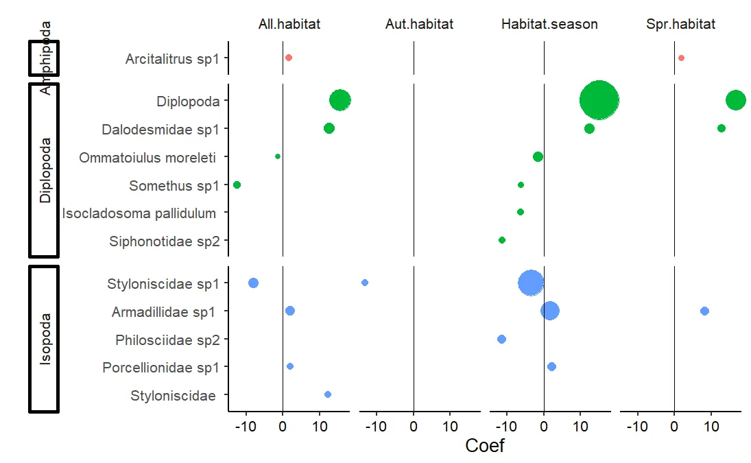
我有以下图表:
图形代码:
图形代码:
library(ggplot2)
library(dplyr)
library(forcats)

posthoc1 %>%
  mutate(ordering = -as.numeric(Dataset) + Test.stat,
         Species2 = fct_reorder(Species2, ordering, .desc = F)) %>%
  ggplot(aes(x=Coef, y=Species2, reorder(Coef, Taxa), group=Species2, colour=Taxa)) +
  geom_point(size=posthoc1$Test.stat*.25, show.legend = FALSE) +
  ylab("") +
  theme_classic(base_size = 20) +
  facet_grid(Taxa~Dataset, scales = "free_y", space = "free_y",  switch = "y") +
  geom_vline(xintercept = 0) +
  theme(axis.text.x=element_text(colour = "black"),
        strip.placement = "outside",
        strip.background.x=element_rect(color = NA,  fill=NA),
        strip.background.y=element_rect(color = "black",  fill=NA)) +
  coord_cartesian(clip = "off") +
  scale_x_continuous(limits=NULL)
数据:
structure(list(Dataset = structure(c(1L, 1L, 1L, 1L, 1L, 1L,
1L, 1L, 1L, 5L, 5L, 5L, 5L, 2L, 3L, 3L, 3L, 3L, 3L, 3L, 3L, 3L,
3L, 3L), .Label = c("All.habitat", "Aut.habitat", "Habitat.season",
"Lit.season", "Spr.habitat"), class = "factor"), Species = structure(c(1L,
2L, 3L, 5L, 6L, 10L, 11L, 12L, 13L, 1L, 3L, 5L, 6L, 13L, 1L,
2L, 5L, 6L, 7L, 8L, 9L, 10L, 11L, 13L), .Label = c("Ar.sp1",
"Ar.sp2", "Arc.sp1", "B.pus", "Dal.sp1.bumps", "Dip.unID", "I.palladium",
"Pale", "Ph.sp3", "Port", "Somethus", "sty", "Sty.sp1"), class = "factor"),
    Species2 = structure(c(2L, 9L, 1L, 4L, 5L, 7L, 11L, 12L,
    13L, 2L, 1L, 4L, 5L, 13L, 2L, 9L, 4L, 5L, 6L, 10L, 8L, 7L,
    11L, 13L), .Label = c("Arcitalitrus sp1", "Armadillidae sp1 ",
    "Brachyiulus pusillus ", "Dalodesmidae sp1", "Diplopoda",
    "Isocladosoma pallidulum ", "Ommatoiulus moreleti ", "Philosciidae sp2",
    "Porcellionidae sp1", "Siphonotidae sp2", "Somethus sp1",
    "Styloniscidae ", "Styloniscidae sp1"), class = "factor"),
    Taxa = structure(c(3L, 3L, 1L, 2L, 2L, 2L, 2L, 3L, 3L, 3L,
    1L, 2L, 2L, 3L, 3L, 3L, 2L, 2L, 2L, 2L, 3L, 2L, 2L, 3L), .Label = c("Amphipoda",
    "Diplopoda", "Isopoda"), class = "factor"), Variable = structure(c(2L,
    2L, 2L, 2L, 2L, 2L, 2L, 2L, 2L, 2L, 2L, 2L, 2L, 2L, 2L, 2L,
    2L, 2L, 2L, 2L, 2L, 2L, 2L, 2L), .Label = c("Autumn", "Litter",
    "Spring", "Summer"), class = "factor"), Coef = c(1.911502938,
    2.086917154, 1.571872993, 12.61184801, 15.6161116, -1.430032837,
    -12.51944478, 12.33934516, -8.040249562, 8.08258816, 1.780142396,
    12.88982576, 16.78107544, -13.22641153, 1.68810887, 2.093965381,
    12.27209197, 15.08328526, -6.334640911, -11.29985948, -11.62658947,
    -1.676293808, -6.246555908, -3.470297147), SE = c(0.403497472,
    2.21607562, 0.348600794, 2.423896379, 0.509468128, 3.423013791,
    2.382857733, 1.775086895, 2.087788334, 2.23631504, 0.33402261,
    2.518562443, 0.459720131, 1.950974996, 0.2476205, 0.235648095,
    1.815155489, 0.325804415, 2.564680067, 2.437104984, 2.212583358,
    2.677618401, 2.324019051, 0.420436743), Test.stat = c(18.36532749,
    13.27324683, 13.29039037, 20.50277493, 44.06097153, 10.55234932,
    14.64951518, 13.22575401, 20.16415411, 16.55627107, 11.81407568,
    15.15213717, 40.67205188, 12.62233207, 37.60085488, 16.90879258,
    20.20215107, 80.30520371, 13.35250626, 13.01692428, 17.52987519,
    20.03658771, 12.02467914, 53.5052683)), row.names = 10:33, class = "data.frame")
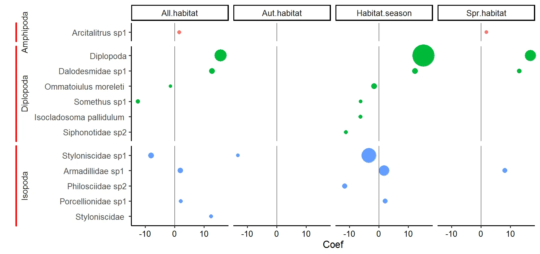
element_rect()控制的,它同时控制所有四个边。如果你只想要它在一侧,通过修改grobs可以实现,但我不确定这是否会真正改善这张图表的外观... - Z.Lin