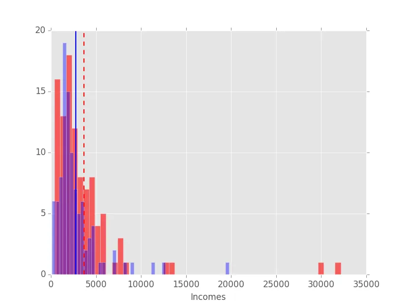
使用matplotlib库,我生成了一个包含两个直方图和均值线的图表。如果我添加图例,我认为图表会更清晰。我希望创建一个图例,说明这两条均值线的确切值。以下是我的代码、生成的图表和我想要实现的图片(在powerpoint中添加图例的图片):
def setPlot(data, mycolor, myalpha, mylinestyle):
    plt.style.use('ggplot')
    plt.rc('xtick',labelsize=12)
    plt.rc('ytick',labelsize=12)
    plt.xlabel("Incomes")
    plt.hist(data, bins=50, color= mycolor, alpha=myalpha)
    plt.axvline(numpy.mean(data), color=mycolor, linestyle=mylinestyle, linewidth=1.5)
    plt.show()
如果您对IT技术有任何建议,我将不胜感激。
-----------解决方案--------
由于wwii和tom的伟大建议,我能够实现我的想法。我已经尝试了两个建议并将它们合并起来,这就是我得到的结果:
def setPlot(data, mycolor, myalpha, mylinestyle):
    plt.style.use('ggplot')
    plt.rc('xtick',labelsize=12)
    plt.rc('ytick',labelsize=12)
    plt.xlabel("Incomes")
    plt.hist(data, bins=50, color= mycolor, alpha=myalpha)
    plt.axvline(numpy.mean(data), color=mycolor, linestyle=mylinestyle, linewidth=1.5, label=str(numpy.mean(data)))
    plt.legend(loc='upper right')
    plt.show()
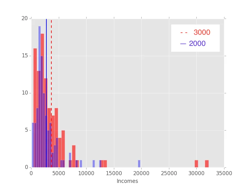
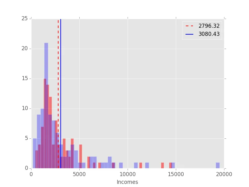
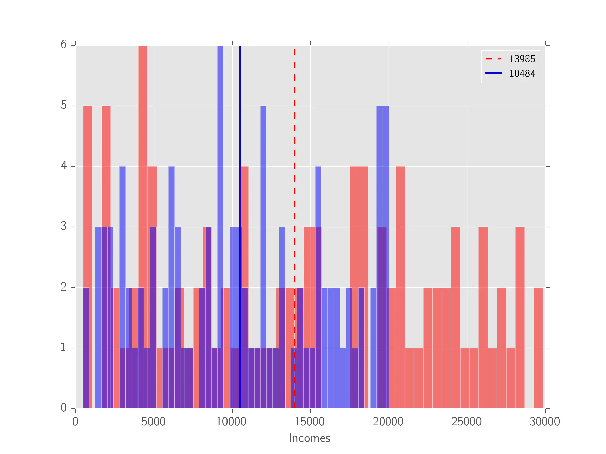
以下是我生成的绘图示例:
非常感谢您的所有帮助!
axvline返回的Line2D对象分配给一个名称/变量。然后将其用作legend的参数 - 就像画廊中的示例一样。如果您找到了解决方案,请随时回答自己的问题。 - wwii