R/ggplot:使用facet_wrap进行垂直条形文字分面图

9

我正在使用R中的ggplot绘制多个条件,并使用facet_wrap进行分面展示。

我想将带有绘图名称的条纹放在垂直轴上的右侧,而不是在顶部。

以下是一个例子:

library(ggplot2)
dat<- data.frame(name= rep(LETTERS[1:5], each= 4), value= rnorm(20), time= rep(1:5, 4))
gg<- ggplot(data= dat, aes(x= time, y= value)) +
    geom_point() +
    facet_wrap(~ name, ncol= 1)

enter image description here 
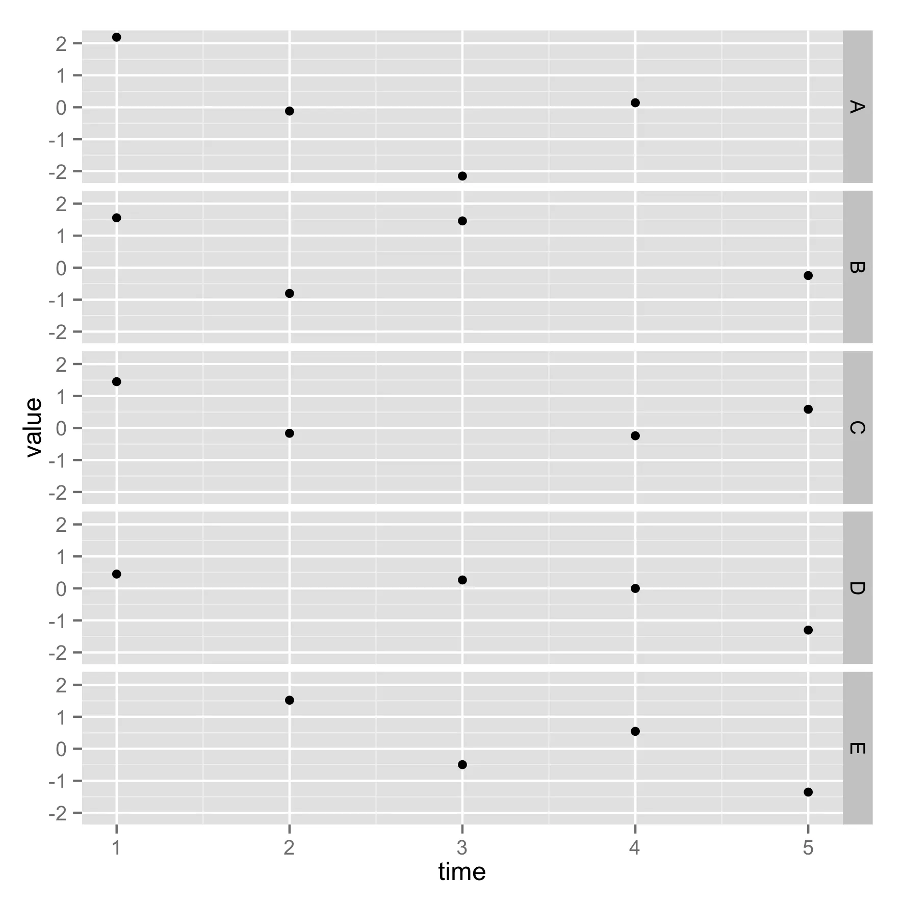
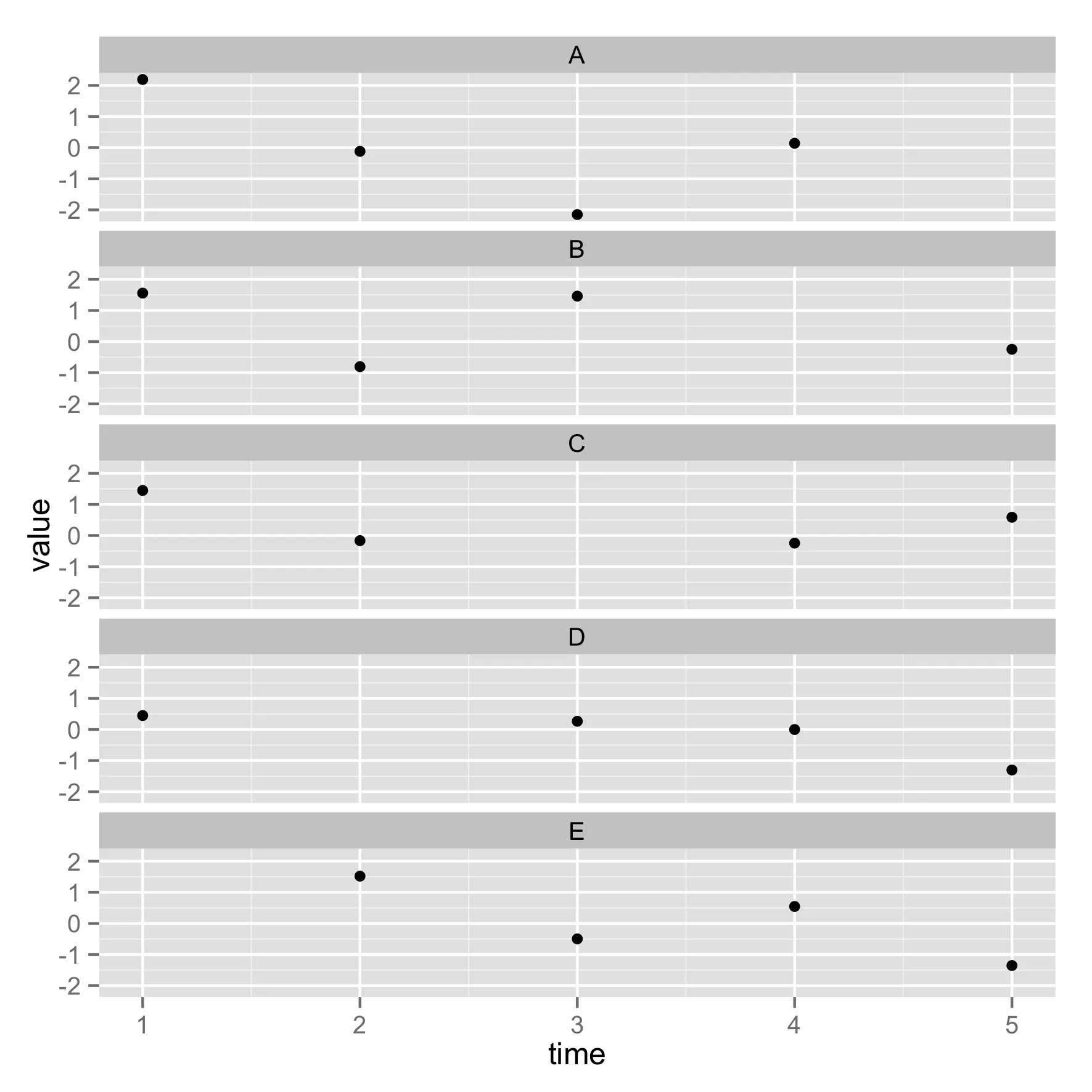
这里的图表名称(A、B、C、D、E)在顶部,我希望它们像这里一样在右边:

gg + facet_grid(name ~ .)

输入图像描述

是否有一个简单的开关可以实现这个功能?(我不使用 facet_grid,因为我想使用 facet_wrap 中提供的选项 nrowncol)。

谢谢!Dario

sessionInfo()
R version 3.0.1 (2013-05-16)
Platform: x86_64-apple-darwin10.8.0 (64-bit)

locale:
[1] en_GB.UTF-8/en_GB.UTF-8/en_GB.UTF-8/C/en_GB.UTF-8/en_GB.UTF-8

attached base packages:
[1] stats     graphics  grDevices utils     datasets  methods   base     

other attached packages:
[1] ggplot2_0.9.3.1

loaded via a namespace (and not attached):
 [1] colorspace_1.2-4   dichromat_2.0-0    digest_0.6.4       grid_3.0.1        
 [5] gtable_0.1.2       labeling_0.2       MASS_7.3-29        munsell_0.4.2     
 [9] plyr_1.8.1         proto_0.3-10       RColorBrewer_1.0-5 Rcpp_0.11.0       
[13] reshape2_1.2.2     scales_0.2.3       stringr_0.6.2      tools_3.0.1       

我认为这不会很容易。我唯一能想象的是制作一个虚拟变量,并将其与 facet_grid 一起使用。你总是可以尝试使用 grid/gridExtra 进行低级别的操作,但那是一条复杂的路径。 - tonytonov
1
好的,感谢反馈。我想虚拟变量路线是最简单的,尽管我不太愿意为了美观而更改数据。 - dariober
2个回答

8

以后参考,您现在可以使用strip.position="right"将它们放在右侧,例如:

library(ggplot2)
dat<- data.frame(name= rep(LETTERS[1:5], each= 4), value= rnorm(20), time= rep(1:5, 4))
gg<- ggplot(data= dat, aes(x= time, y= value)) +
    geom_point() +
    facet_wrap(~ name, ncol= 1, strip.position="right")

此参数现在是开关,例如 facet_wrap(~ name, ncol= 1, switch='y') - Kyouma
这实际上似乎只是在左侧显示已经在右侧的条带文本:https://www.rdocumentation.org/packages/ggplot2/versions/3.3.1/topics/facet_wrap - Zeke

1
如果您希望在facets的左侧有facet标签,则有一个简单的解决方案,其中y轴变为x轴,x轴变为y轴。
library(ggplot2)
library(gridExtra)
library(gridGraphics)

# standard plot, facet labels on top
ggplot(diamonds) + 
  aes(x = carat, y = price) + 
  geom_point() + 
  facet_wrap( ~ cut)

enter image description here

# Use the gridExtra and gridGraphics utilities to rotate the plot.
# This requires some modifications to the axes as well.  Note the use of 
# a negative carat in the aes() call, and text modifications with theme()
grid.newpage()
pushViewport(viewport(angle = 90))
grid.draw(ggplotGrob(

  ggplot(diamonds) + 
    aes(x = price, y = -carat) + 
    geom_point() + 
    facet_wrap( ~ cut) + 
    scale_y_continuous(name = "Carat", breaks = -seq(0, 5, by = 1), labels = seq(0, 5, by = 1)) + 
    theme(axis.text.y = element_text(angle = 270), 
          axis.title.y = element_text(angle = 270), 
          axis.text.x = element_text(angle = 270))
    ))

enter image description here

facet_wrap标签移动到旋转图形的右侧,需要使用-90度的旋转角度。然而,这将使有效的x轴位于绘图之上。您需要编写代码将y轴标签从“标准”绘图的左侧移动到右侧,然后按此处所示进行旋转,旋转角度为-90度。

这是一个有趣且相当简单的方法,谢谢!您有什么想法可以确保生成的图形大小不会超出视口吗? - cashoes

网页内容由stack overflow 提供, 点击上面的
可以查看英文原文,
原文链接