我有一些x和y的数据,想要生成一个带有颜色渐变(bwr或其他)的3D直方图。
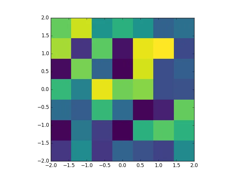
我编写了一个脚本,绘制了在x和y的绝对值范围在-2到2之间的有趣数值:
我编写了一个脚本,绘制了在x和y的绝对值范围在-2到2之间的有趣数值:
import numpy as np
import numpy.random
import matplotlib.pyplot as plt
# To generate some test data
x = np.random.randn(500)
y = np.random.randn(500)
XY = np.stack((x,y),axis=-1)
def selection(XY, limitXY=[[-2,+2],[-2,+2]]):
XY_select = []
for elt in XY:
if elt[0] > limitXY[0][0] and elt[0] < limitXY[0][1] and elt[1] > limitXY[1][0] and elt[1] < limitXY[1][1]:
XY_select.append(elt)
return np.array(XY_select)
XY_select = selection(XY, limitXY=[[-2,+2],[-2,+2]])
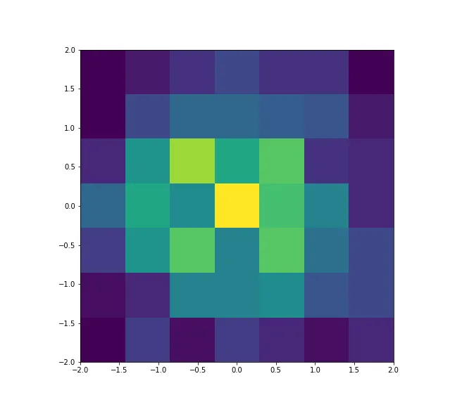
heatmap, xedges, yedges = np.histogram2d(XY_select[:,0], XY_select[:,1], bins = 7, range = [[-2,2],[-2,2]])
extent = [xedges[0], xedges[-1], yedges[0], yedges[-1]]
plt.figure("Histogram")
#plt.clf()
plt.imshow(heatmap.T, extent=extent, origin='lower')
plt.show()
并返回正确的结果:
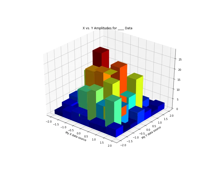
现在,我想将它转换成一个3D直方图。不幸的是,我无法通过bar3d正确地绘制它,因为它默认采用x和y的长度作为横坐标。
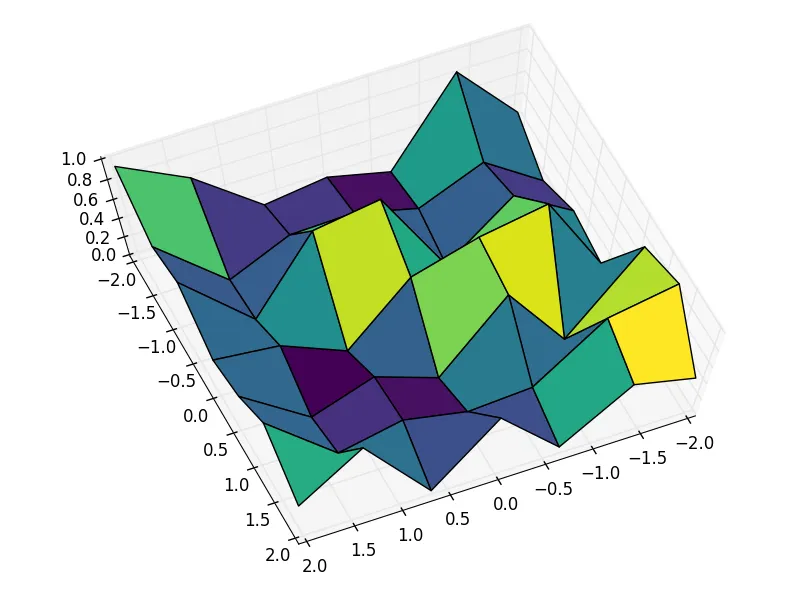
我相信用imshow很容易以3D形式绘制这个图像。就像一个未知选项一样...