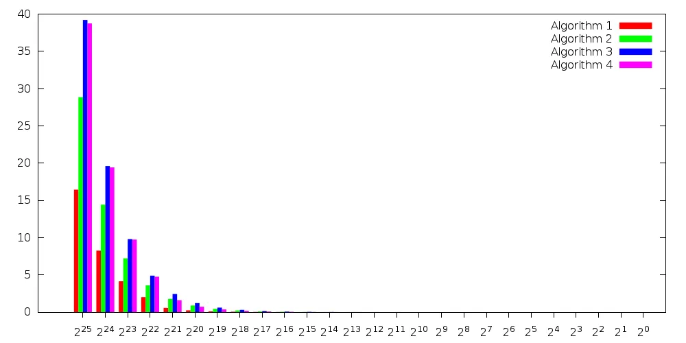
对于您的数据集,将本地和通讯部分堆叠起来是没有意义的,因为通讯部分太小了,在图表中看不清楚。无论如何,如果要结合堆叠和聚类,根据进一步的要求(图例条目、刻度标签等),这也会非常棘手。
以下是如何为您的数据集绘制聚类直方图的示例:
set style histogram clustered gap 1
set style data histogram
set style fill solid 1.0 noborder

set termoption enhanced

set xtics out nomirror

myxtic(x) = sprintf('2^{%d}', int(floor(log(x)/log(2) + 0.5)))
plot 'test.dat' using ($2+$3):xtic(myxtic(stringcolumn(1))) title 'Algorithm 1',\
     for [i=2:4] '' using (column(2*i)+column(2*i+1)) title sprintf('Algorithm %d', i)
结果是:
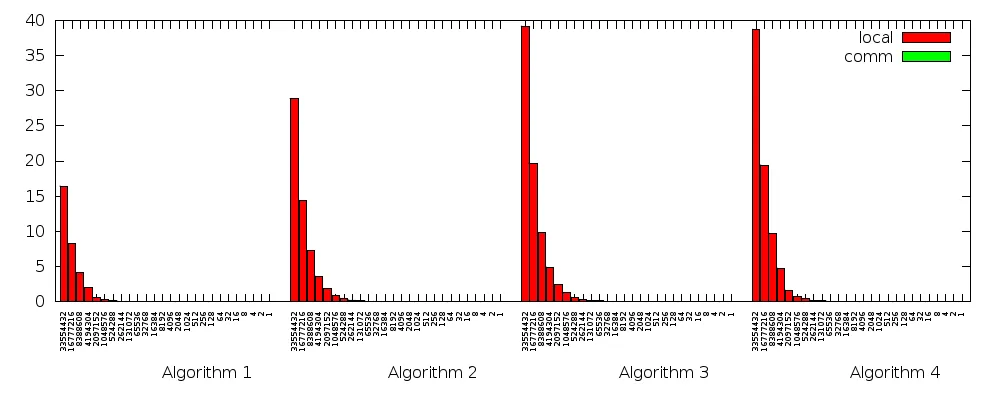
要使用分组算法,您可以使用newhistogram关键字创建新的分组:
set style histogram rowstacked title offset 4,1
set boxwidth 0.9 relative
set style fill solid 1.0 border lt -1
set xtics rotate by 90 right
plot newhistogram "Algorithm 1" lt 1,\
     'test.dat' using 2:xtic(1) title columnheader, \
     '' using 3 title columnheader,\
     newhistogram "Algorithm 2" lt 1,\
     'test.dat' using 4:xtic(1) notitle, \
     '' using 5 notitle,\
     newhistogram "Algorithm 3" lt 1,\
     'test.dat' using 6:xtic(1) notitle, \
     '' using 7 notitle,\
     newhistogram "Algorithm 4" lt 1,\
     'test.dat' using 8:xtic(1) notitle, \
     '' using 9 notitle
local和comm数据被堆叠在一起,但是comm部分非常小,在图表中几乎看不到(只有缩放后才能看到)。
输出使用了4.6.3版本和以下设置:
set terminal pngcairo size 1000,400
set output 'test.png'
set xtics font ',6'
结果是:
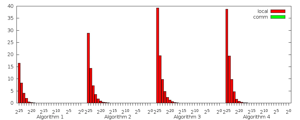
更复杂的x轴刻度显示需要一些技巧,因为对于直方图而言,x轴刻度不被视为数值,而是字符串。以下是一个示例:
set terminal pngcairo size 1000,400
set output 'test.png'

set style histogram rowstacked title offset 0,-0.5
set bmargin 3
set boxwidth 0.9 relative
set style fill solid 1.0 border lt -1
set termoption enhanced
set xtics out nomirror
myxtic(x) = (int(floor(log(x)/log(2) + 0.5)) % 5 == 0) ? sprintf('2^{%d}', int(floor(log(x)/log(2) + 0.5))) : ""

plot newhistogram "Algorithm 1" lt 1,\
     'test.dat' using 2:xtic(myxtic(real(stringcolumn(1)))) title columnheader, \
     '' using 3 title columnheader,\
     newhistogram "Algorithm 2" lt 1,\
     'test.dat' using 4:xtic(myxtic(real(stringcolumn(1)))) notitle, \
     '' using 5 notitle,\
     newhistogram "Algorithm 3" lt 1,\
     'test.dat' using 6:xtic(myxtic(real(stringcolumn(1)))) notitle, \
     '' using 7 notitle,\
     newhistogram "Algorithm 4" lt 1,\
     'test.dat' using 8:xtic(myxtic(real(stringcolumn(1)))) notitle, \
     '' using 9 notitle
有了结果