我使用内部基准测试工具。我使用 gnuplot(
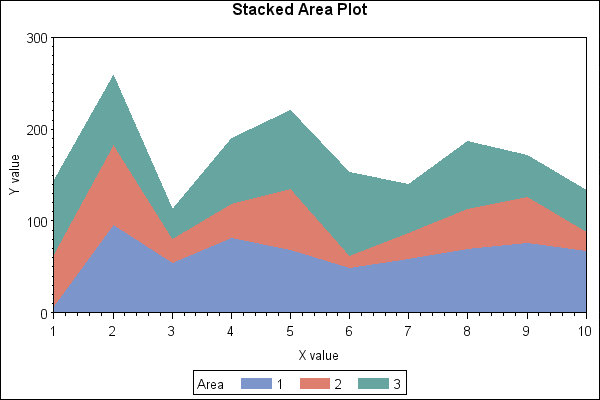
我需要将结果(多次运行的方法执行时间)表示为堆积线图,类似于以下内容:
我得到以下结果:
gnuplot 4.6 patchlevel 4)进行可视化。我需要将结果(多次运行的方法执行时间)表示为堆积线图,类似于以下内容:
这是我 .tsv 数据文件的摘录:
Run MethodA MethodB MethodC
1   192 171 152
2   227 178 161
...
10  229 161 149
我正在使用的脚本:
#!/usr/bin/gnuplot -p

reset
clear

set terminal png size 640,480
set output "timings.png"
set key top left outside horizontal autotitle columnhead
set title "Third-party REST calls"

set xlabel "Run (ordinal)"
set xtics nomirror scale 0

set ylabel "Time (milliseconds)"
set ytics out nomirror

set grid ytics lt 0 lw 1 lc rgb "#bbbbbb"

set style data histogram
set style histogram rowstacked
set style fill solid border -1
set boxwidth 0.75

plot  "timings.tsv" using 2:xticlabels(1) , "" using 3, "" using 4
我得到以下结果:
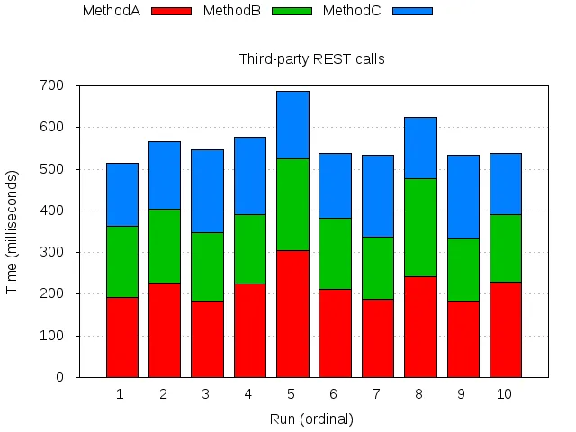
是的,这不是一条线图而是柱状图(我需要表示每个方法执行时间的百分比)。我需要稍微不同的结果(相同的直方图,但不是用盒子而是用连接盒子顶部的线和线下的填充物),就像这样:
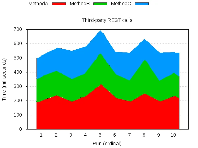
我知道使用filledcurve的方法(例如,在GNUPlot中创建填充堆栈图中描述),但在那种方法中,您需要明确地对值求和。
是否可以通过gnuplot绘制填充区域而不是框,例如将直方图转换为堆叠线图?
plot for和sum函数非常容易,就像你链接的那个页面上所示。 - Christoph