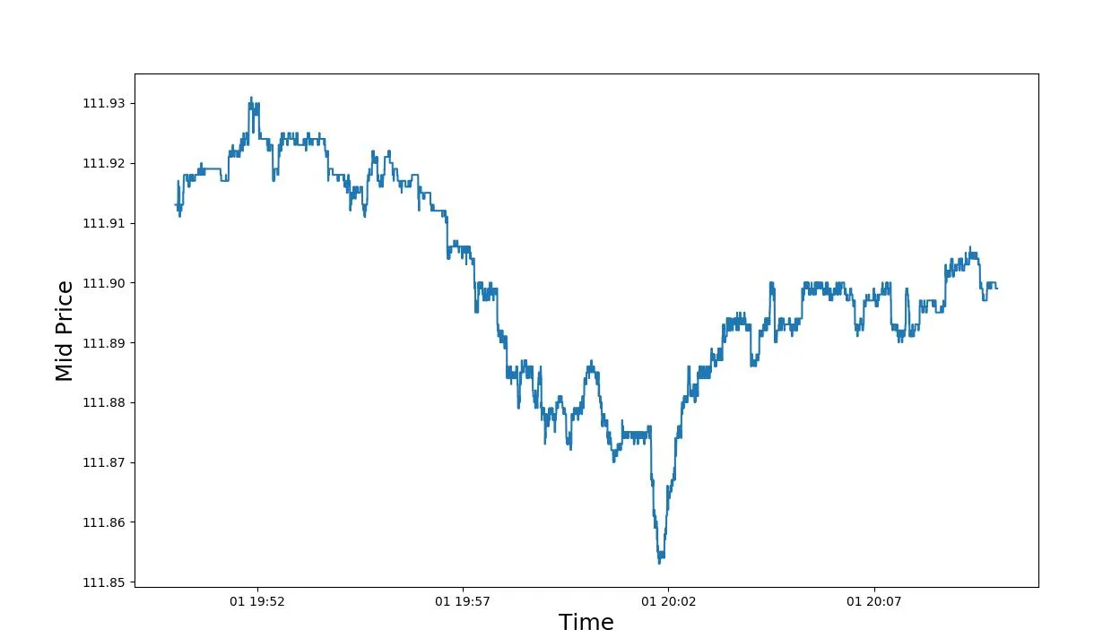
我正在处理汇率数据,但是图表中出现了不必要的线条,结果非常奇怪。
我已经阅读了不同的示例,并按照示例进行操作,但仍无法消除这些线条。
是否有人知道我的代码有什么问题?谢谢您的帮助。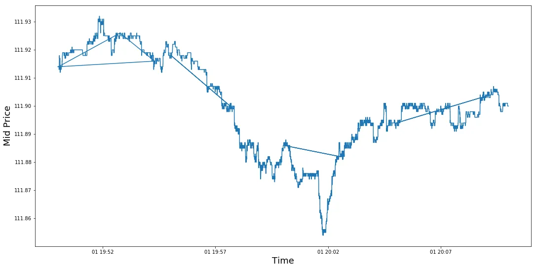
如果需要数据,我已将csv文件保存在Google Drive中 https://drive.google.com/file/d/1ANybvOKeUYIhXxtm97VNT88SI8z2OWjV/view?usp=sharing。
我已经阅读了不同的示例,并按照示例进行操作,但仍无法消除这些线条。
是否有人知道我的代码有什么问题?谢谢您的帮助。
df = df[['PRICE', 'TIME']]
start_time = '2018-08-01 19:50:00'
end_time = '2018-08-01 20:10:00'

df = df[(df['TIME'] > start_time) & (df['TIME'] <= end_time)]
df = df.set_index('TIME')

plt.figure(figsize = (18,9))
plt.plot(pd.to_datetime(df.index),df["PRICE"])
plt.xlabel('Time',fontsize=18)
plt.ylabel('Mid Price',fontsize=18)
如果需要数据,我已将csv文件保存在Google Drive中 https://drive.google.com/file/d/1ANybvOKeUYIhXxtm97VNT88SI8z2OWjV/view?usp=sharing。