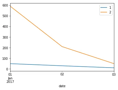
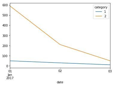
Pandas 绘制多个分类线

3

假设我有以下数据...

date      Score  category                 
2017-01-01   50.0         1
2017-01-01  590.0         2
2017-01-02   30.0         1
2017-01-02  210.4         2
2017-01-03   11.0         1
2017-01-03   50.3         2

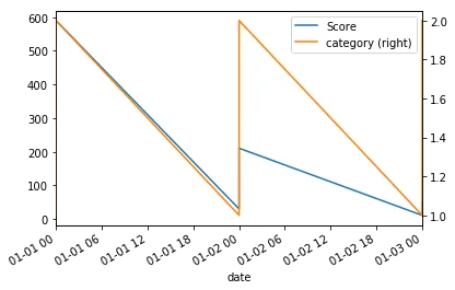
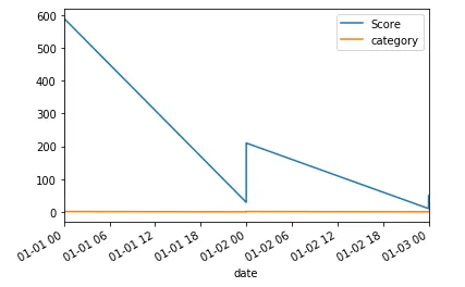
每天我有多个类别,每个类别都被赋予一个得分。以下是我的代码...

vals = [{'date': '2017-01-01', 'category': 1, 'Score': 50},
         {'date': '2017-01-01', 'category': 2, 'Score': 590},
         {'date': '2017-01-02', 'category': 1, 'Score': 30},
         {'date': '2017-01-02', 'category': 2, 'Score': 210.4},
         {'date': '2017-01-03', 'category': 1, 'Score': 11},
         {'date': '2017-01-03', 'category': 2, 'Score': 50.3}]
df = pd.DataFrame(vals)
df.date = pd.to_datetime(df['date'], format='%Y-%m-%d')
df.set_index(['date'],inplace=True)

这导致了下面奇怪的情节。 enter image description here 我想要多条线,每个类别一条,日期显示在X轴上 - 我该如何做?
2个回答

5
你可以使用 groupby 和 plot。
fig, ax = plt.subplots()
for label, grp in df.groupby('category'):
    grp.plot(x = grp.index, y = 'Score',ax = ax, label = label)

enter image description here


4

让我们尝试使用参数ax=axsecondary_y=True来配合使用轴:

ax = df.plot(x=df.index, y='Score')
df.plot(x=df.index, y='category', secondary_y=True, ax=ax)

输出:

在此输入图像描述

或者如果你想要@Vaishali图表,你可以使用这个一行代码。

df.set_index('category',append=True).unstack()['Score'].plot()

输出:

这里输入图像描述


你真的喜欢set_index(),stack,unstack!:) - Vaishali
@Vaishali。谢谢! - Scott Boston

网页内容由stack overflow 提供, 点击上面的
可以查看英文原文,
原文链接