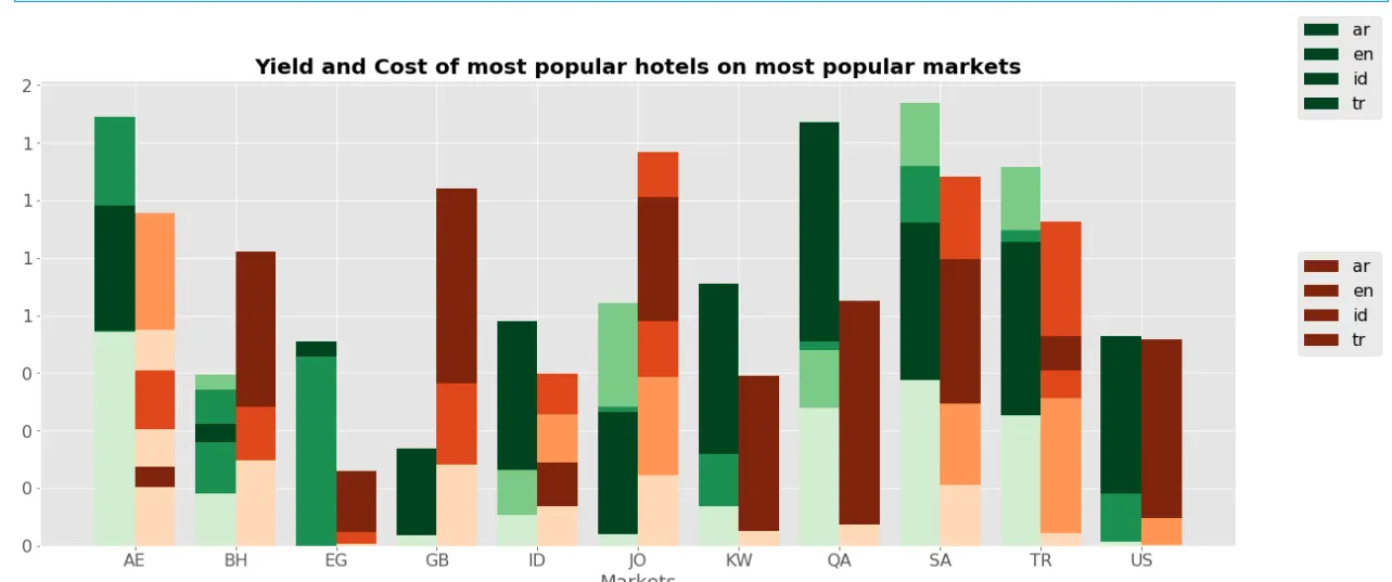
我的问题与 matplotlib两个图例超出绘图范围 非常相似。有一个答案适用于普通线图。
我在复制解决方案时遇到了条形图的问题...
问题是,在给定的解决方案中,
我在复制解决方案时遇到了条形图的问题...
问题是,在给定的解决方案中,
l1、l2等是<matplotlib.lines.Line2D,如果我对bar-plot采用同样的技巧,它无法推断颜色...
代码:
import matplotlib.pyplot as plt
import numpy as np
bar_data_cost = np.random.rand(4,11)
bar_data_yield = np.random.rand(4,11)
cmap_yield = plt.cm.Greens(np.linspace(0.2, 1, len(bar_data_cost)))
cmap_costs = plt.cm.Oranges(np.linspace(0.2, 1, len(bar_data_cost)))
fig, axes = plt.subplots(nrows=1, ncols=1, figsize=(20,8))
ax1 = axes
y_offset_yield = np.zeros(len(bar_data_yield[0]))
y_offset_cost = np.zeros(len(bar_data_cost[0]))
index1 = np.arange(len(bar_data_yield[1])) - 0.2
index2 = np.arange(len(bar_data_yield[1])) + 0.2
for row in range(len(bar_data_yield)):
b1 = ax1.bar(left=index1, width=0.4, height=bar_data_yield[row], bottom=y_offset_yield, color=cmap_yield[row])
y_offset_yield = bar_data_yield[row]
for row in range(len(bar_data_yield)):
b2 = ax1.bar(left=index2, width=0.4, height=bar_data_cost[row], bottom=y_offset_cost, color=cmap_costs[row])
y_offset_cost = bar_data_cost[row]
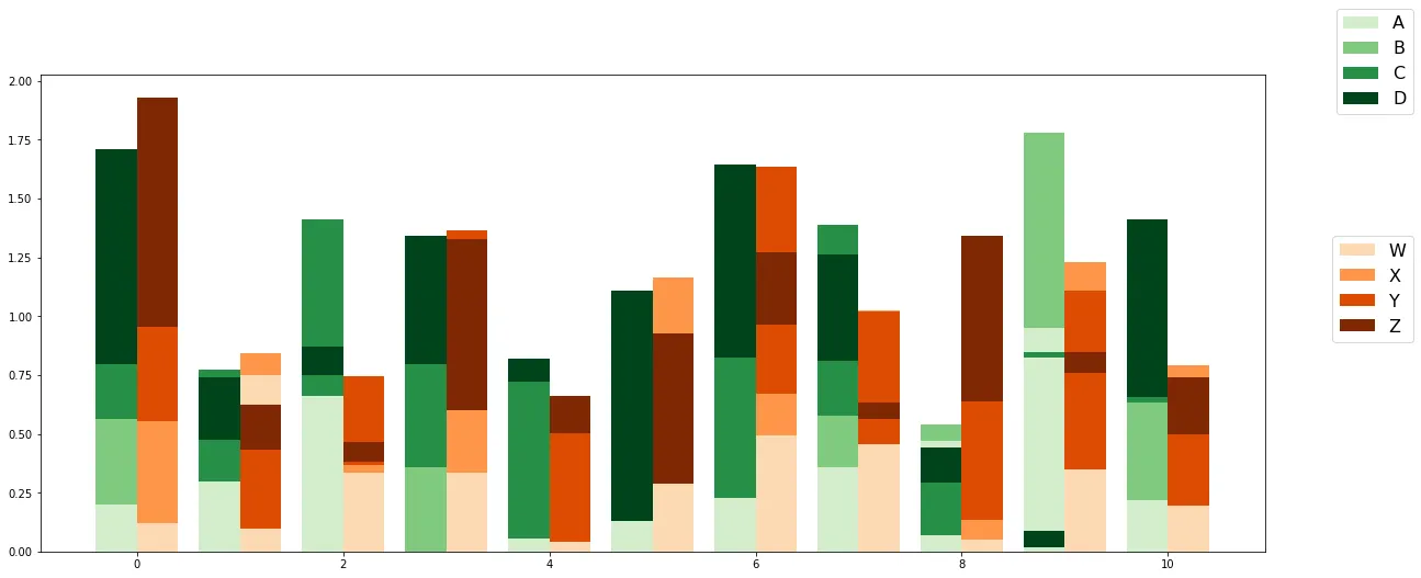
fig.legend(b1, grouped_dataset.index.levels[0], fontsize=16, loc="upper right")
fig.legend(b2, grouped_dataset.index.levels[0], fontsize=16, loc="center right")
grouped_dataset。但我找到了你的问题!现在回答... - Parfait