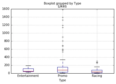
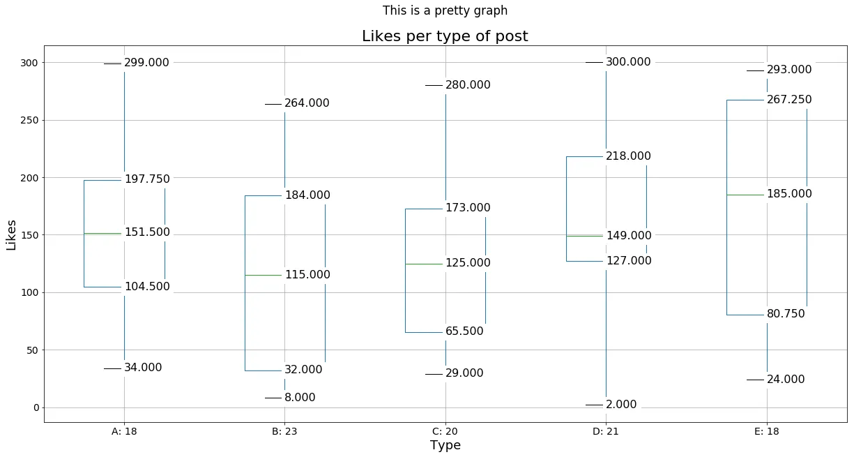
如何对箱线图的中位数、四分位数和须进行注释

9
我有一个名为“Posts_by_type”的pandas数据框,其中包含按“帖子类型”分解的Facebook帖子数据。它包括喜欢数量、分享数量和帖子类型。共有三种帖子类型:赛车、娱乐和推广。
我想在matplotlib中创建一个箱线图,显示每种类型的帖子的喜欢数量。
我的代码可以正常工作:
Posts_by_type.boxplot(column='Likes', by='Type', grid=True)

这将产生以下箱线图:

enter image description here

然而,我还想在箱线图上标记中位数和须的对应数值。

在matplotlib中是否可以实现?如果可以,有没有人能够指导我如何做到这一点?


两个相关的问题展示了解决这个问题的方法。这里这里。你需要说明为什么它们在你的情况下不适用。 - ImportanceOfBeingErnest
2个回答

12

一种解决方案,还可以为框中的值进行相加。

import random
import string
import matplotlib.pyplot as plt
import pandas as pd
import numpy as np

def get_x_tick_labels(df, grouped_by):
    tmp = df.groupby([grouped_by]).size()
    return ["{0}: {1}".format(k,v) for k, v in tmp.to_dict().items()]

def series_values_as_dict(series_object):
    tmp = series_object.to_dict().values()
    return [y for y in tmp][0]

def generate_dataframe():
    # Create a pandas dataframe...
    _likes = [random.randint(0,300) for _ in range(100)]
    _type = [random.choice(string.ascii_uppercase[:5]) for _ in range(100)]
    _shares = [random.randint(0,100) for _ in range(100)]
    return pd.DataFrame(
        {'Likes': _likes,
         'Type': _type,
         'shares': _shares
        })

def add_values(bp, ax):
    """ This actually adds the numbers to the various points of the boxplots"""
    for element in ['whiskers', 'medians', 'caps']:
        for line in bp[element]:
            # Get the position of the element. y is the label you want
            (x_l, y),(x_r, _) = line.get_xydata()
            # Make sure datapoints exist 
            # (I've been working with intervals, should not be problem for this case)
            if not np.isnan(y): 
                x_line_center = x_l + (x_r - x_l)/2
                y_line_center = y  # Since it's a line and it's horisontal
                # overlay the value:  on the line, from center to right
                ax.text(x_line_center, y_line_center, # Position
                        '%.3f' % y, # Value (3f = 3 decimal float)
                        verticalalignment='center', # Centered vertically with line 
                        fontsize=16, backgroundcolor="white")

posts_by_type = generate_dataframe()


fig, axes = plt.subplots(1, figsize=(20, 10))

bp_series = posts_by_type.boxplot(column='Likes', by='Type', 
                                  grid=True, figsize=(25, 10), 
                                  ax=axes, return_type='dict', labels=labels)
# This should return a dict, but gives me a Series object, soo...
bp_dict = series_values_as_dict(bp_series)
#Now add the values
add_values(bp_dict, axes)
# Set a label on X-axis for each boxplot
labels = get_x_tick_labels(posts_by_type, 'Type')
plt.xticks(range(1, len(labels) + 1), labels)
# Change some other texts on the graphs?
plt.title('Likes per type of post', fontsize=22)
plt.xlabel('Type', fontsize=18)
plt.ylabel('Likes', fontsize=18)
plt.suptitle('This is a pretty graph')
plt.show()

输入图像描述


3
在使用labels变量之前应该先定义它。 - Al Guy

2
虽然使用中位数值在seaborn中标记箱线图作为参考,但那些答案不适用,因为由matplotlib绘制的须线不容易直接从数据中计算得出。
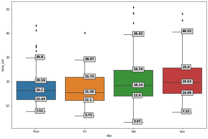
matplotlib.pyplot.boxplot所示,须线应该在Q1-1.5IQRQ3+1.5IQR处,然而只有当存在异常值时,才会将须线绘制到这些值上。否则,须线只会绘制到Q1下方的最小值,和/或Q3上方的最大值。
查看days_total_bill.min()可以看到所有低须线只绘制到列中的最小值({'Thur': 7.51, 'Fri': 5.75, 'Sat': 3.07, 'Sun': 7.25})。 如何获取matplotlib箱线图的数据展示了如何使用matplotlib.cbook.boxplot_stats提取matplotlib使用的所有箱线图统计数据。 boxplot_stats适用于不包含NaN的值数组。在样本数据的情况下,每天(注释1.)的值数量不相同,因此不能使用boxplot_stats(days_total_bill.values),而是使用列表推导式(注释2.)来获取每列的统计数据。 tips是一个整洁的数据框,因此相关数据('day''total_bill')被转换为宽数据框,使用pandas.DataFrame.pivot,因为boxplot_stats需要数据以这种形式提供。
字典列表被转换为数据框(注释3.),其中使用.iloc仅选择要进行注释的统计数据。此步骤是为了在进行注释时更容易迭代每天的相关统计数据。
数据使用sns.boxplot绘制,但也可以使用pandas.DataFrame.plotbox_plot = days_total_bill.plot(kind='box', figsize=(12, 8), positions=range(len(days_total_bill.columns))),其中range指定从0开始索引,因为默认情况下箱线图从1开始索引。 python 3.11.4pandas 2.0.3matplotlib 3.7.1seaborn 0.12.2中测试通过
import seaborn as sns
import matplotlib.pyplot as plt
from matplotlib.cbook import boxplot_stats

# load sample data
tips = sns.load_dataset("tips")

# 1. pivot tips so there's a column for each day for total_bill
days_total_bill = tips.pivot(columns='day', values='total_bill')
# 2. extract the boxplot stats for each day
days_total_bill_stats = [boxplot_stats(days_total_bill[col].dropna().values)[0] for col in days_total_bill.columns]
# 3. create a dataframe for the stats for each day
stats = pd.DataFrame(days_total_bill_stats, index=days_total_bill.columns).iloc[:, [4, 5, 7, 8, 9]].round(2)

# plot
fig, ax = plt.subplots(figsize=(12, 8))
# directly plot the wide dataframe with only the total_bill data
box_plot = sns.boxplot(data=days_total_bill, ax=ax)

# same plot is created with the primary tips dataframe
# box_plot = sns.boxplot(x="day", y="total_bill", data=tips, ax=ax)

# annotate
for xtick in box_plot.get_xticks():
    for col in stats.columns:
        box_plot.text(xtick, stats[col][xtick], stats[col][xtick], horizontalalignment='left', size='medium', color='k', weight='semibold', bbox=dict(facecolor='lightgray'))

enter image description here

数据视图

提示

   total_bill   tip     sex smoker  day    time  size
0       16.99  1.01  Female     No  Sun  Dinner     2
1       10.34  1.66    Male     No  Sun  Dinner     3
2       21.01  3.50    Male     No  Sun  Dinner     3
3       23.68  3.31    Male     No  Sun  Dinner     2
4       24.59  3.61  Female     No  Sun  Dinner     4

days_total_bill

  • 不是所有的指标都有数据
day  Thur  Fri  Sat    Sun
0     NaN  NaN  NaN  16.99
1     NaN  NaN  NaN  10.34
2     NaN  NaN  NaN  21.01
3     NaN  NaN  NaN  23.68
4     NaN  NaN  NaN  24.59
...
239    NaN  NaN  29.03  NaN
240    NaN  NaN  27.18  NaN
241    NaN  NaN  22.67  NaN
242    NaN  NaN  17.82  NaN
243  18.78  NaN    NaN  NaN

days_total_bill_stats

[{'mean': 17.682741935483868,
  'iqr': 7.712500000000002,
  'cilo': 14.662203087202318,
  'cihi': 17.73779691279768,
  'whishi': 29.8,
  'whislo': 7.51,
  'fliers': array([32.68, 34.83, 34.3 , 41.19, 43.11]),
  'q1': 12.442499999999999,
  'med': 16.2,
  'q3': 20.155},
 {'mean': 17.15157894736842,
  'iqr': 9.655000000000001,
  'cilo': 11.902436010483171,
  'cihi': 18.85756398951683,
  'whishi': 28.97,
  'whislo': 5.75,
  'fliers': array([40.17]),
  'q1': 12.094999999999999,
  'med': 15.38,
  'q3': 21.75},
 {'mean': 20.441379310344825,
  'iqr': 10.835,
  'cilo': 16.4162347275501,
  'cihi': 20.063765272449896,
  'whishi': 39.42,
  'whislo': 3.07,
  'fliers': array([48.27, 44.3 , 50.81, 48.33]),
  'q1': 13.905000000000001,
  'med': 18.24,
  'q3': 24.740000000000002},
 {'mean': 21.41,
  'iqr': 10.610000000000001,
  'cilo': 17.719230764952172,
  'cihi': 21.540769235047826,
  'whishi': 40.55,
  'whislo': 7.25,
  'fliers': array([48.17, 45.35]),
  'q1': 14.987499999999999,
  'med': 19.63,
  'q3': 25.5975}]

统计

      whishi  whislo     q1    med     q3
day                                      
Thur   29.80    7.51  12.44  16.20  20.16
Fri    28.97    5.75  12.10  15.38  21.75
Sat    39.42    3.07  13.90  18.24  24.74
Sun    40.55    7.25  14.99  19.63  25.60

手动计算与Matplotlib盒须位置不匹配。
stats = tips.groupby(['day'])['total_bill'].quantile([0.25, 0.75]).unstack(level=1).rename({0.25: 'q1', 0.75: 'q3'}, axis=1)
stats.insert(0, 'iqr', stats['q3'].sub(stats['q1']))
stats['w_low'] = stats['q1'].sub(stats['iqr'].mul(1.5))
stats['w_hi'] = stats['q3'].add(stats['iqr'].mul(1.5))
stats = stats.round(2)

        iqr     q1     q3  w_low   w_hi
day                                    
Thur   7.71  12.44  20.16   0.87  31.72
Fri    9.66  12.10  21.75  -2.39  36.23
Sat   10.84  13.90  24.74  -2.35  40.99
Sun   10.61  14.99  25.60  -0.93  41.51

网页内容由stack overflow 提供, 点击上面的
可以查看英文原文,
原文链接