你好,感谢您的帮助!(下面提供代码和数据)(图表如下)
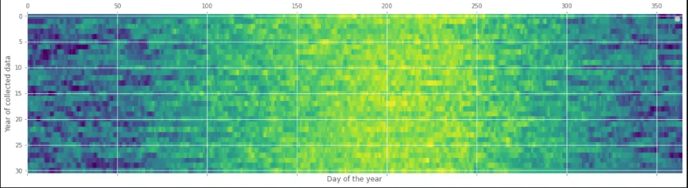
我试图在这张热力图上添加一个图例,解释地图上颜色的变化(较暖的颜色表示温度更高)。 我添加了:
ax1.legend([ax1], ['Temp'])
问题在于这行代码没有使我的图表包含图例。为了添加一个解释温度和颜色之间关系的图例,我需要做什么?
raw_data = pd.read_csv('https://raw.githubusercontent.com/the-
datadudes/deepSoilTemperature/master/allStationsDailyAirTemp1.csv', index_col=1, parse_dates=True)
df_all_stations = raw_data.copy()

# load the data into a DataFrame, not a Series
# parse the dates, and set them as the index

df1 = df_all_stations[df_all_stations['Station'] == 'Williston']


# groupby year and aggregate Temp into a list
dfg1 = df1.groupby(df1.index.year).agg({'Temp': list})

# create a wide format dataframe with all the temp data expanded
df1_wide = pd.DataFrame(dfg1.Temp.tolist(), index=dfg1.index)


# adding the data between 1990/01/01 -/04/23 and delete the 29th of Feb
rng = pd.date_range(start='1990-01-01', end='1990-04-23', freq='D')
df = pd.DataFrame(index= rng)
df.index = pd.to_datetime(df.index)
df['Temp'] = np.NaN
frames = [df, df1]
result = pd.concat(frames)
result = result[~((result.index.month == 2) & (result.index.day == 29))]

dfg1 = result.groupby(result.index.year).agg({'Temp': list})
df1_wide = pd.DataFrame(dfg1['Temp'].tolist(), index=dfg1.index)

# Setting all leftover empty fields to the average of that time in order to fill in the gaps
df1_wide = df1_wide.apply(lambda x: x.fillna(x.mean()),axis=0)

# ploting the data

fig, (ax1) = plt.subplots(ncols=1, figsize=(20, 5))
##ax1.set_title('Average Daily Air Temperature - Minot Station')
ax1.set_xlabel('Day of the year')
ax1.set_ylabel('Year of collected data')
ax1.legend([ax1], ['Temp'])
ax1.matshow(df1_wide, interpolation=None, aspect='auto');